Ayurveda for every user

Lopez Design was approached by a startup wanting to change the current worldview of Ayurveda and wellness. It is often believed that Ayurvedic solutions are not scientific, nor have tested efficacy and therefore, are not reliable. Working closely with our client, we took on the challenge to turn these perceptions around. Our strategy focused on making this new-age and truthful Ayurvedic product central to preventive healthcare, and keeping it at par with modern medicine.
Instead of a reactive healthcare model, we moved the brand positioning to a predictive, preventive, personalized, and participatory one. Our strategy focused on providing an authentic Ayurvedic lifestyle guided by doctors, aiming at the prime target group of Gen Z and millennials. The packaging and branding formats are designed to become an integral part of a sustainable modern lifestyle.
‘Purely Yours’, Science of Ayurveda
The name ‘Purely Yours’ comes from the core offering of the brand, Ayurveda at its purest. The ‘yours’ makes it personalized for every buyer’s special needs. It evokes the charismatic, youthful and agile nature of the brand. The name is complemented by a logical and straightforward tagline “Science of Ayurveda”.
Managing a vast product portfolio range
We proposed a functional brand architecture to complement the highly evocative name ‘Purely Yours ’. This established relevant categorization in context to customers’ ease of understanding and need for order, brings clarity to customers in making choices and ensures an efficient buying journey. The new brand architecture we developed, helps to organize an extensive portfolio into meaningful categories, not only for the customer but also for the brand’s future product management. We used the seven chakras in Ayurveda to create the foundation of a fresh and contemporary color palette.
Ayurveda reflects nature, reflects science, reflects you
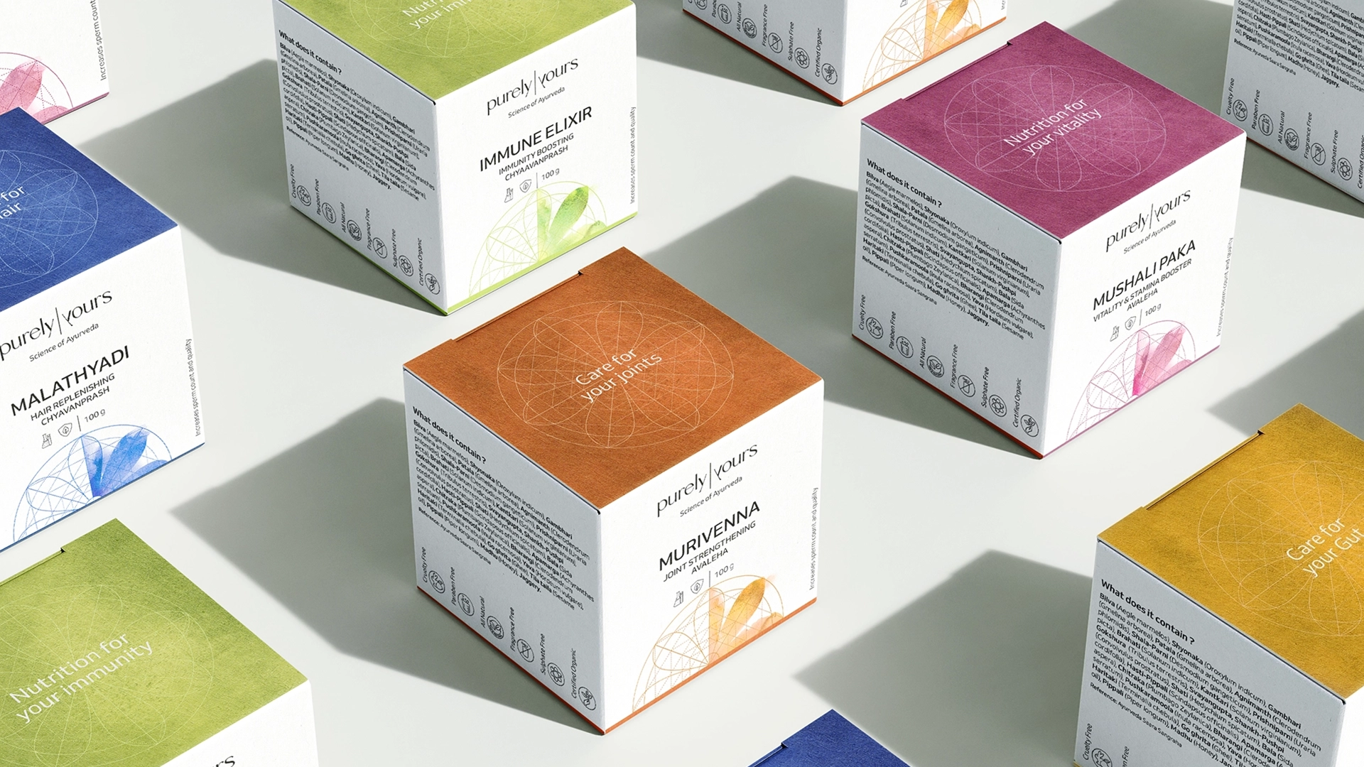
The identity brings to light the sacred geometry in nature and how nature portrays the concept of mirroring. It draws a parallel between science and nature reflecting how one balances the other. The identity includes the custom logotype and the geometric flower motif which lend their reflective nature across various brand assets.
A clean packaging system
We took an all-white approach to create a simple, contemporary packaging system free of visual clutter, that asserts the brand’s stance as a well-researched, doctor-recommended, honest, Ayurvedic product . The all-white look allowed for emphasis on the brand motif and product information and homogenized the various forms of packaging that covers the vast expanse of product range.
Related Projects
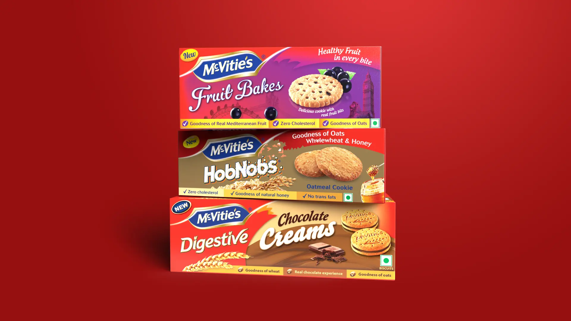
McVities Packaging
BRAND STRATEGY + BRAND IDENTITY + PACKAGING + ACTIVATION
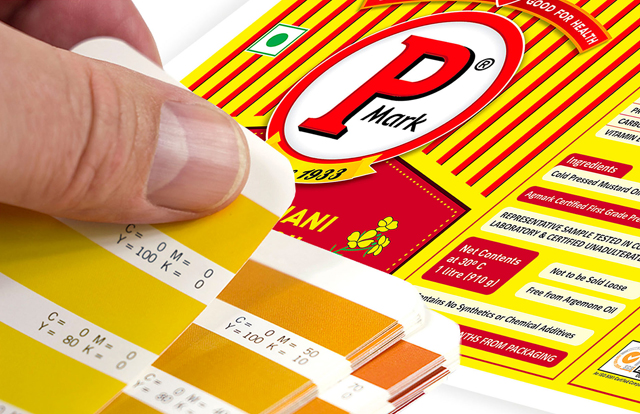
Puri Oil Mills
IDENTITY SYSTEMS + BRAND ARCHITECTURE + PACKAGING GRAPHICS + PACKAGING DESIGN
Join our mailing list
Receive our periodic newsletter on Branding, Experience, and Design thinking.
More Articles
An Iconic Gold
NOW = WON
Follow us on
Activation
Project Management
Supervision
Fabrication & Installation
Insights
Follow Us
© 2025 Lopez Design Pvt. Ltd. All rights reserved


