McVities Packaging
McVities Packaging
McVities Packaging
McVities Packaging
McVities Packaging
BRAND STRATEGY + BRAND IDENTITY + PACKAGING + ACTIVATION
BRAND STRATEGY + BRAND IDENTITY + PACKAGING + ACTIVATION
BRAND STRATEGY + BRAND IDENTITY + PACKAGING + ACTIVATION
BRAND STRATEGY + BRAND IDENTITY + PACKAGING + ACTIVATION
BRAND STRATEGY + BRAND IDENTITY + PACKAGING + ACTIVATION
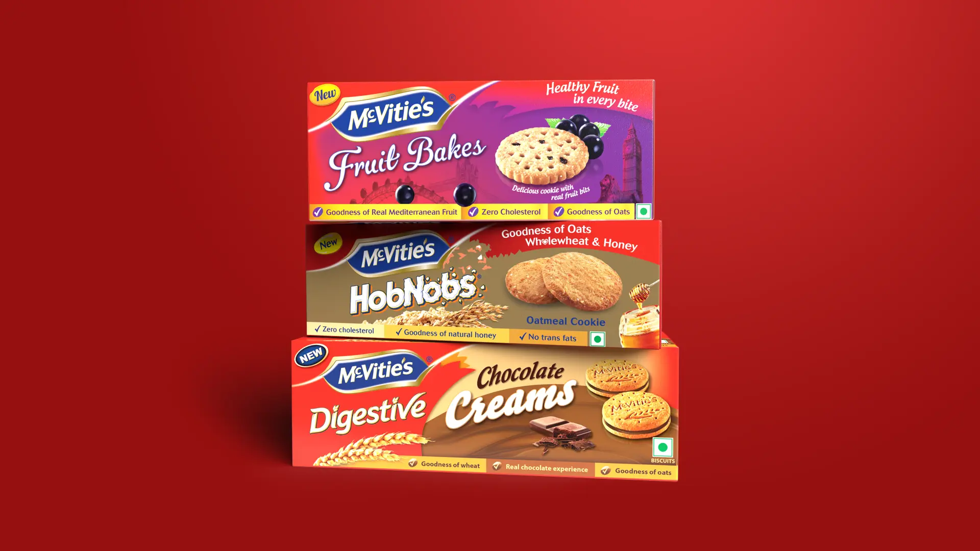
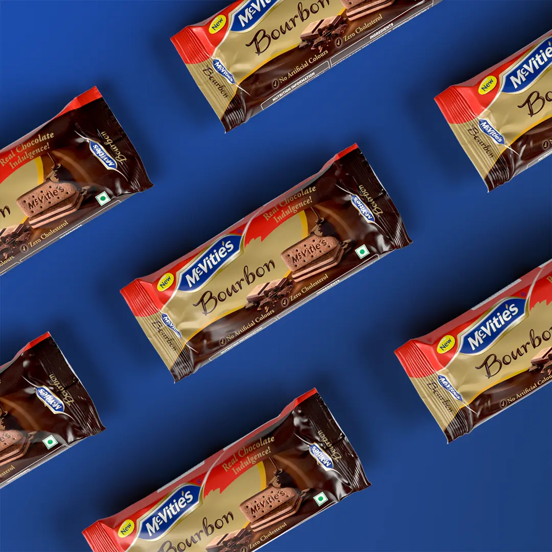
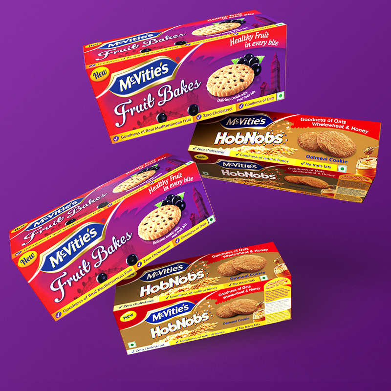
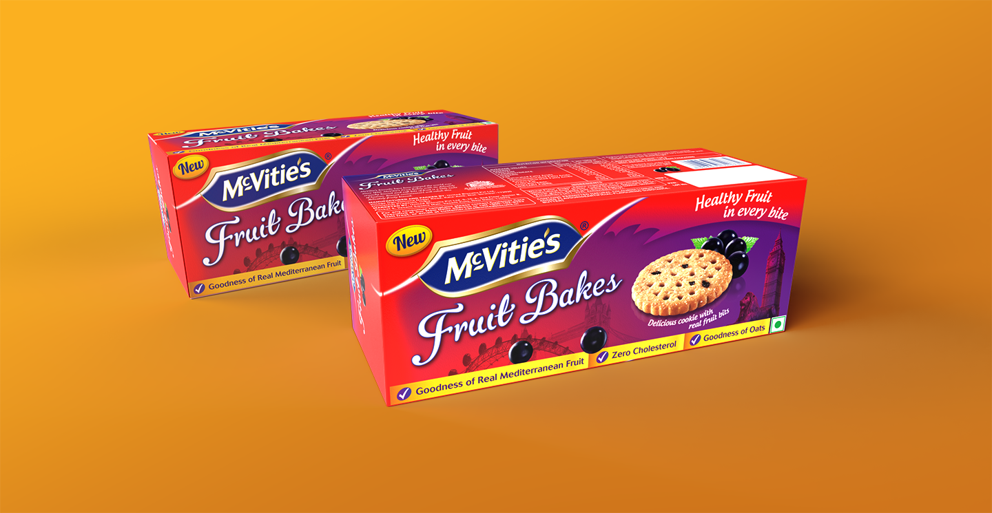
As a packaging partner for United Biscuits, Lopez Design brought in a strong systems design approach for McVities. A distinct and strong visual differentiator gave its products prominence, while consistency in language across the entire range of biscuits maintained its core branding. This balance of various factors made the brand stand out in a hugely cluttered and fiercely competitive market.
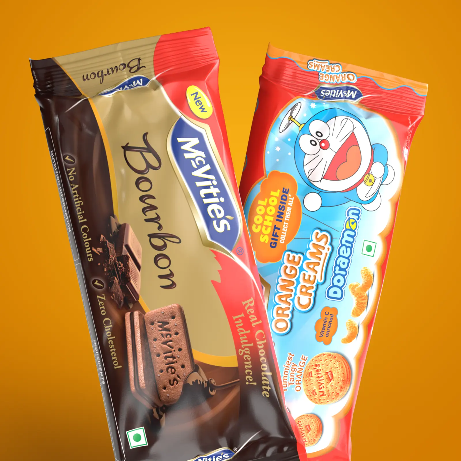
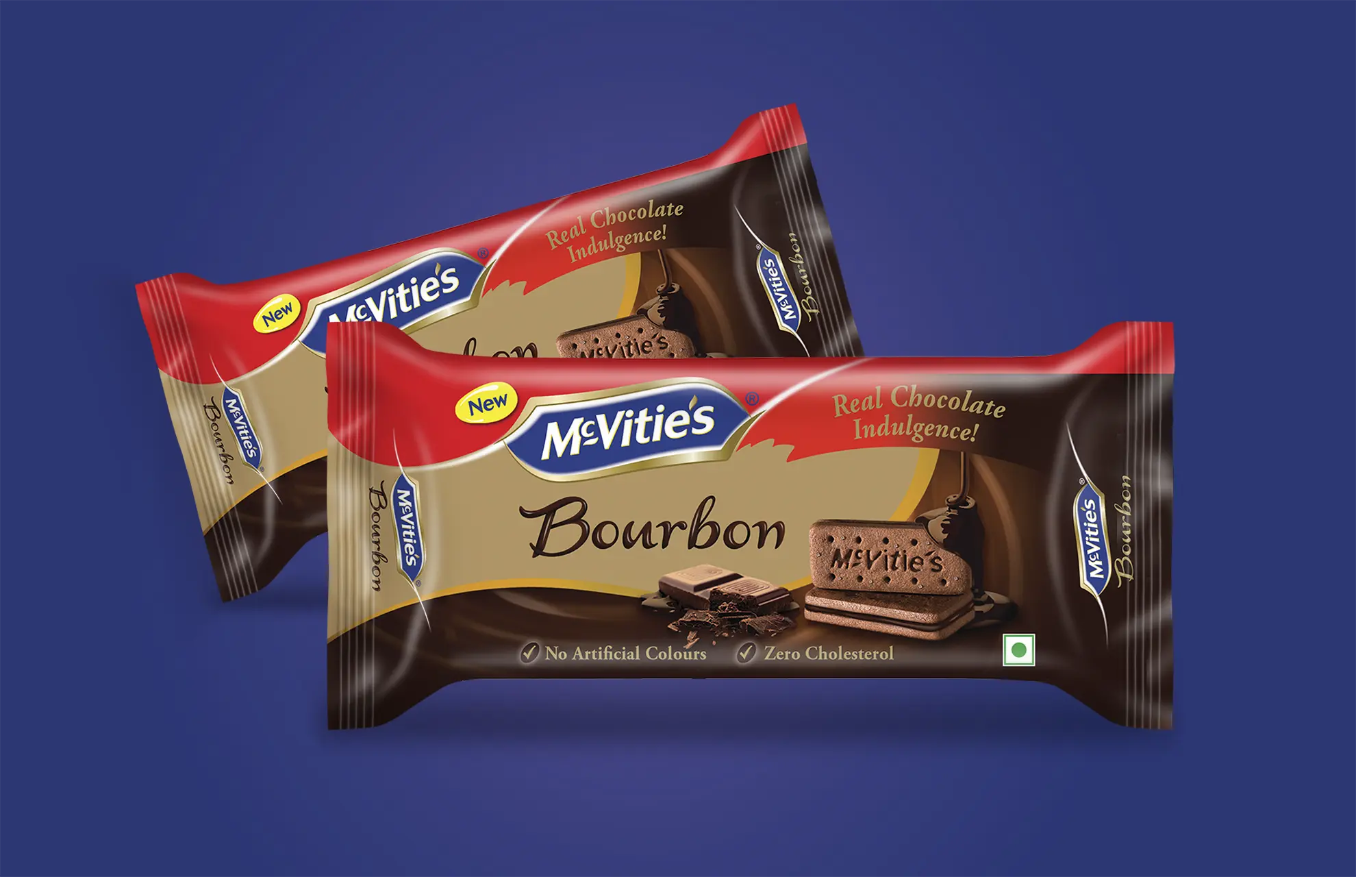
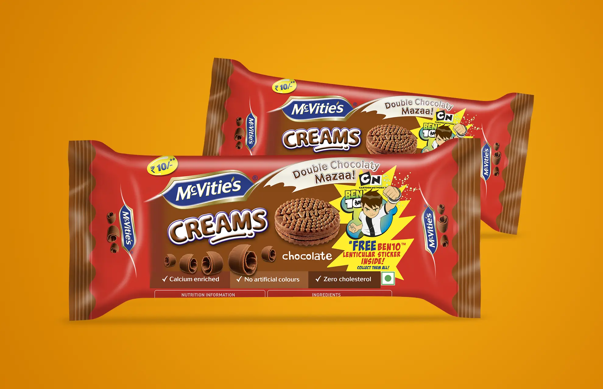
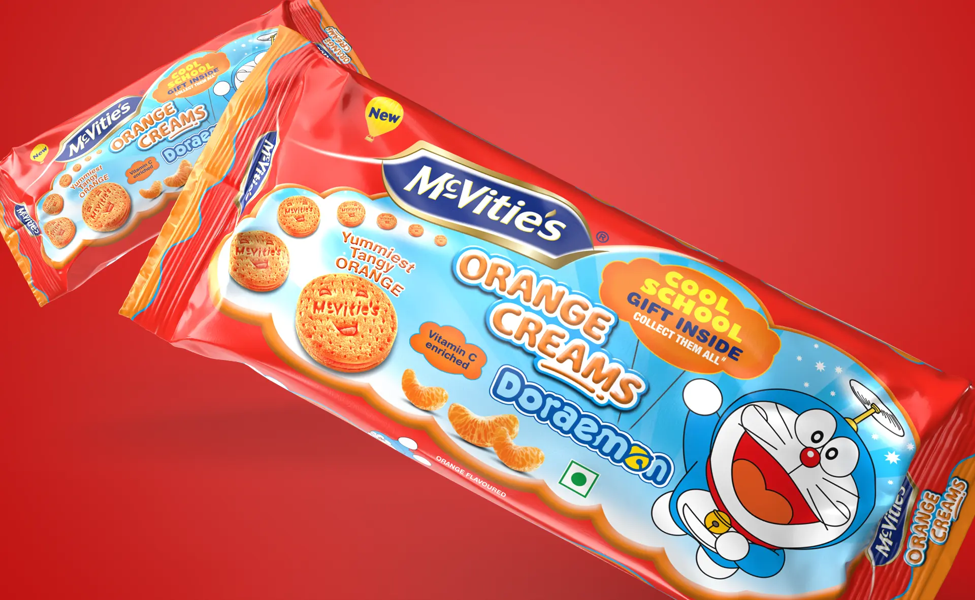
By discreet use of colour combinations and bold graphics, we came up with designs that avoided visual clutter and were easy to discern.

Matthew Moyes
Senior Global Brand Manager, United Biscuits International
"Lopez Design was integral to the successful launch of McVitie's in India. Their ability to take global brand guidelines and localize a range of new products has been exemplary. Their work helped create clear differentiation among McVitie's range while unifying the range under a consistent brand architecture.
The challenge wasn't easy, as there were multiple pack sizes, existing category color cues, and global guidelines to consider. I personally appreciated their collaborative approach, grounded in clear design excellence and an absolute determination to understand the business context."
Activation
Project Management
Supervision
Fabrication & Installation
Insights
Follow Us
© 2025 Lopez Design Pvt. Ltd. All rights reserved
