Brand strategy in motion; a radical design upskilling edtech platform

Lopez Design conceived an integrated brand ecosystem, a witty name, strategic positioning, and a conversational communication system for ‘AND Academy’, an online design upskilling platform, launched by Indian Institute of Art and Design.
A few insights into what makes it stand out:
Putting a paradigm shift into action
Most young aspirants, after graduation or their initial industrial experience are vulnerable and are in an anxiety-ridden mental construct in context to their career. We positioned AND Academy as a cohort-based upskilling platform specifically designed to transform careers through various design courses.
‘AND Academy’, mark of growth by design
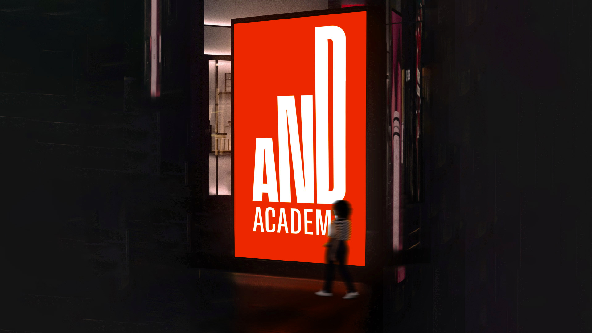
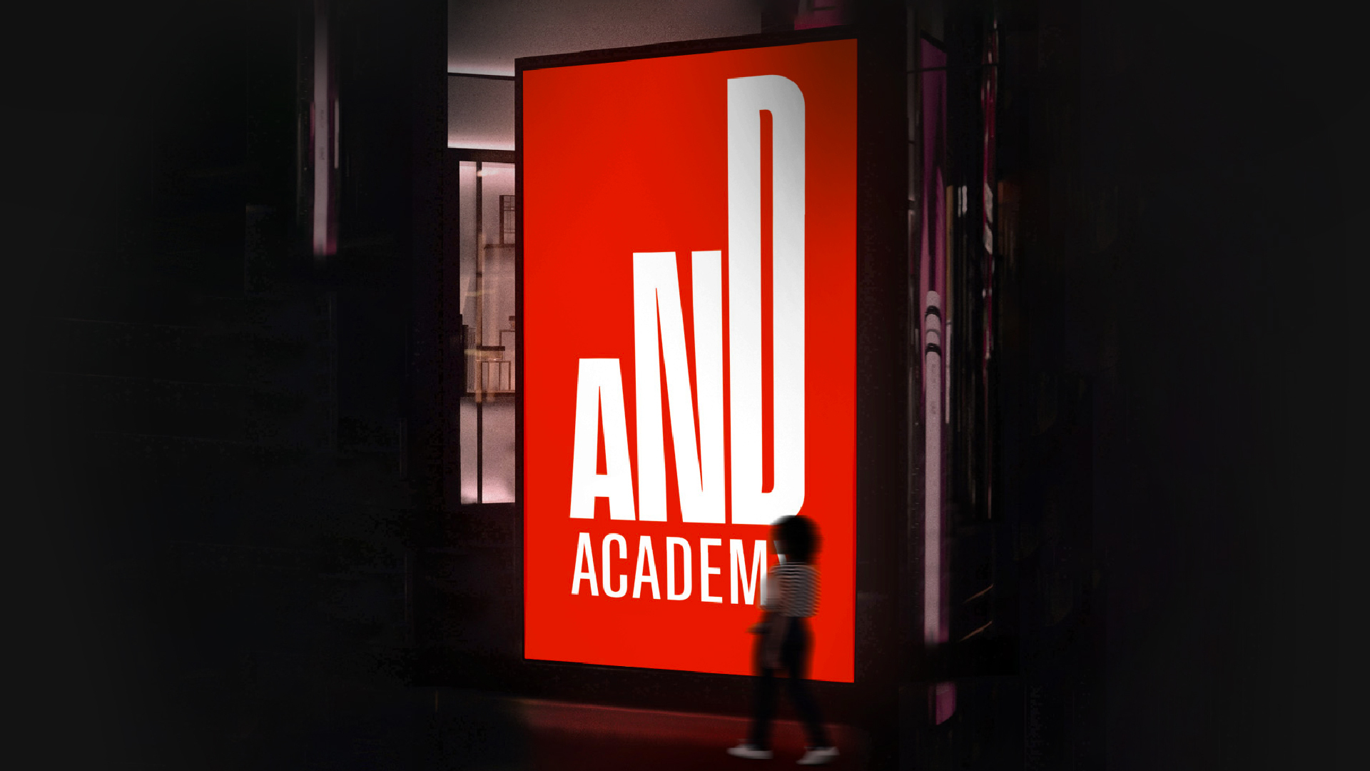
The name AND comes from the core offering of the brand, Art ‘n’ Design or A ’n’ D. As a conjunction, it allows us to project it in addition to their existing profession. Engineering AND Design.
The word ‘AND’ also increases the brand name’s elasticity, extending the platform’s strength to future offerings and courses, aiding individuals to evolve towards their aspirations.
Taking a straightforward stance
The visual identity is a direct analogy of ‘stepping up the career’ by upskilling in design, as it revolves around the transformative nature of design and the growth it leads to.
We crafted a custom logotype with a sharp typeface ‘Antarctica’ and built the system using variable type applications to complement its highly energetic and contemporary outlook.
A conversational branding system
For AND Academy, we seeded a ‘content first’ brand approach, making it authentic, relatable and straightforward. We brought content to the forefront of the visual system and delivered it through variable typography without any additional visual elements.
We leveraged the conjunction ‘AND' to bring out a conversational brand by joining two words, phrases and ideas with ‘AND as the bridge’ - to deliver compelling and relatable communications.
Performance-oriented UI
AND Academy’s UI is designed on-point for ‘young aspirants’, allowing them to focus on the matter at hand. It offers crisp information delivery, straightforward user flow, clean visual appearance and an energetic demeanor.
Related Projects
AND Academy
BRAND STRATEGY + NAMING + BRAND IDENTITY + VISUAL SYSTEM + MARKETING + UI&UX + PRINT
Transform Health
BRAND STRATEGY + BRAND IDENTITY + VISUAL SYSTEM + UI&UX
Join our mailing list
Receive our periodic newsletter on Branding, Experience, and Design thinking.
More Articles
META MAY
Build your business ‘by design’
Follow us on
Insights
Follow Us
© 2025 Lopez Design Pvt. Ltd. All rights reserved


