An Iconic Gold
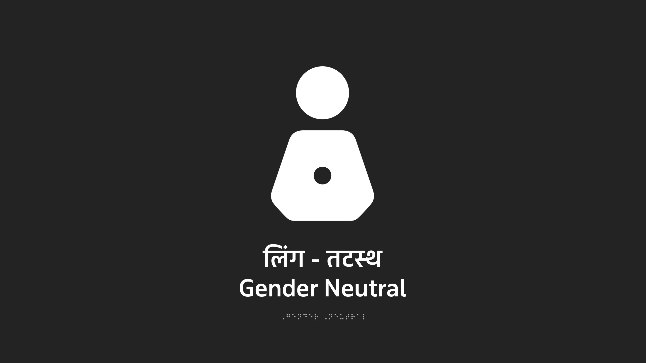
Lopez Design has won a prestigious Gold German Design Award with the citation category Excellent Communications Design in Wayfinding & Signage for the design of the Gender Neutral icon for restrooms, recently launched in Kartavya Path, the avenue leading to the seat of the Central Government of India.
About GDA
2012 to 2022 marks ten years of the German Design Awards, and this year they celebrate their 10th anniversary with the theme “How Designers Think”. The awards mark honorable achievements in the field of communications, products, and architecture. The winning entries are selected by an outstanding international jury that looks for designs that spell success.
Designing the Gender-Neutral Icon
The application of icons for washrooms have become universal icons that represent how we see human beings, Hence, it is all the more important to recognize and design a Gender Neutral symbol for many sections of people, some in marginal categories, who do not fit in the stark black and white categories of male and female.
We designed an icon that is humane, truly inclusive, and respectful. Binary elements were eliminated to make it non-conformist, while the dot makes it iconic, universal, and differentiating. Its simplicity ensures high recall value and worldwide acceptance. In India, it will be accompanied by Hindi and English text that says ‘Gender Neutral’ catering to binary, non-binary, transgender, agender, genderqueer, pangender, gender non-conformist, and others.
Inception
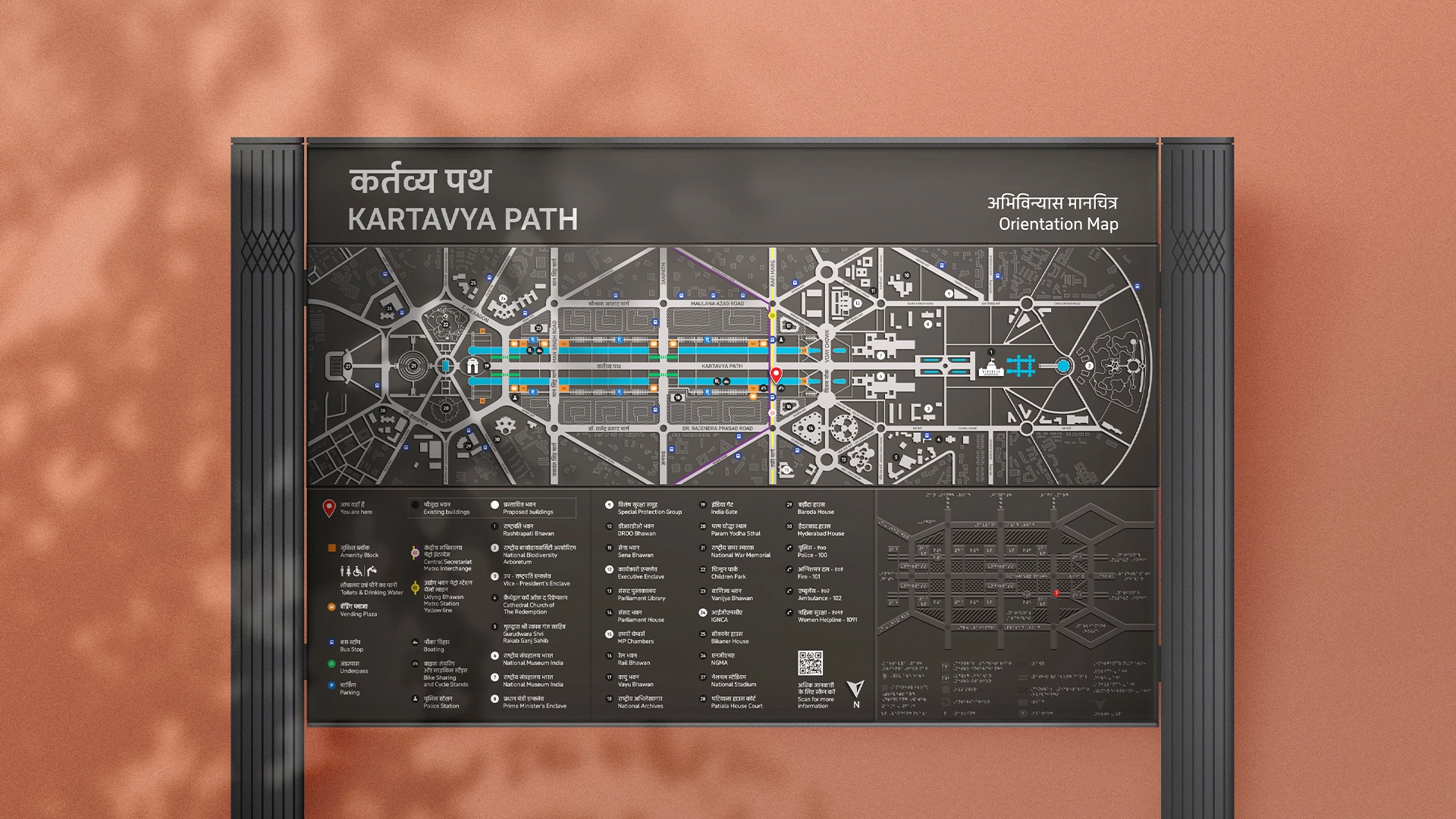
One of the new symbol’s first applications is at India’s most significant avenue at New Delhi - the Kartavya Path, the Central Government’s seat of administration, and also the site of the Republic Day Parade. It was our wayfinding and signage project for Central Vista that got us on the track of designing a symbol that was acceptable to a diverse set of people who often feel alienated. In a progressive 21st century, where so much emphasis has been put on embracing varied opinions, cultures and peoples from many different customs, traditions and backgrounds, we found that most ‘gender neutral’ symbols excluded a set of people and did not represent them thoughtfully and equitably.
Approach
The team followed a diligent process by questioning the need for a gender-neutral symbol to the need for a gender-neutral toilet, reviewing the current symbols across the globe, and researching where gender identities are rooted among many other points. Traditionally, skirts and pants are used to depict female and male, and many existing symbols combine the male-female representations, which are not truthful or sensitive to the many categories of persons who are neither male nor female. Further, the symbol had to represent a human form with respect to the categories that fall outside the male and female purview.
With respect for all and prejudice to none
The team designing the symbol says, “The new symbol is without any past reference or prejudice. It has a circle in the negative space in a neutral human form that differentiates this from the male and female icons used commonly, making it iconic with an identity of its own. Till the icon develops its own recall value, it would be accompanied by text - Gender Neutral written in Hindi and English (can be adapted as per the local language). Its lack of historical reference also allows the symbol to be seen in a new light by society at large.”
While CPWD has ownership of the specific stylized version we designed for Kartavya Path, the open-source aspects of the symbol include the form, which excludes binary elements of men and women, and the dot at the center. Symbols have a long and penetrating influence on human consciousness, and it is our hope that this democratic intervention will change how society views its people on the fringe.
Lopez Design has come up with a superbly designed proposal for labelling gender-neutral WCs. Derived from the existing male & female icons, the new sign does away with the binary elements that affect only the lower half. The upper half has been retained, making the accustomed form more recognisable. A dot in the middle makes the new sign an icon in its own right. Although an additional written note regarding the gender-neutral meaning is still recommended in the beginning, the sign was so clear and simple that the public learning process means that an explanation will become less and less necessary over time since the sign is self-explanatory. A strong inclusive contribution.
Related Projects
Gender Neutral Symbol
ICON DESIGN
The Bihar Museum
BRAND STRATEGY + BRAND IDENTITY + PRINT DESIGN + UI&UX +DIGITAL & SOCIAL MEDIA + WAYFINDING & SIGNAGE + ACTIVATION
Join our mailing list
Receive our periodic newsletter on Branding, Experience, and Design thinking.
More Articles
No. 9
Wayfinding and Signage Design for India’s grandest public space
Follow us on
Activation
Project Management
Supervision
Fabrication & Installation
Insights
Follow Us
© 2025 Lopez Design Pvt. Ltd. All rights reserved


