The Magic Touch
Like every project that arrives at our doorstep, reviving Magic Edtech’s online branding posed its own challenges and made us think afresh. Creative thinking can be like a quadratic equation, with many variables, and the answer lies somewhere between intuition and logic as the team applies itself to necessity, reason, and aesthetics to capture that intangible visual quotient.
This interview with the studio team led by Anthony Lopez opens up the process and thinking behind our newly launched identity and website for Magic EdTech.
What is Magic EdTech? Can you describe what they do?
Magic EdTech offers education technology expertise. They provide solutions in educational technology for a niche to large educational organizations. Ed Tech is a field that has many sectors, and therefore the range of applications is very wide. Magic is education focussed, and even though they don’t claim to be education experts they understand digital education very well, right from K2 to higher education.
In their years of business, their unique understanding of technology, content, and education has let them connect strongly with their learning audience with a greater goal of finding happiness. Magic’s customer base is B2B, and with this holistic approach, they deliver solutions with better efficacy for their customer’s learning audience. While Magic builds the tech infrastructure and platforms, they also sell Magic Box as an intelligent ready-made platform which can be integrated into the client’s systems.

In the market of Education Technology, how did you seek to differentiate Magic?
If you look at Magic EdTech and their competitors, they can be easily mistaken for doing just the backend development and coding. However, their greater focus on learning and their engagement in creating curriculum, and structuring learning platforms from the content perspective, has given them a niche space in the EdTech market.
Magic EdTech brings an unusual blend of technology, education, and content through its solutions. They stand out in the landscape because they know education as a medium; they understand and empathize with learners. Technology for Magic is a tool to deliver education online. Quite often, they are commissioned to take existing courses and transform them for digital platforms. All these became potent differentiating factors in evolving the strategy.
What was the positioning and strategy for Magic EdTech — can you talk about how you evolved it?
In the world of digital education, Magic EdTech’s competitors are organizations like Learning Mate, Hurix Digital, Ansrsource, and Excelsoft. Magic EdTech came across as a B2C company when we initially started to research and study the brand.
Magic was earlier catering to schools and K12 and the client was emphatic about creating “happy learning experiences”. They also placed a lot of emphasis on being open and equitable as their products reached people across the world, some in remote areas as well. With their new offerings, their learning audience would now include graduates and higher education — so, the entire positioning needed to make a distinct change.
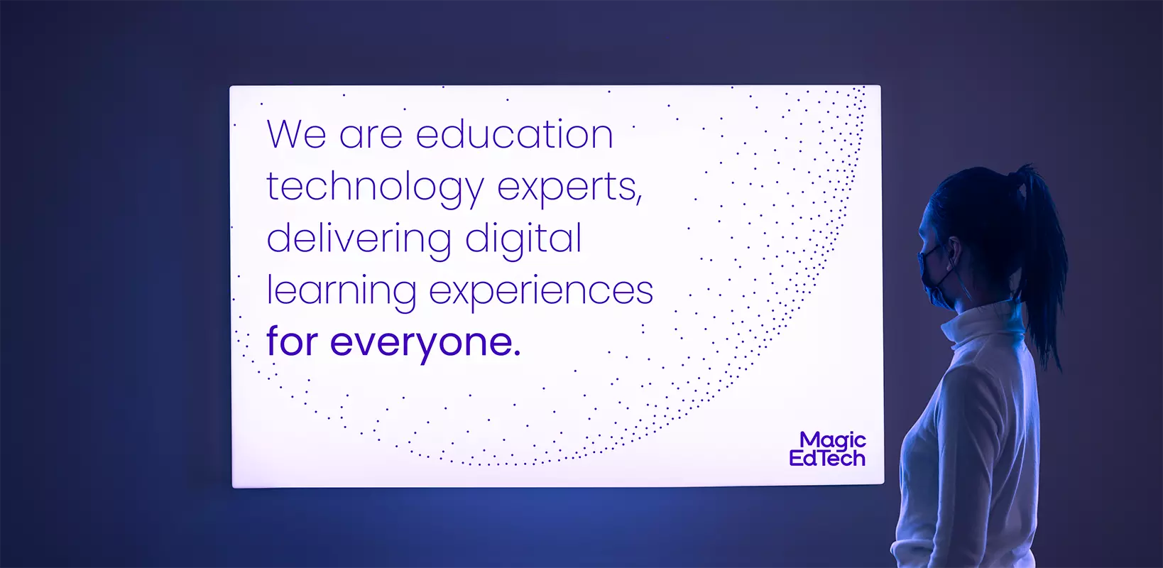
Our aim for Magic was to position it as a cutting-edge, credible, and distinct brand. We arrived at the by-line “Digital Learning for everyone” making an elegant shift where the brand embraced people everywhere. Along with the logo and the graphic language, we ensured that they are perceived as an organization, which could add significant value to their client’s growth potential.
Why did you choose to make a logotype versus a logo?
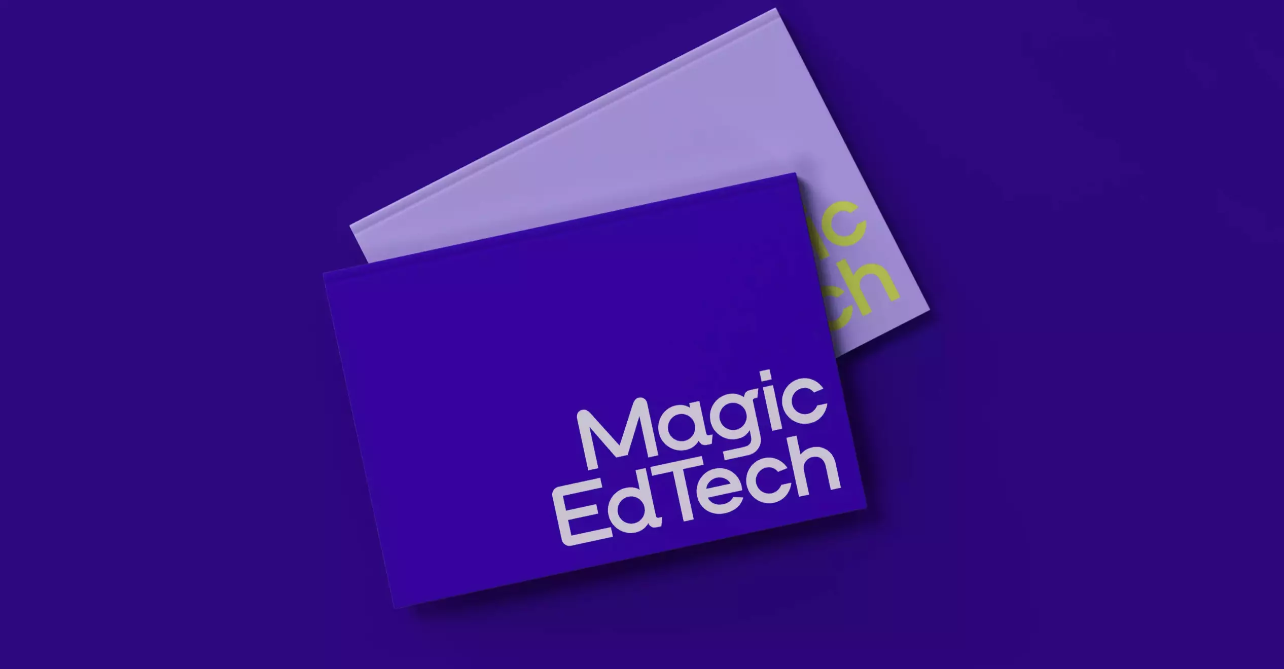
As a service organization, we felt it was important Magic comes across as a provider who means business. While a symbol can be more subjective, a logotype is impartial. Another consideration is that the logotype gives an organization more scope to diversify and expand its business. A clinching factor in this decision was to project Magic’s credibility — a pure logotype that works as a mark of quality.
We developed a customized font with a unique character for Magic. The font has roundness and approachability combined with a chiseled look so it comes across as highly crafted as well as engineering. There are people who deliver hardcore technology and people who deliver education solutions. Magic bridges this gap and we wanted this to come out. The logotype is by itself not symmetrical but it sits in a symmetrical sphere of dots.
How did you create a sense of magic in online education solutions through the graphic solution?
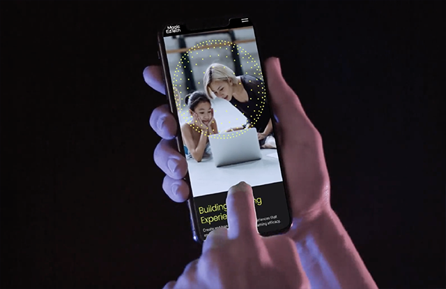
We wanted to create a humanistic solution that bridges the gaps to bring out the aspects of digital education. The ‘magic’ was not about pulling a rabbit from a hat but communicating how technology can create magical learning experiences. We, therefore, decided the identity will never be in isolation and will always go along with a visual system that signifies technology for learning.
The logotype and the visual motif of dots in a circular formation go along with the color palette to position Magic as a platform with cutting-edge digital technology — not just to write code but to connect with people. The combination of black, green, and hues of purples brings out how effective they are in technology, and with a humane approach.
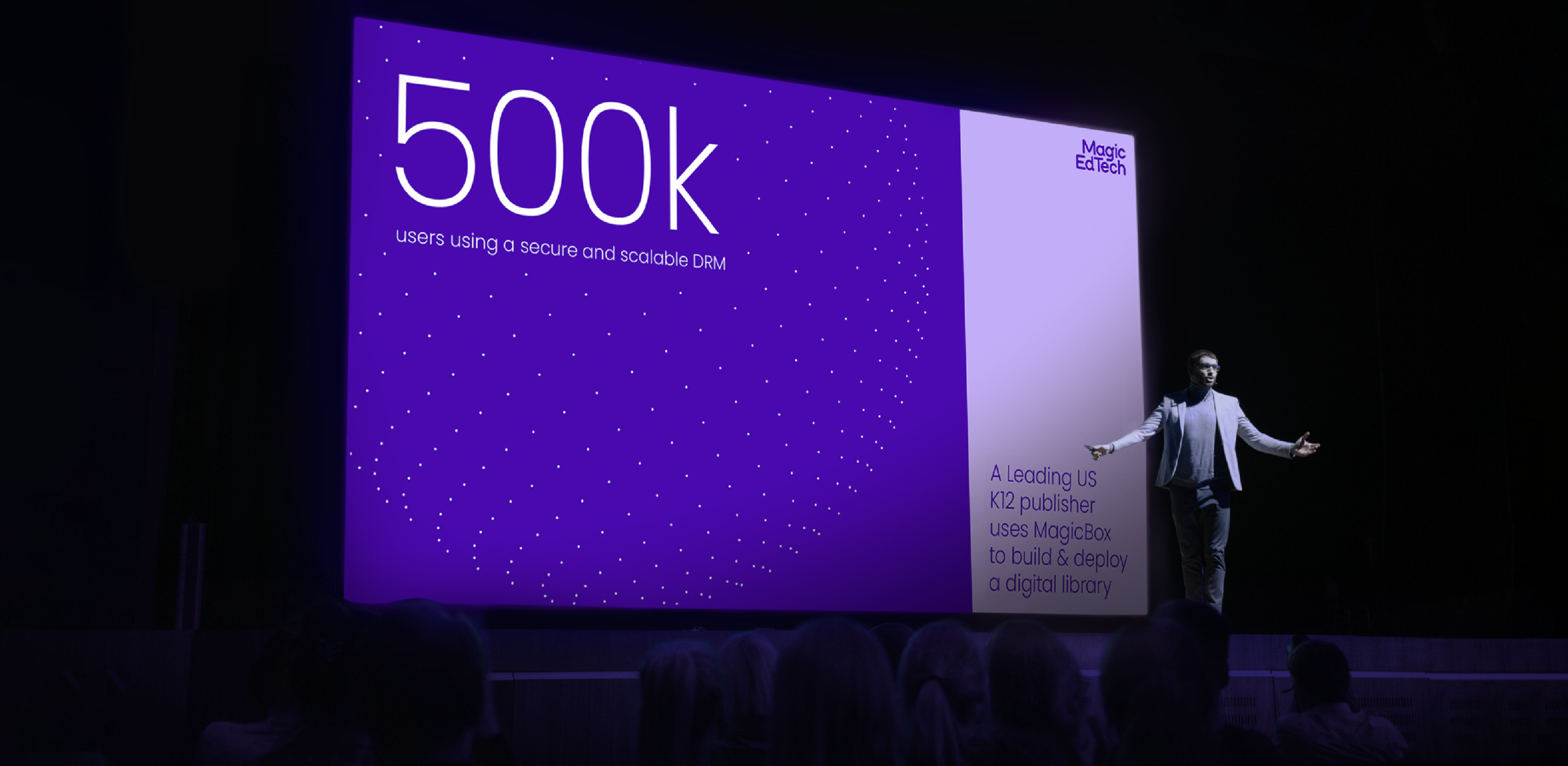
The circular forms we used for the motif embraced the idea of Digital Learning for Everyone and resonated with a spark of enlightenment. In motion, they are pulsating dots, and in the graphic language, they encircle the subjects, communicating deeper messages about human learning.
At Lopez Design, you work closely with your clients in an inclusive way. How did the interactions with the client aid the design process?
We had direct access to the entire hierarchy of the organization, from the MD to the sales team, and to the developers, which helped us to share our process and get real feedback. The client was very transparent and shared all the negatives and positives, as well as suggestions they received from partners and colleagues. At times we were taken aback by the ‘no-holds-barred’ tone of the communications. Yet, we also appreciated how Acky Kamdar and his team could be completely frank and honest with us. This encouraged us to take several steps back each time to review every decision and deliver the final solution with clarity, finesse, and perfectionism.
View case study on Magic Edtech Branding and Magic EdTech UI&UX
Written by Sujatha Shankar Kumar
Related Projects
Magic EdTech
BRAND STRATEGY + BRAND IDENTITY + VISUAL SYSTEM + UI&UX
Magic Website
UI & UX + ACTIVATION
Join our mailing list
Receive our periodic newsletter on Branding, Experience, and Design thinking.
More Articles
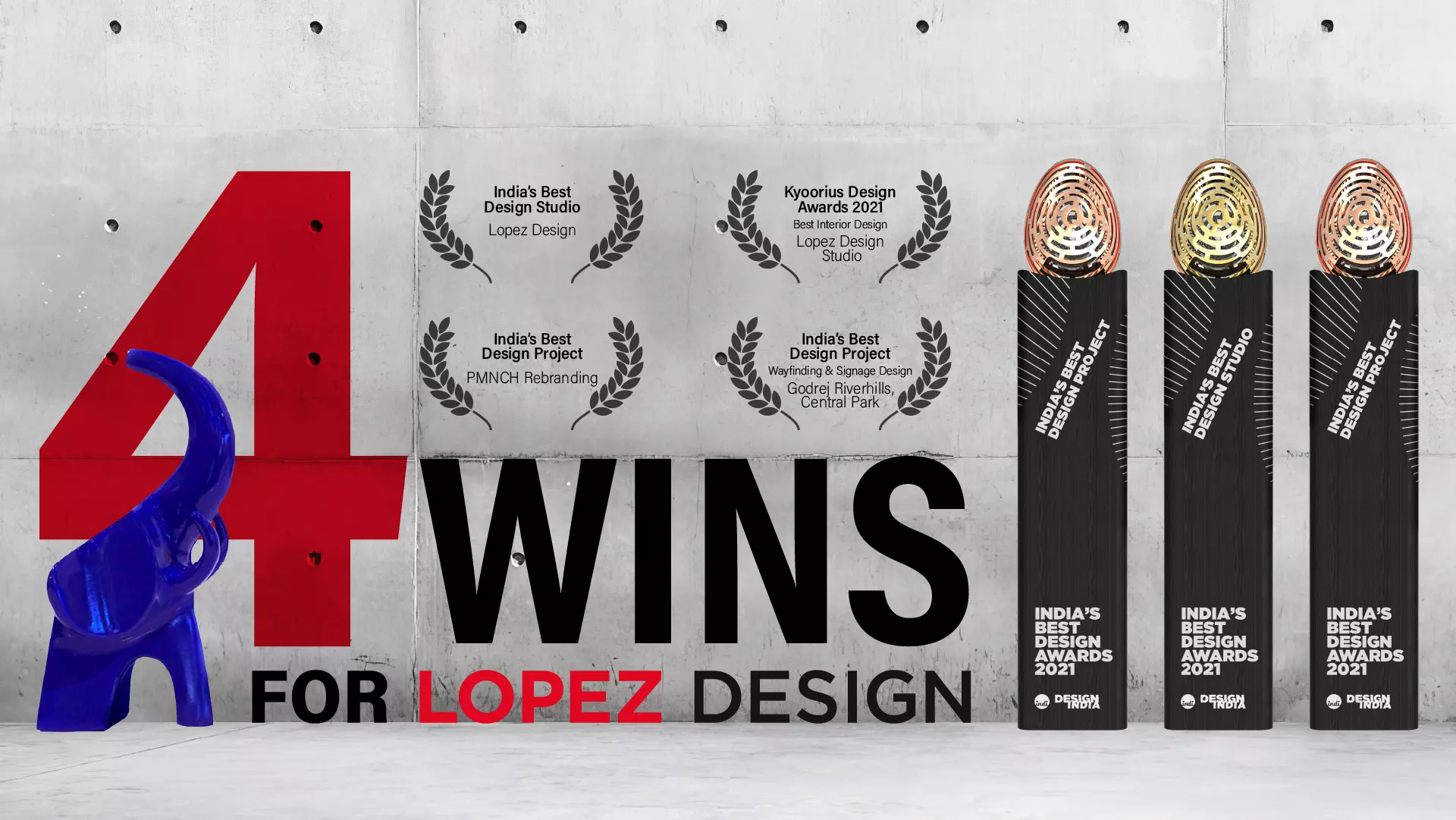
Four wins for Lopez Design
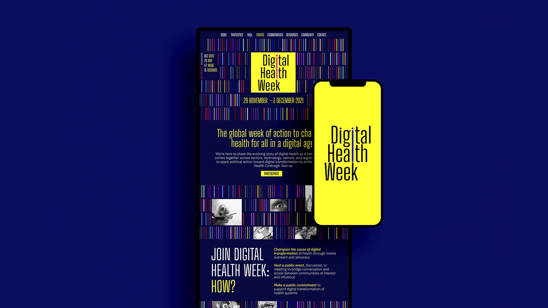
Bridging Digital and Health
Follow us on
We can add significant value to your
long-term business goals.
Get in touch with us or meet us at our studio in Gurgaon.
Activation
Project Management
Supervision
Fabrication & Installation
Insights
Follow Us
© 2025 Lopez Design Pvt. Ltd. All rights reserved
