A Visual-Wordplay
Dear Readers,
Today, our culture is dominated by visuals. We live in a world where images have become synonymous with communication with the popularity of apps like Snapchat and Instagram. Also we often find ourselves in an endless scroll, blurring our attention zones. However, in this modern-day fast paced world, visuals alone cannot be the central pillar of differentiation, because humans seek meaning and value in everything they do.
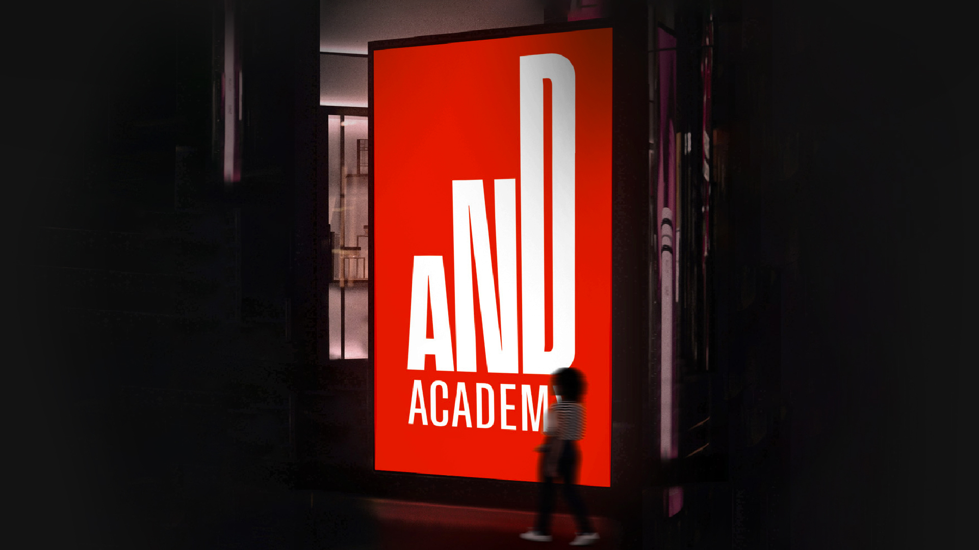
This edition talks about our latest branding work for AND Academy, where we pulled a reverse strategy by making words the main protagonist over visuals. This approach facilitates a compelling pitch to its consumers and candidly brings out its proposition through typographic visuals.
AND Academy’s visual identity blurs the lines between visual and content communication, securing a critical, straightforward stance.
Entering into an overcrowded and cluttered EdTech market, learn how it sets itself apart through our article ‘Brand strategy in motion; a radical design upskilling EdTech platform.’
Another addition to our portfolio of brands targeted at the future workforce is the branding for ‘Future Right Skills Network’ facilitated by Quest Alliance, Accenture, Cisco, and JP Morgan. The brand unveils itself with an energetic and flexible visual system, emphasising FRSN’s role of influencing several areas through an inclusive network to ensure the future employment of youth. View the case study here
Warm wishes,
Interim editor
Sukanya Panda
Related Projects
AND Academy
BRAND STRATEGY + NAMING + BRAND IDENTITY + VISUAL SYSTEM + MARKETING + UI&UX + PRINT
Transform Health
BRAND STRATEGY + BRAND IDENTITY + VISUAL SYSTEM + UI&UX
Join our mailing list
Receive our periodic newsletter on Branding, Experience, and Design thinking.
More Articles
Brand strategy in motion; a radical design upskilling EdTech platform
Mojo March
Follow us on
Activation
Project Management
Supervision
Fabrication & Installation
Insights
Follow Us
© 2025 Lopez Design Pvt. Ltd. All rights reserved


