A Culture of Colours
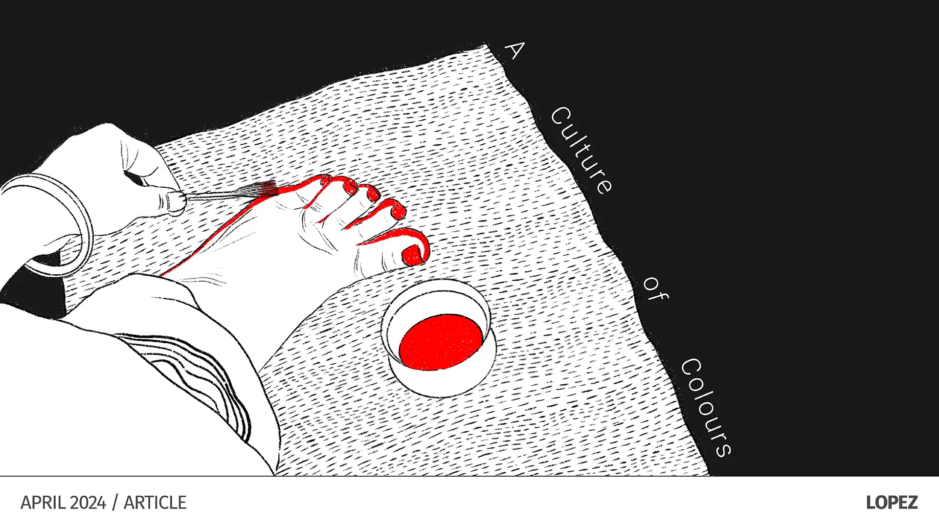
By Sujatha Shankar Kumar
We are a colourful country. We wear clothes of many colours, often in edgy combinations. Our buildings are multi-hued and with varied textures. We love using daily objects that are colourful. In a globally facing India, how much of this relationship with colour shifts to how we brand our products and entities? How much colour seeps into the brand story? Should Indian brands follow trends of minimalistic colours for identities, or can we find unusual ways of being phenomenal and outrageous with colour, since that is much of our DNA? Here are some exclusive ways in which we can leverage colour effectively to shape compelling brand identities and narratives to capture attention and resonate with customers, both domestically and internationally.
Using colours to tell stories
Closely tied in with colour, is the Indian love for story. Colours are used to celebrate the victory of good over evil — in Holi, Diwali and Navratri. Every colour has deeply symbolic qualities and associations in India — for example, red is a symbol of fertility and prosperity, yellow signifies cleansing, purity and victory. White is not only peace and simplicity, it is also associated with mourning and departure.
Brands have picked up cues to use the power of colours in storytelling. The Incredible India campaign launched by the Government of India in 2002, is an iconic example of our natural proclivity for colour. Rather than a monotonic palette, the campaign brings out our diversity through the use of both illustration and colour relative to place.
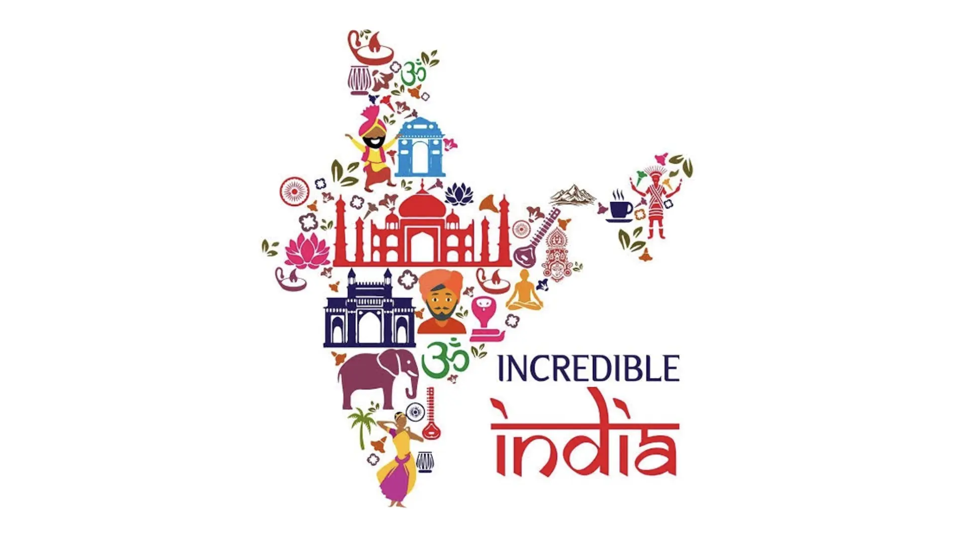
Campaign by Government of India’s Tourism Ministry commissioning O & M
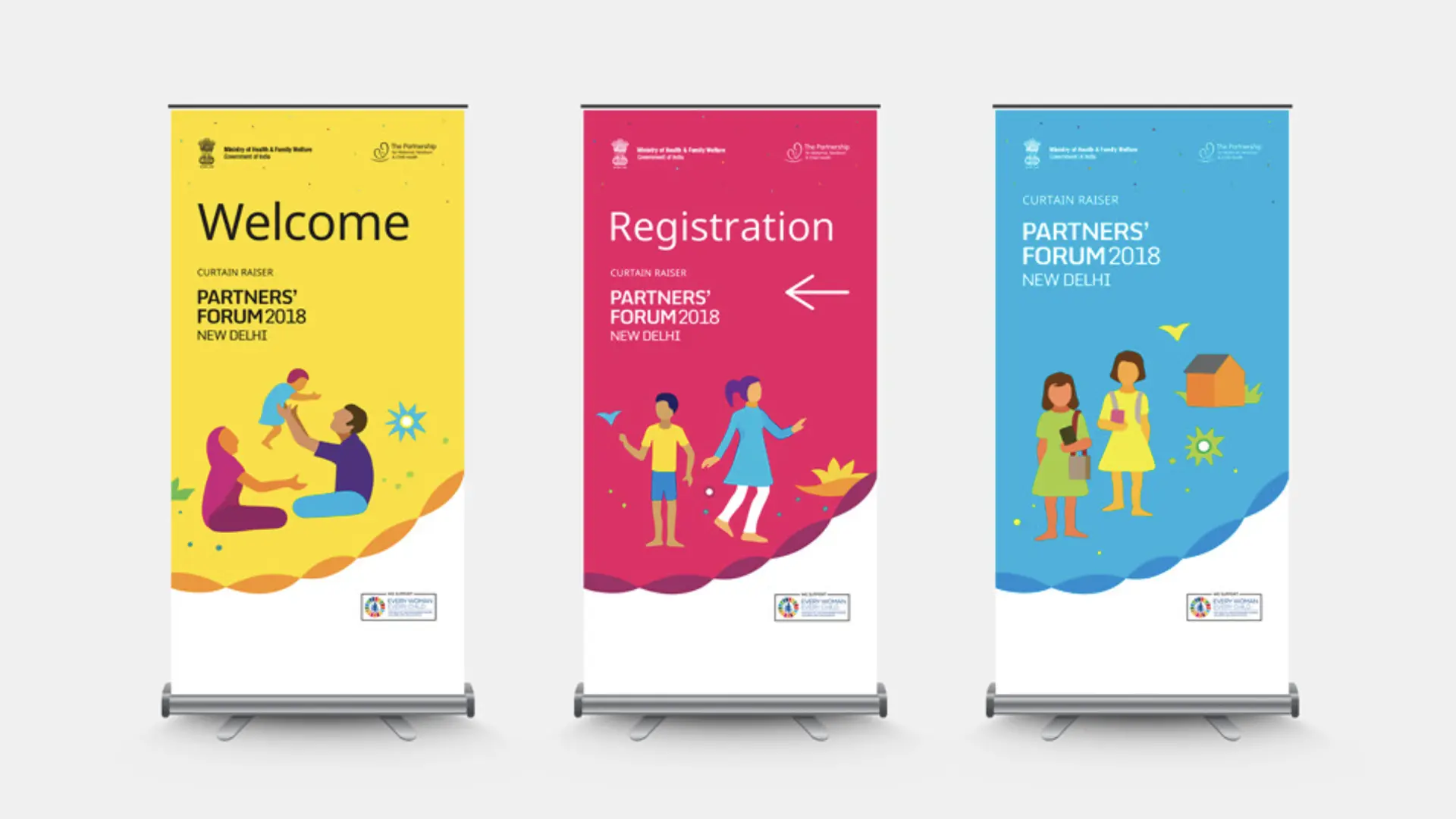
At Lopez, for the Partners' Forum in New Delhi in 2018, we created conference materials of fabric, inspired by the craft of Pipli, which were made renewable as gifts at the end of the event. The bags, cushions and banners display an uninhibited celebration of the power of partnership, showing how many different kinds of organisations come together for women’s, children’s and adolescents’ health. Ideating from the core concept that ‘ Women, Children and Adolescents are the fabric of society’ mini-stories were told through the powerful use of colours and shapes which also generated a playful space in which the conference exchanges could unravel with creative energy and zest. Anthony Lopez has said, “The entire premise of the branding exercise for the Partners’ Forum was based on a belief that identities such as these could emerge from culture, with the ability to connect with people with empathy.”
Creating strong associations with colours
Colours don’t need to stay true to the original object of inspiration. Change of colour is often a path to projecting a contemporary outlook. Apple’s journey from a rainbow-hued symbol (1977 to 1998) to a solid black (retaining the symbol of the apple with the iconic bite) coincided with the sleek new generation of computers and the iMac launch. Tailor Brands
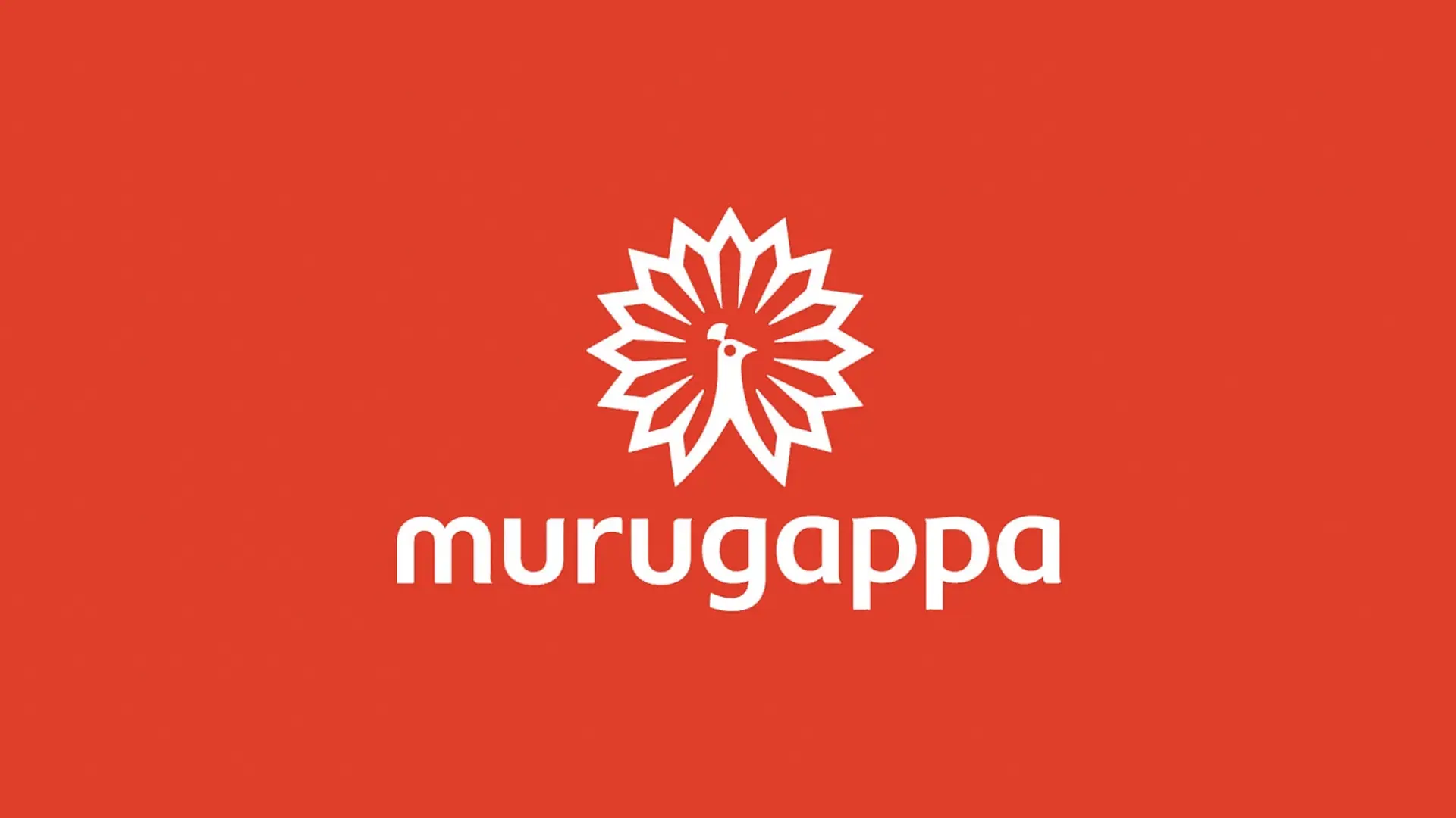
Consider our rebrand for Murugappa: while their original peacock symbol was blue, we changed the brand colour to a daring red which symbolised a younger energy of vision, passion and drive.
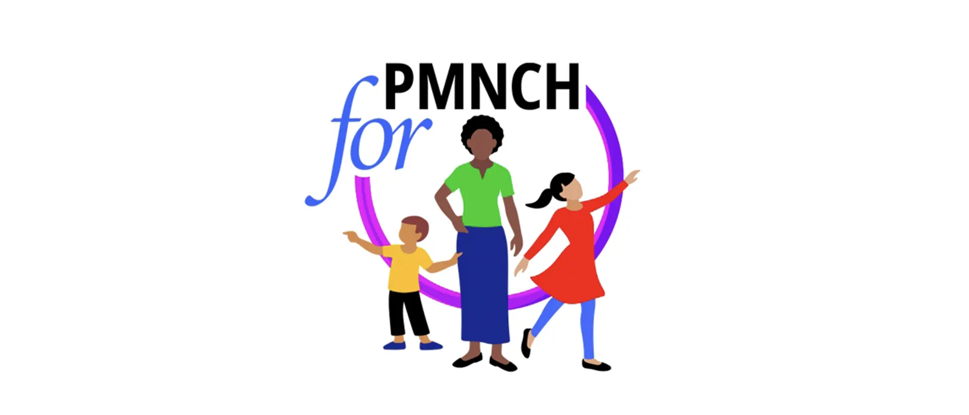
In fact, the association with colour is so strong, that in many cases, even when we rebrand, we retain the principal brand colour for brand recognition. Thus, in rebranding the VIP identity, we retained the colour red. For PMNCH, we kept purple as the primary colour, while creating a varied palette. For both clients and their audiences, in these cases, the colour was a ready reckoner.

Colour associations can also happen through complex palettes. Our colour palette for IIAD, a premier design institution in Delhi, uses purple, yellow, black and white, with a spunky red for the logo, banners and titles. This playful and exciting colour way reflects the institution’s creative offerings while also projecting its dependable and grounded educational space.
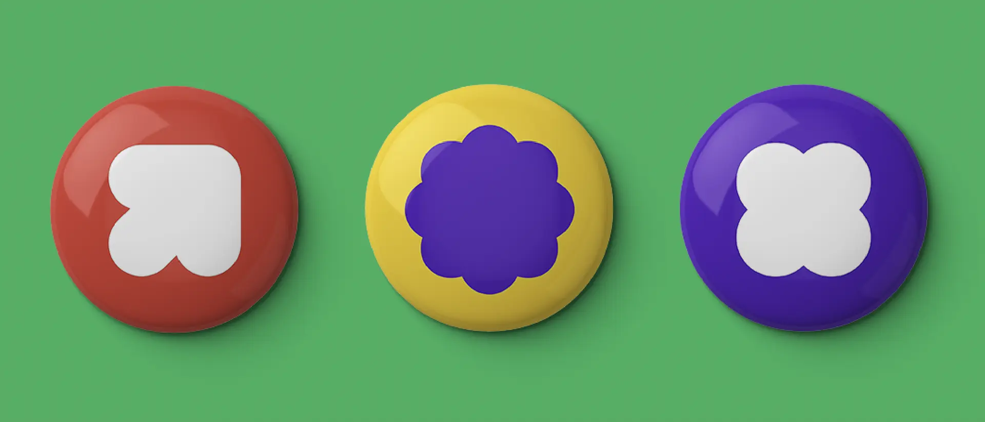
Defining complex systems with bold colour palettes
How can we create recognition for a brand’s objectives that are complex and diverse? When we were commissioned to redesign the PMNCH identity and systems, we celebrated the power and creativity of women, children and adolescents, using a varied colour palette. Further, we designed multichannel palettes for the different programs of PMNCH so that the organisation had a fully equipped system for their various needs. With over 250 characters and environmental elements of a daring colour palette, we raised the bar for engaging with colour and illustration. The purple ties it all together as the brand’s principal colour.
Using colours to celebrate culture and bring pride
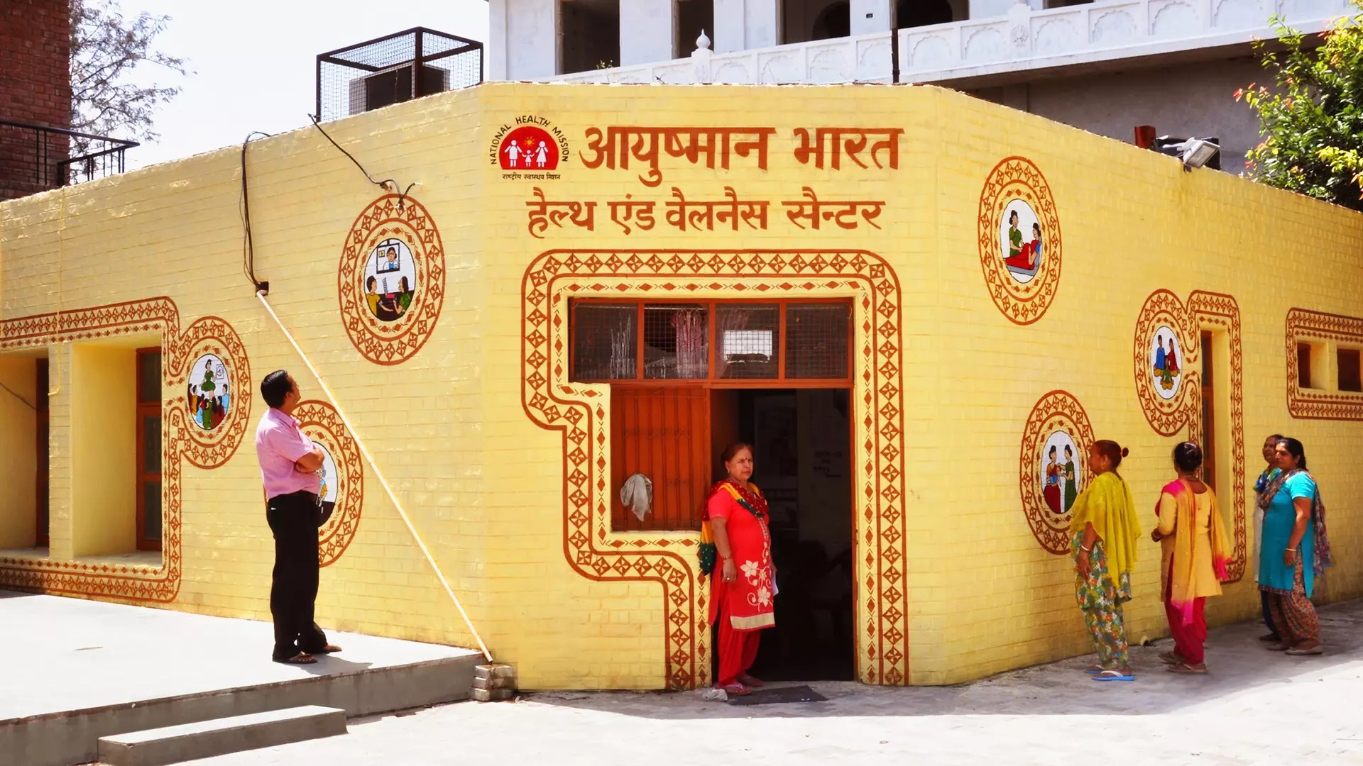
We’ve talked about how colours make strong associations, and how they evolve from our geography and our close kinship with natural sources over aeons. When we did the branding for GoI’s Ayushman Bharat program, the colours we picked for the buildings — a creamy yellow for the walls and the deep brown for doors and windows (as also the patterns) — resonated with the earthy tones of our natural geography. The icons for the varied services were rendered in green, red, blue and yellow. Simplicity and availability of colours across the country for a vast project of 1.5 lakh health centres were a core consideration.
The story of colour thus is the story of people, history, geography and culture. It seeps into everything and leaves indelible impressions. Colours are us.
More Articles
Related Projects
A Walk along Kartavya Path
WAYFINDING STRATEGY + SIGNAGE SYSTEM + TECHNICAL DETAILING + SUPERVISION & QC + TYPEFACE CUSTOMIZATION
Synapse
BRAND IDENTITY + VISUAL SYSTEM + UX & UI
Join our mailing list
Receive our periodic newsletter on Branding, Experience, and Design thinking.
More Articles
HUES
Between Bob and Swift
Follow us on
Activation
Project Management
Supervision
Fabrication & Installation
Follow Us
© 2025 Lopez Design Pvt. Ltd. All rights reserved