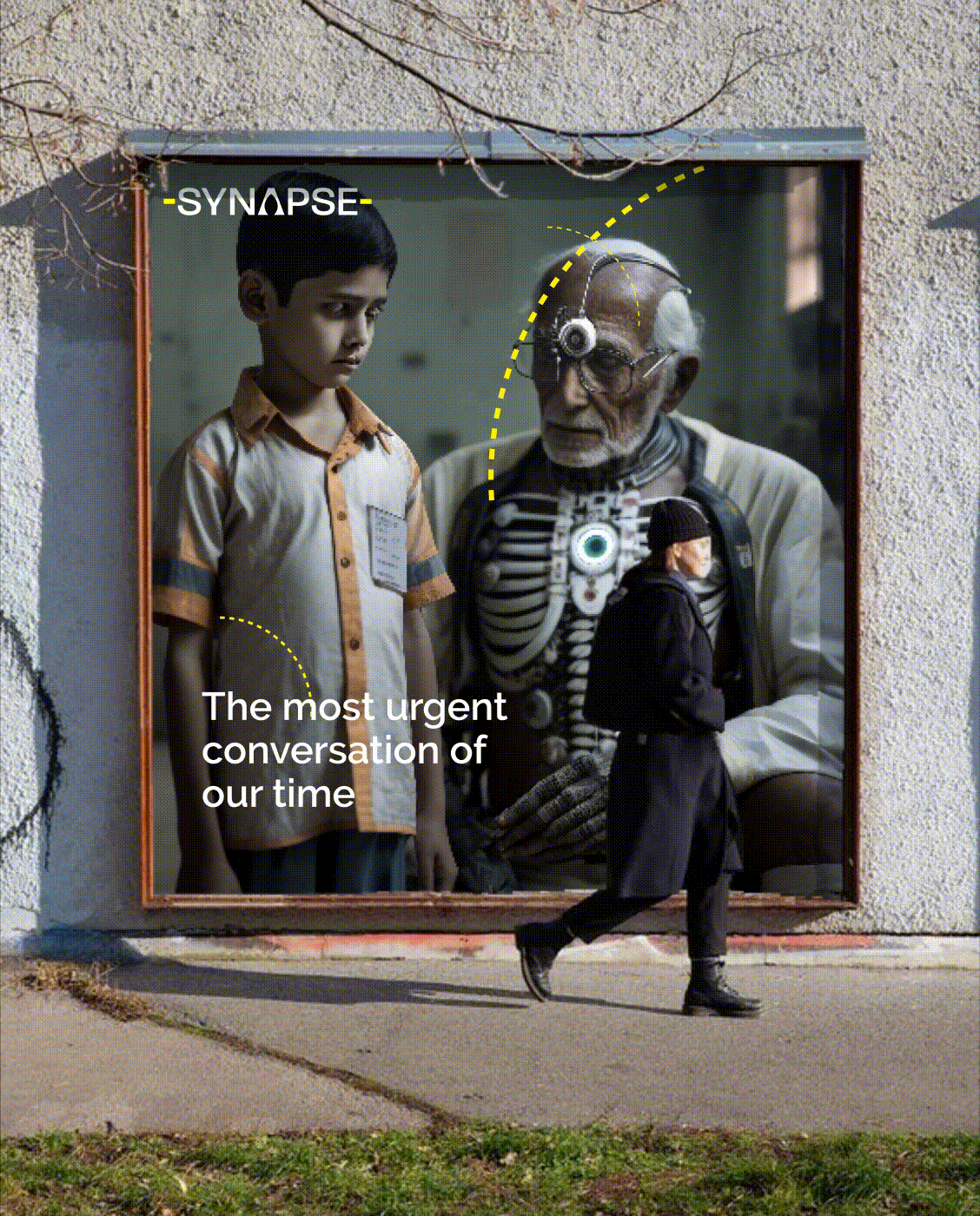
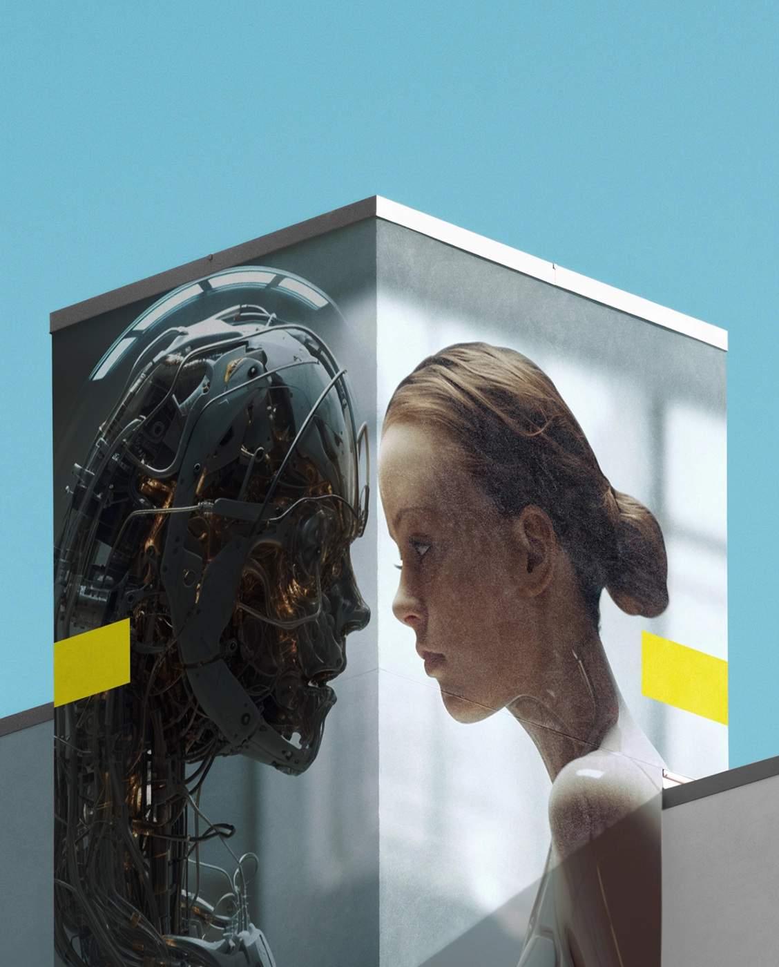
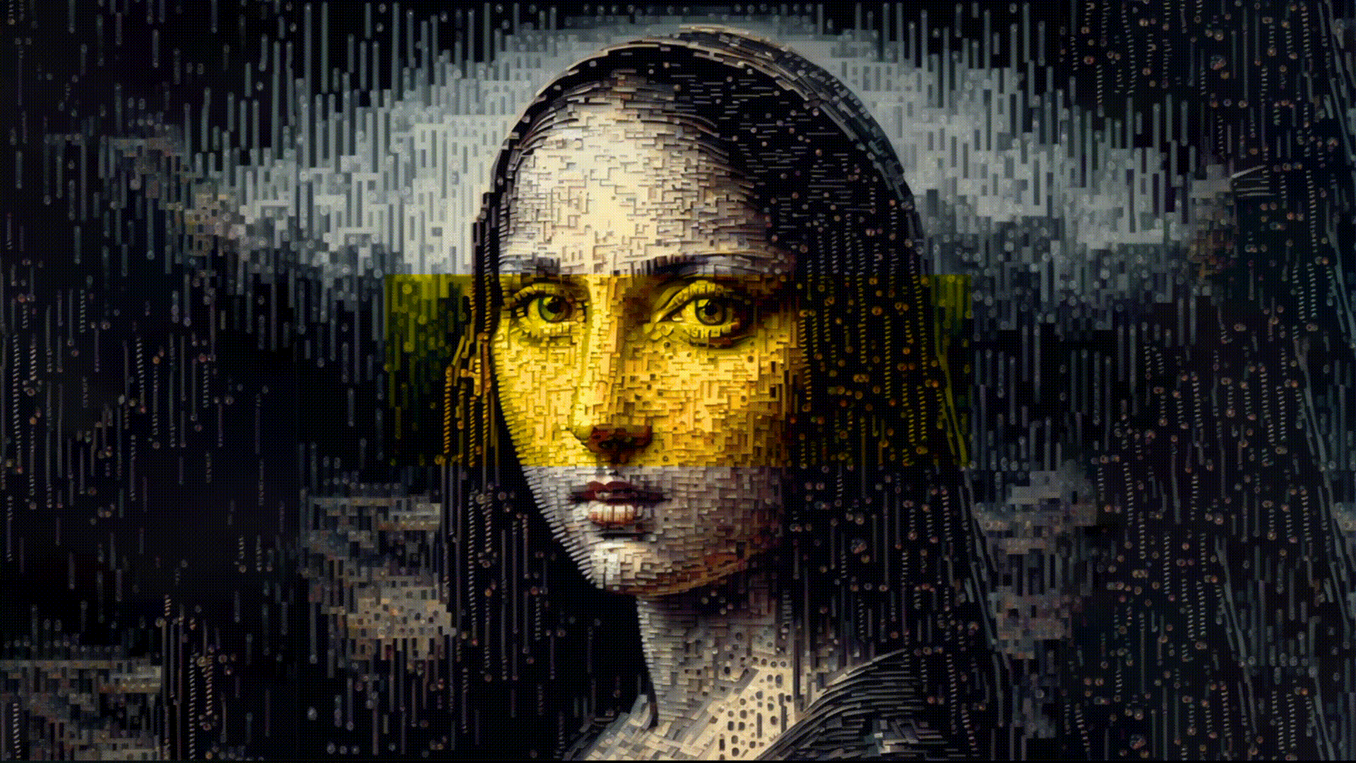
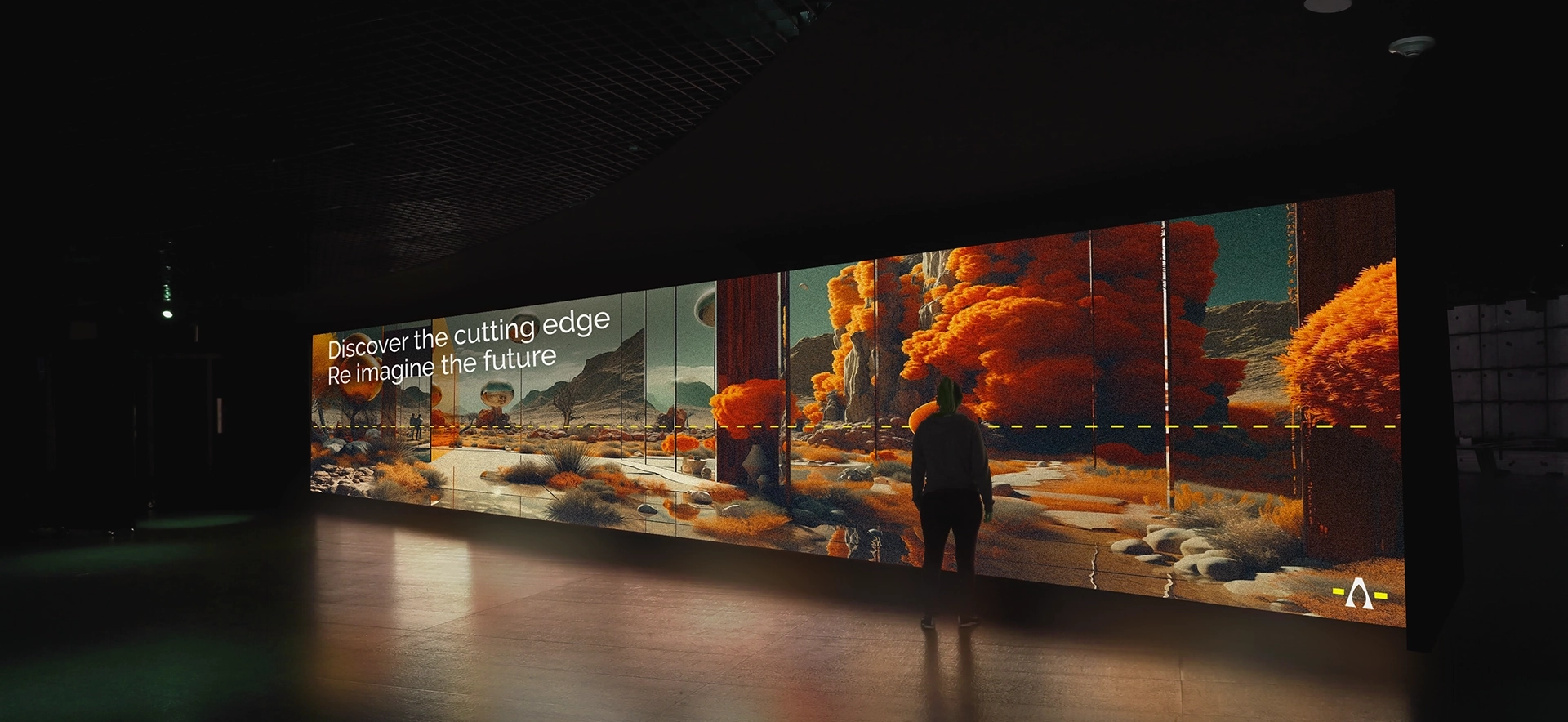
Synapse
BRAND IDENTITY + VISUAL SYSTEM + UX & UI
While every brief is thrilling for its own constraints, we're starved for the occasional brief that opens up new avenues for dynamic exploration. Synapse, a conference that explores human interfaces with technology, was one such. How can we build discovery and delight into a fleeting exchange of fluid ideas? How can we conceive an identity that nudges the viewer to look twice? What nuggets of meaning can we weave into a communication system that constantly shifts shapes? These were the challenges we rose to face with Synapse.
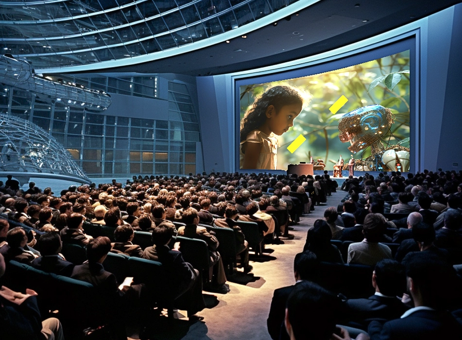
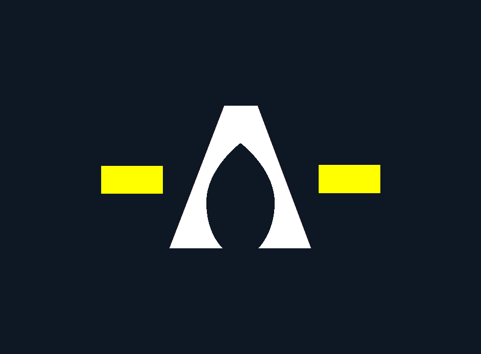
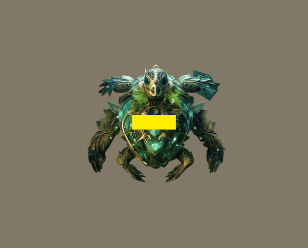
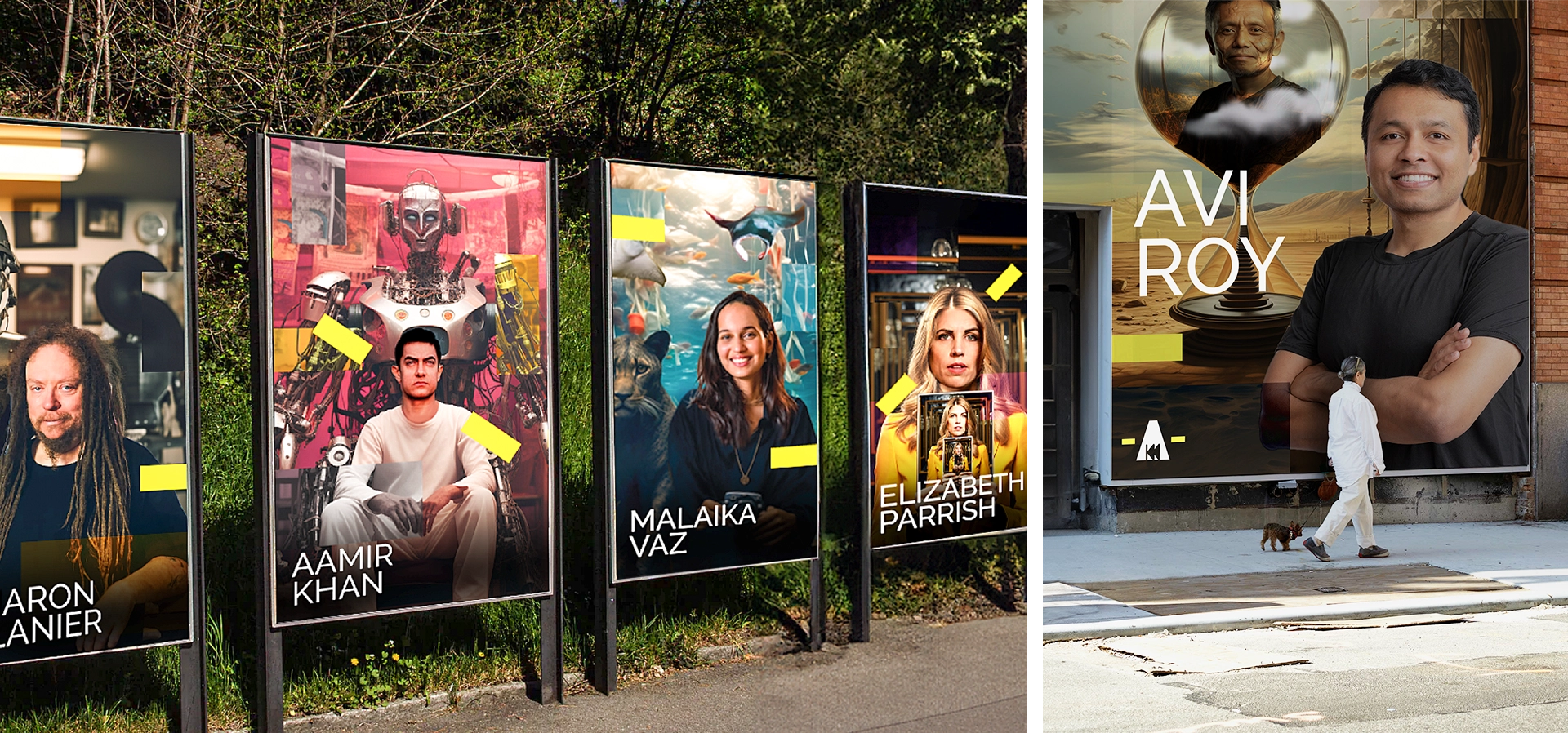
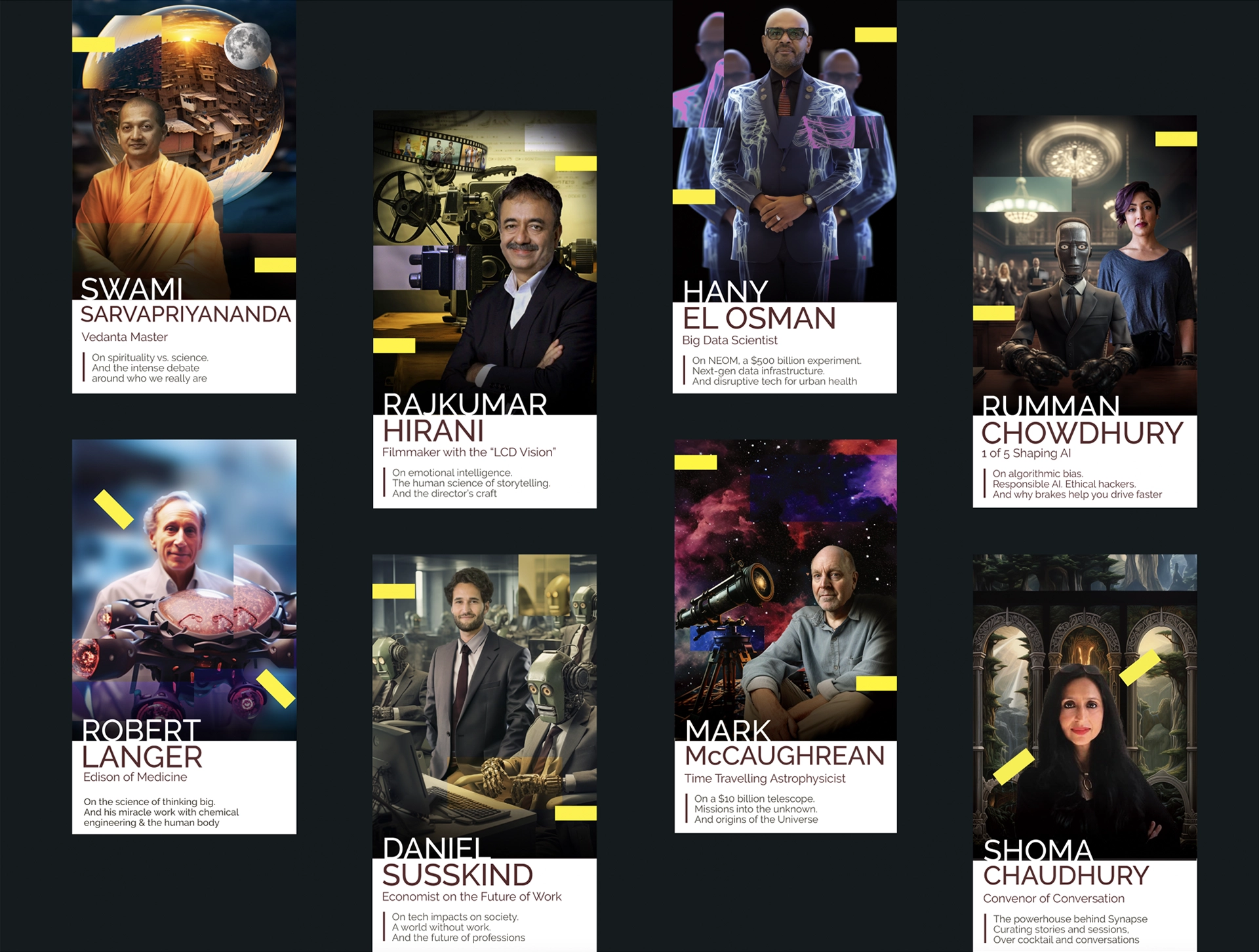
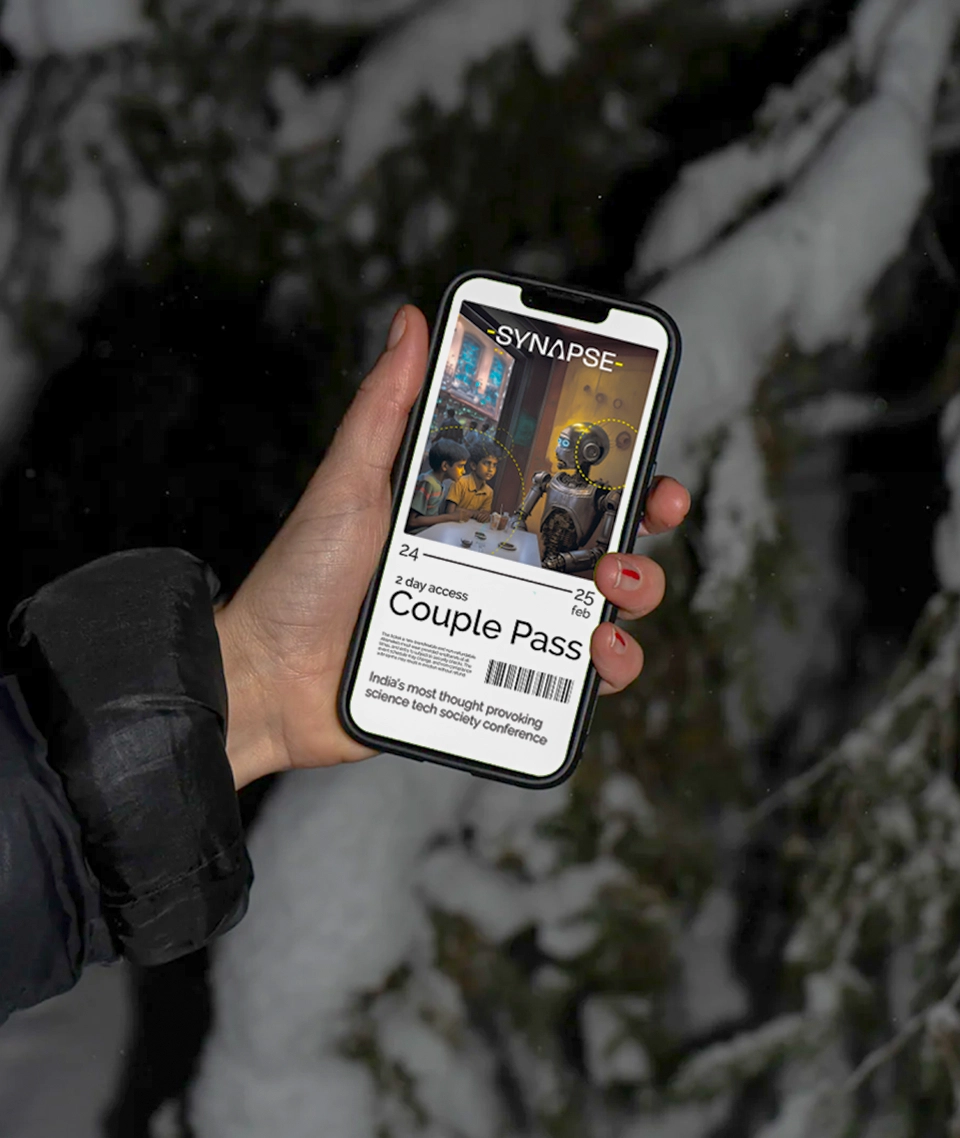
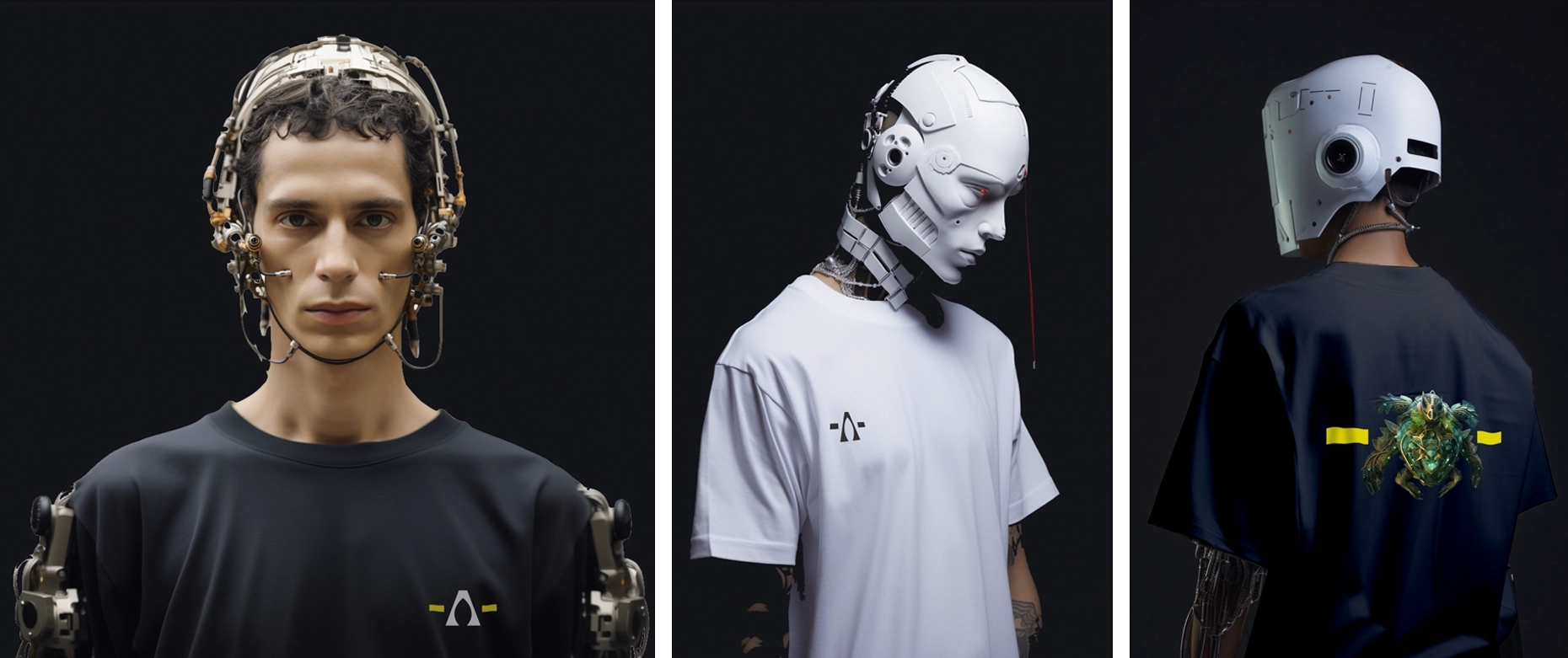
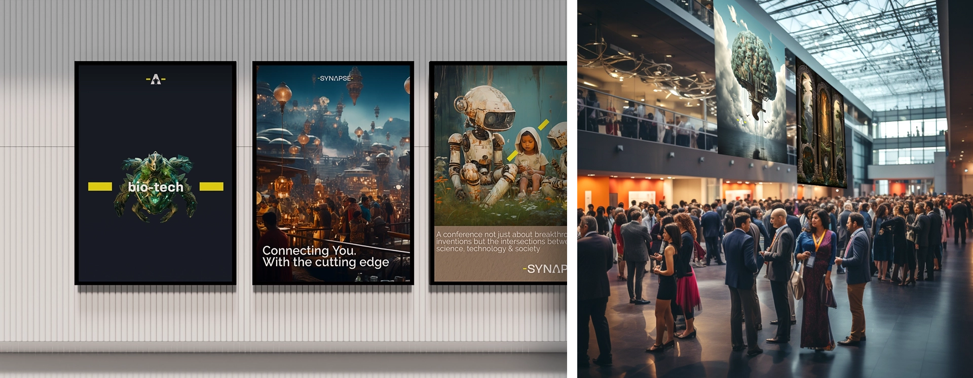
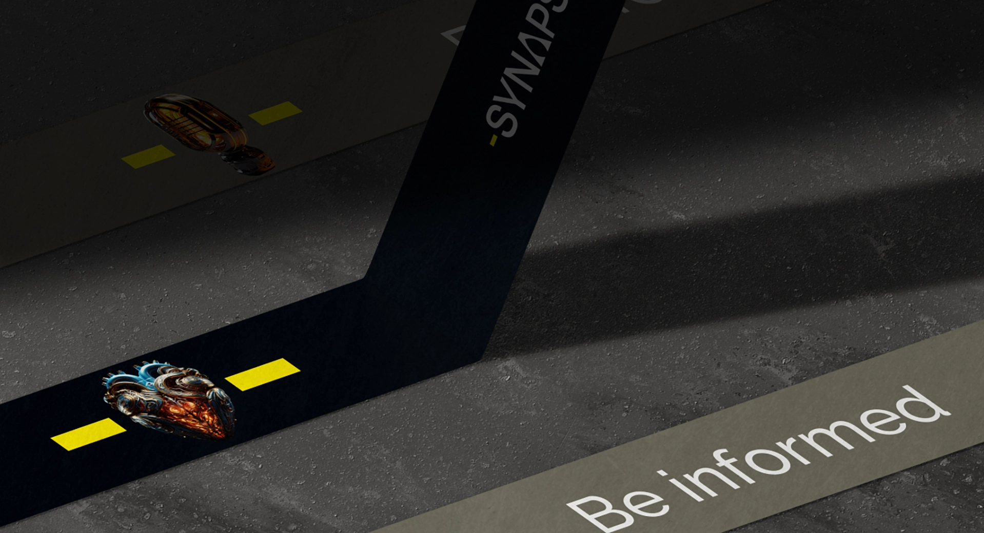
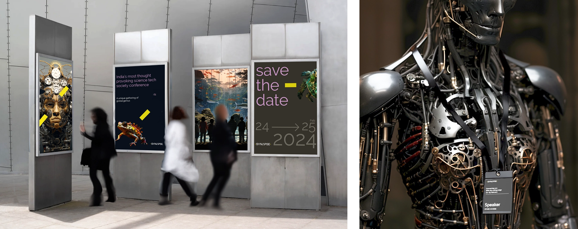
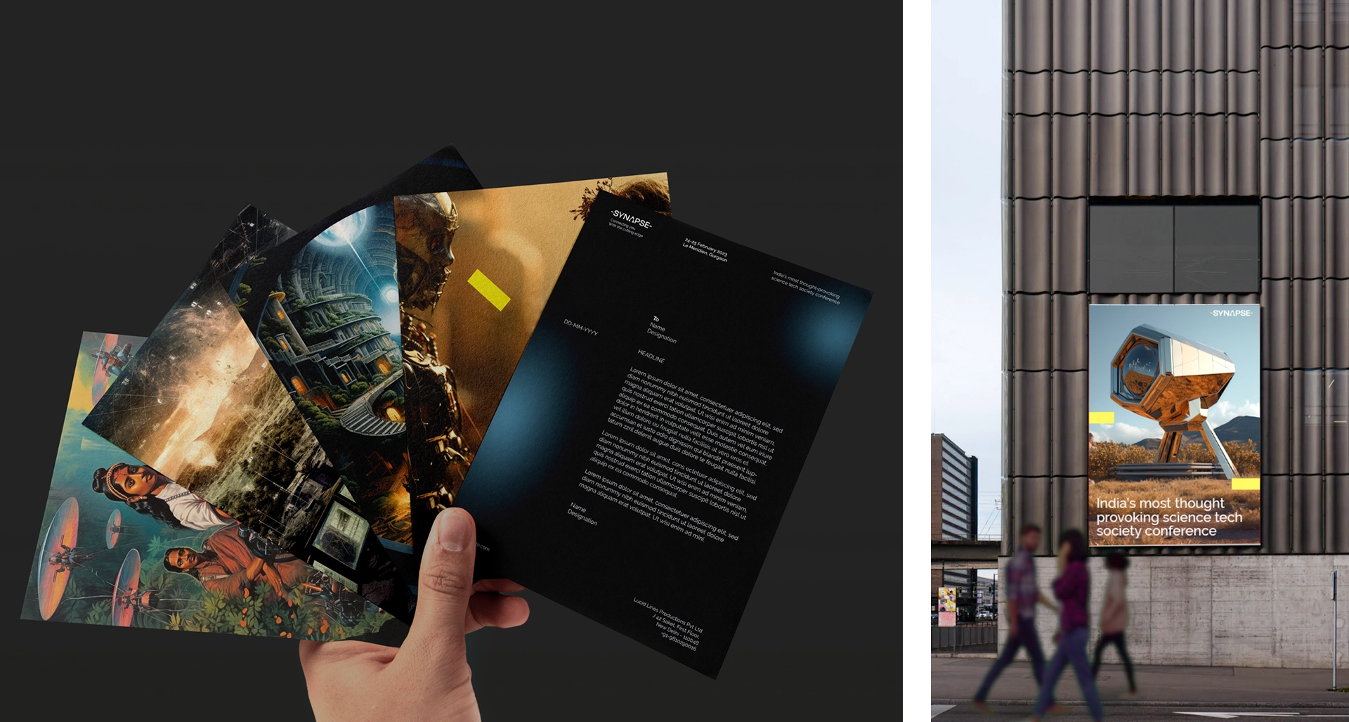
A synapse is the site of transmission between neurons, helping to transmit information and make connections through triggers. The logo has two dashes that depict the nerves and the A at the center is visualized as the site of transmission. Further, the two dashes are also superimposed over graphics showing eventful happenings as triggers containing the ‘synaptic space’. The electro-chemical nature of the process relates to the discourse about the blurred edges of how technology integrates into society. This became the foundation of how we translated the brand story into action. We designed the A for every speaker with a specialized icon that represents their primary field of specialization. Synapse is happening on the 24th and 25th of February 2024 in Gurgaon.
The dash
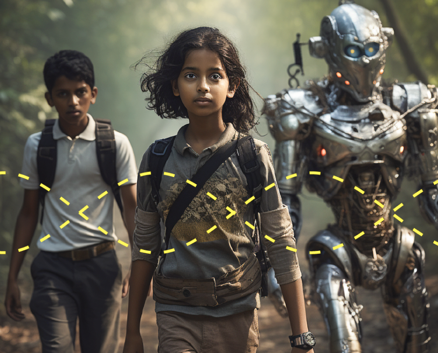

Imagery
Speakers
Team
Simran Kaur
Communication Designer
Malvika Dwivedi
Communication Designer
Mohan Godwal
Senior Graphic Designer
Sukanya Panda
Research & Strategy
Tarka Patil
Business Manager and Strategist
Anthony Lopez
Founder and Chief creative director
Activation
Project Management
Supervision
Fabrication & Installation
Follow Us
© 2025 Lopez Design Pvt. Ltd. All rights reserved