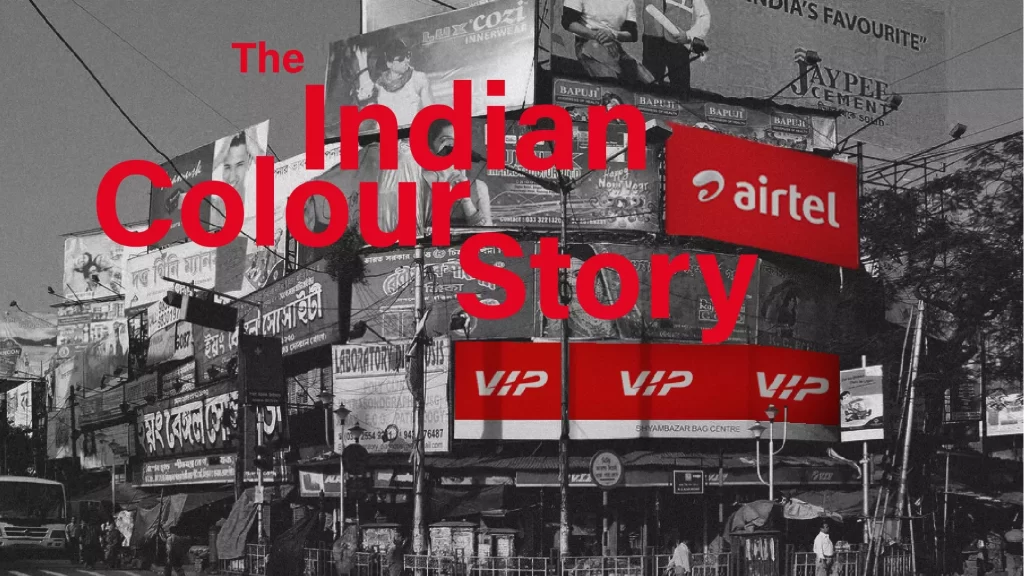
The Indian Color Story investigates how Indian brands make decisions about colors in their identity. While we expect that cultural associations and symbolic connections are likely to influence color choices, we found influential brands make decisions about color in their identity quite differently.
As a country, we’ve always been pretty daring about color choices. Take a walk around the neighborhood and you will find houses painted candy pink, leaf green, canary yellow and even a feisty purple — colors most cultures would consider over the top. Our sense of fashion has always been extravagant, ornate and excessive both in color and decorative choices. We celebrate festivals in a riot of colors. How then do Indian brands approach color in their identity? Are they as daring?


When the new rupee notes were launched, the colors of the notes ranged from greenish yellow and fluorescent blue to twilight orange and even lavender, jolting most of us used to bills being formal and sedate. It takes us right to that term ‘the color of money’, which refers to proving your worth and giving solid assurance. Money is about serious business, not frivolous gambles, and big brands are not comfortable with flamboyance. Certainly, they want to ensure that their customers see their identity for their values, and somewhere at the heart of this is a need for conservatism and global recognition. And so, in branding, VIBGYOR, the rainbow palette, is picked at both ends mostly for red and blue, rarely departing to make color combinations that are experimental.
Popular color choices and associations
Years back, India’s second oldest paint company, 1922-established Jenson & Nicholson (now a Joint Venture with Sheenlac Paints) ran an advertisement with the punch line — Whenever you see color think of us. J&N’s logo which was black and red for a long time is now an organic green. While brands get plucky to an extent with advertising, when it comes to their identity colors, a look at the logos of the 2020 top ranked brands in branddirectory.com reveals a rather conventional approach to color choices — sedate blues and reds, and combos of blue and yellow and blue and red — rarely venturing beyond the primary colors bucket. Tata sits right on top of this list in its humble blue. When they do risk adventure, like eleventh-ranked Wipro, which unveiled a new logo in 2017, color choice still hovers around blue in the wordmark for reliability and authority. With Wipro’s mission to ‘connect the dots’, the colors of the dots in the Wipro logo resonate with the rainbow, which is all encompassing. Again, a safe choice.

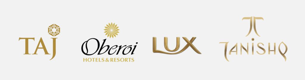
The color of luxury
When brands want to step out of these associations, and are keen to share their values being associated with affluence and indulgence, they resort to India’s everlasting love for gold. Gold is at the centre of our showy affair with being rich and powerful. Gold is ‘forever’ in the Indian mindset. In the logo, it guarantees exclusivity, reserving you a space in a crowded market, so long your brand delivers on its promise. And therefore, this sign of wealth and abundance is a color that resonates with high status hotels like the Taj Group, a multinational conglomerate like Reliance, as well as Lux soap where again lux is luxury.
When brands get brave with color
As we go down lower in the list, we see a marked departure from the more staid conventions. The Adani Group, whose tagline is “Growth with Goodness” has a multi-hued logo with shifting colors from blue through violet ending with red. Patanjali is in a rusty red with flourishing accents in leaf green and orange. Hindalco under the Aditya Birla Group is like a Cubist painting in shades of yellow, rust and orange with the wordmark on ultramarine blue.

Does a brand position in the market govern its identity colors? We would like to conclude that brands do gain a certain amount of freedom of expression, to be true to themselves when they move down the ladder. While top ranked brands are compelled to woo a wide audience and toe the line for global acceptability, brands down the line are less risk-averse as well as resourceful with color in identity.
Remember the Indian matchbox designs? Well that’s enough to tell you how small brands can make great escapes to light up our lives.

We may want to ask ourselves, in what way has the color story changed? What is now influencing brands to spread their wings and fly? Well, the answer is plain and simple — digital technology. Twenty years back, visiting cards were screen printed. Color printing for cards were all about single color and two color — going beyond that was considered an extravagance. Offset Printing required really big runs. With digital technology, inkjet printing and short runs being made possible, brands can afford to be far more experimental. Today’s digital printing technology allows a vast freedom to print what we like without any restrictions. There’s also an expectancy to cater to the wide audience on social media, which requires a calculated response to today’s dynamic nature of branding. Color is an important influencer. And it’s the smaller brands that take the plunge.
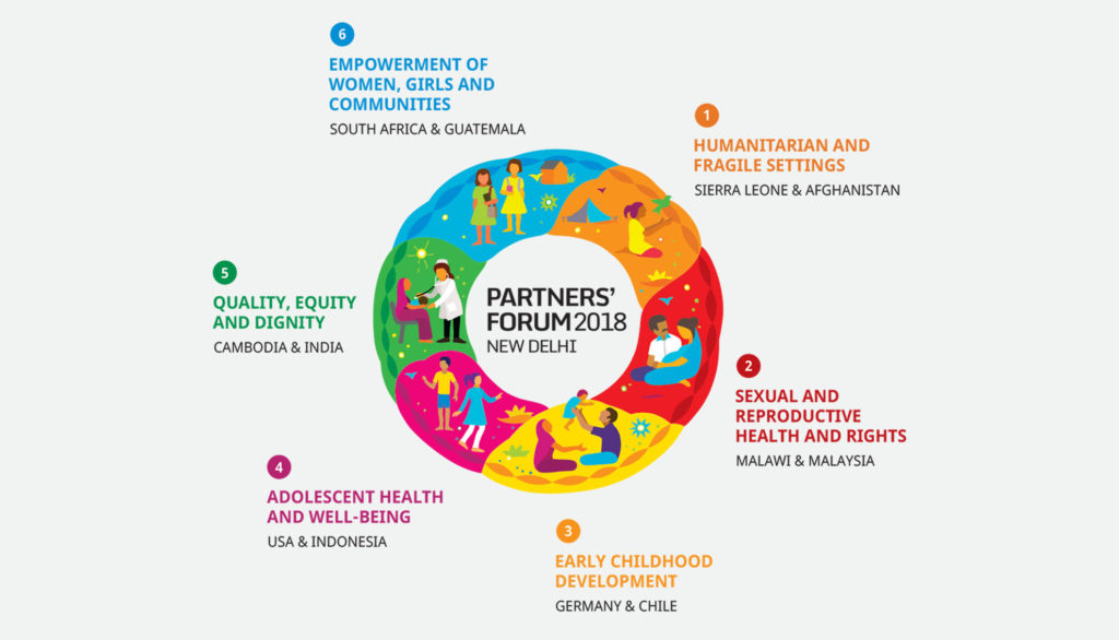
Our identity for the 2018 Partners’ Forum in New Delhi, inspired by the colorful art of Pipli, brought together the six themes of the conference in a ring, each theme represented by a different color. While the collaterals for the conference were handmade, the multiple renditions for social media and communications, thereafter, took off smoothly based on the wide color palette giving the brand an amazing presence.
Such customized color palettes are possible because of the digital medium, which was also the case in our branding for Nestaway, an online homefinding portal, where we used bold and youthful fluorescent colors for the brand language. The no-holds-barred approach lets the brand express itself across multiple mediums uniquely. India, after all, is the land of spices, and variety is the spice of life.
Written by Sujatha Shankar Kumar
Cover illustration by Era Namjoshi
Further reads: