Type Right
What came first: the chicken or the egg? Ek Type co-founder Sarang Kulkarni doesn’t have just one answer. He has five. He generously shared three with us when he dropped by the studio last weekend.
Noopur Datye, Girish Dalvi, and Sarang Kulkarni founded Ek Type in 2009, four years after Sarang had set up WhiteCrow, a design studio focused on lettering, calligraphy, and custom type-design. The word ek means one in many Indian languages and Ek Type was visualized as an open and collaborative platform under a common roof for developing and distributing multi-script fonts. The collective is doing stellar work in steadily championing contemporary Indian fonts, ushering in prevalent trends in current typeface design: plural design, multiscript families, representing fonts that aren’t traditionally explored, and so on.
We had the privilege of being taken through a vibrant visual deck by Sarang himself, as he recollected his journey from art schooling to mid-career. Sarang found his path to typeface design through an interest in art and calligraphy. Thanks to professor Santosh Kshirsagar at JJ School of Art, Mumbai, his alma mater, he made a call early on to develop the eye-hand skills necessary for calligraphy rather than building marketing and advertising chops. He spoke passionately of the endless hours he has invested into learning the dark magic of form and counterform. Calligraphy requires patience and practice: the interaction of positive and negative space is a dance that needs to be observed and imbibed like any skill. Sarang turned down a teaching stint at NID to build WhiteCrow and pursue custom type design. His accounts of challenges faced in translating the visual grammar of English logotypes into Indic scripts to derive regional variants took us down a whole new path to discovering forms, branding, and India itself.
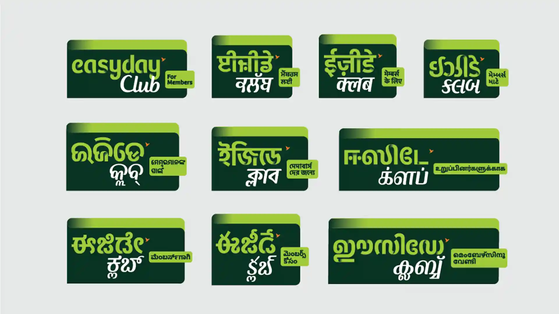
Fig 1: Custom type design work by WhiteCrow
From Ek, we moved to Anek — many. Where does one begin? Anek, as the meaning of the word suggests, is an exercise in multiplicity — multiple scripts designed in multiple weights and widths by multiple designers. A well-informed, conscientious and refreshing interpretation of India’s letter traditions, this family offers a versatile system that can meet the demands of a wide range of applications. Sarang spoke of the power of collaboration and how a team of twelve worked across cities and languages to bring this mammoth project to life. Their efforts have been well rewarded: a Bronze at One Show, Communication Arts, D&AD Graphite Pencil, and a TDC Certificate. Not to mention Anek’s free release on Google Fonts: ever since, it is being liberally used everywhere from airport signage to the Indian Premier League telecasts.
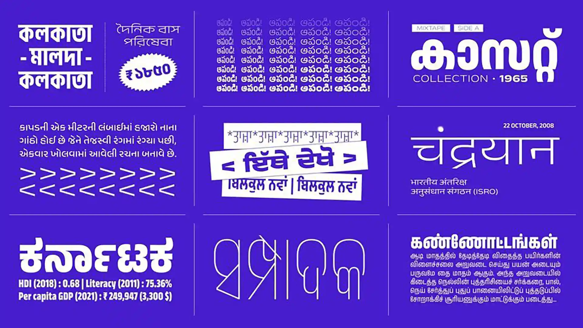
Fig 2: Anek by Ek Type
Sarang offered us sneak peeks into other typefaces being cooked up at Ek Type right now. We congratulate him on winning TDC’s Certificate of Typographic Excellence for Vilom! So, what came first then — the type or the typographer? Staring long and hard at the question reveals answers. We commend Sarang, Noopur, Girish, and the team at Ek Type for their excellent work towards their core belief: that everybody has the right to good typography.
A thing of beauty is a joy forever. And beauty lies in the eye of the penholder.
Read more about Anek here.
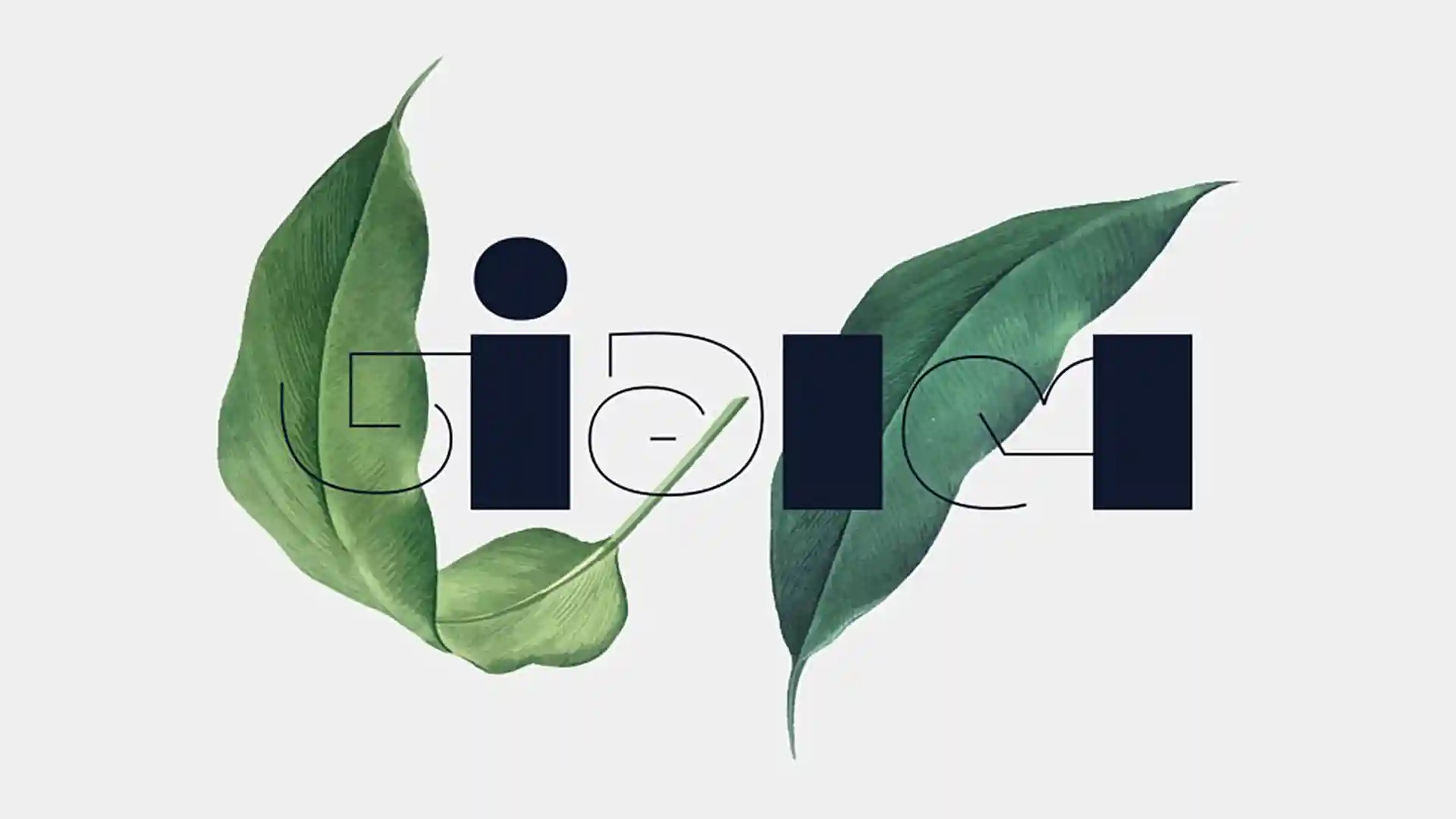
Fig 3: Vilom by Sarang Kulkarni
More Articles
Related Projects
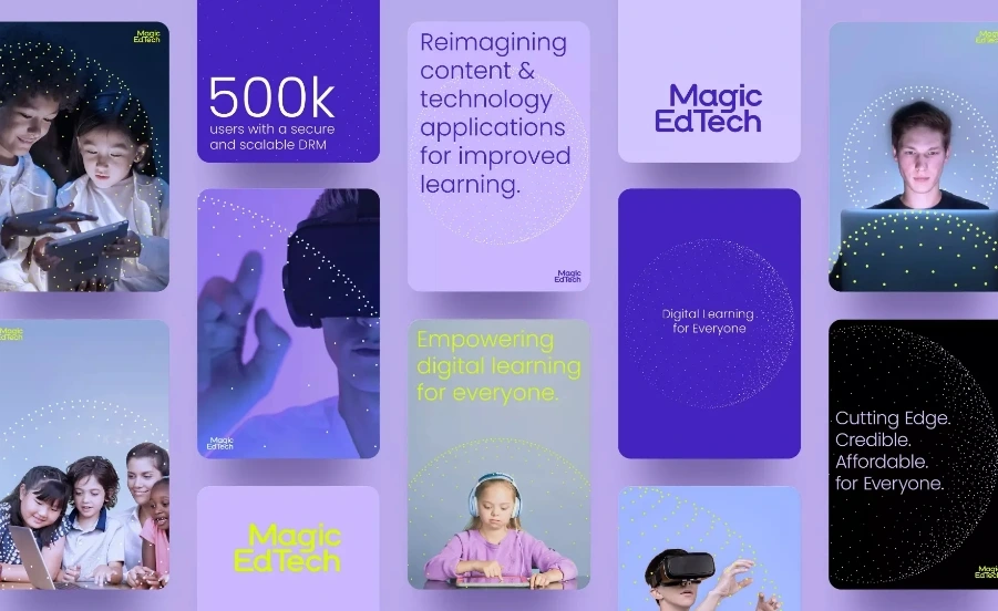
Magic EdTech
BRAND STRATEGY + BRAND IDENTITY + VISUAL SYSTEM + UI & UX
VIP Branding
BRAND STRATEGY + BRAND IDENTITY
Join our mailing list
Receive our periodic newsletter on Branding, Experience, and Design thinking.
More Articles
Takes Three to Tango
Reviving the art of ‘book-keeping’
Follow us on
We can add significant value to your
long-term business goals.
Get in touch with us or meet us at our studio in Gurgaon.
Activation
Project Management
Supervision
Fabrication & Installation
Insights
Follow Us
© 2025 Lopez Design Pvt. Ltd. All rights reserved
