Nestaway Digital Product Experience
UI&UX + ACTIVATION
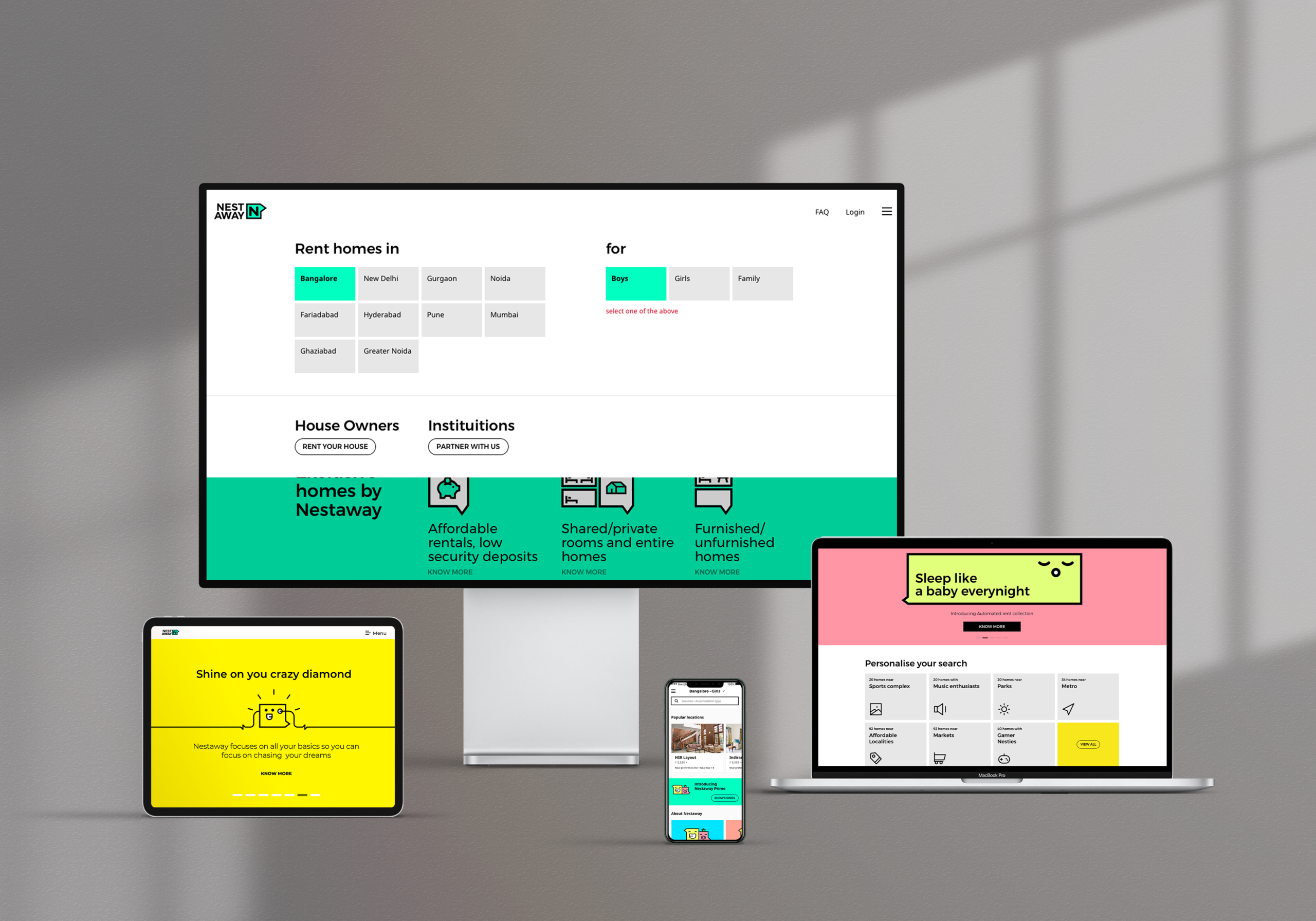
Our Objectives
1. Translating the new character, behaviour and tone of voice of Nestaway into all aspects of the online experience. The new brand strategy will influence the usability, features and content of the
online tools.
2. Creating a fulfilling online experience that augments the real world experience of searching for a home in a new city. The entire online and offline activity should be an integrated wholesome experience. Ensuring a seamless omni-channel experience across platforms for users.
3. A right balance between catering to the user’s core requirement and brand promotion is needed.
4. Marketing goals should be considered and aptly promoted without interfering the user’s task flow. e.g. Refer & Earn. An application oriented approach which gives easy access to navigation and input tools.e.g. Upfront sorting and filtering tools, quick access to shortlists
5. The abundance of the offering should be evident at the landing page. The offering mix should resonate with the business objectives. e.g. Equal promotion of Bachelor and Family homes
6. Package the product offerings to cater to the user’s lifestyle choices and emotional needs. e.g. Lifestyle choices: posh localities, commuting convenience. Emotional needs: acceptance, freedom, privacy, respect, support
Brand value alignment: focus on building transparency
Data indicated that users tend to oversee crucial messages while selecting important dates.
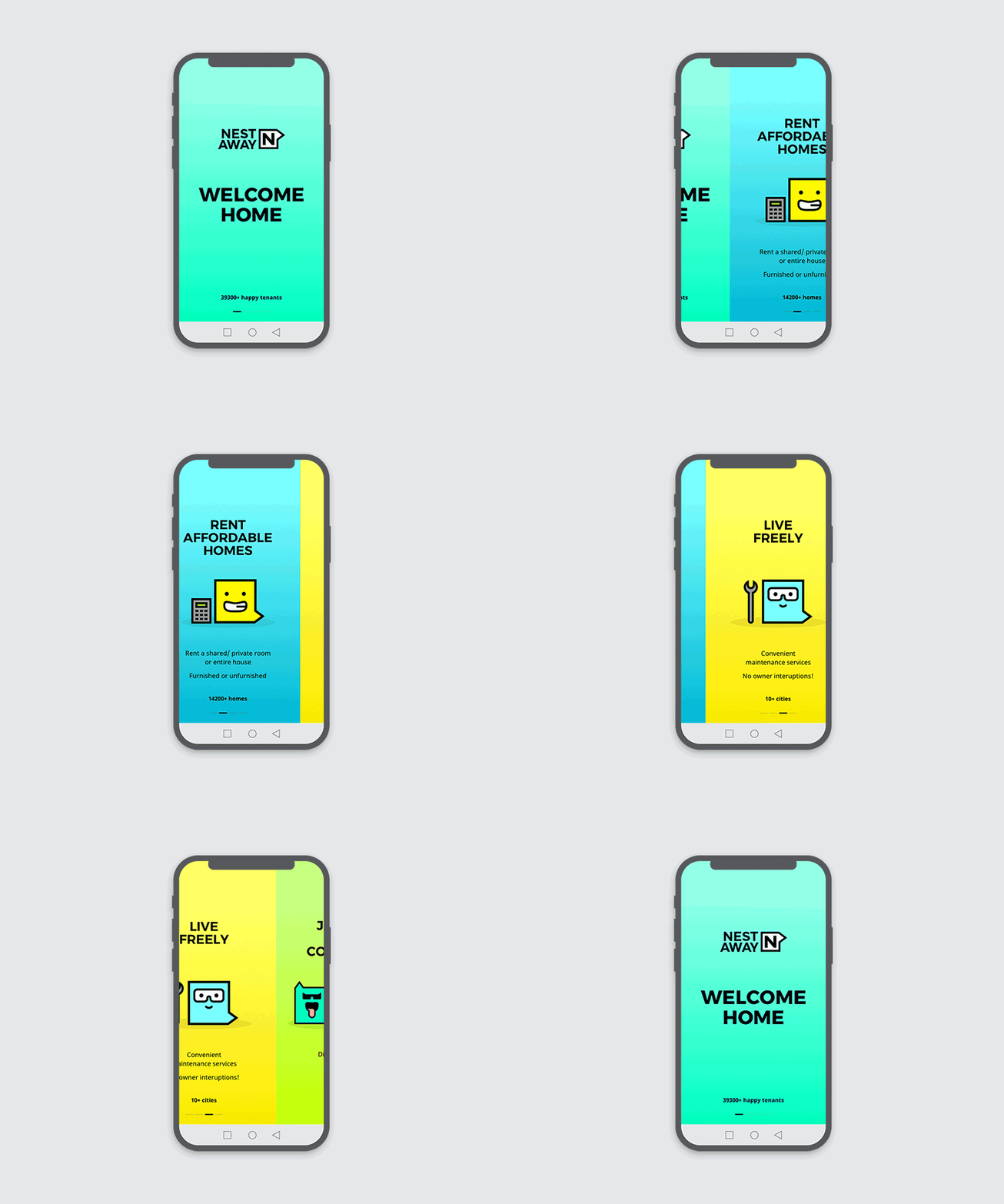
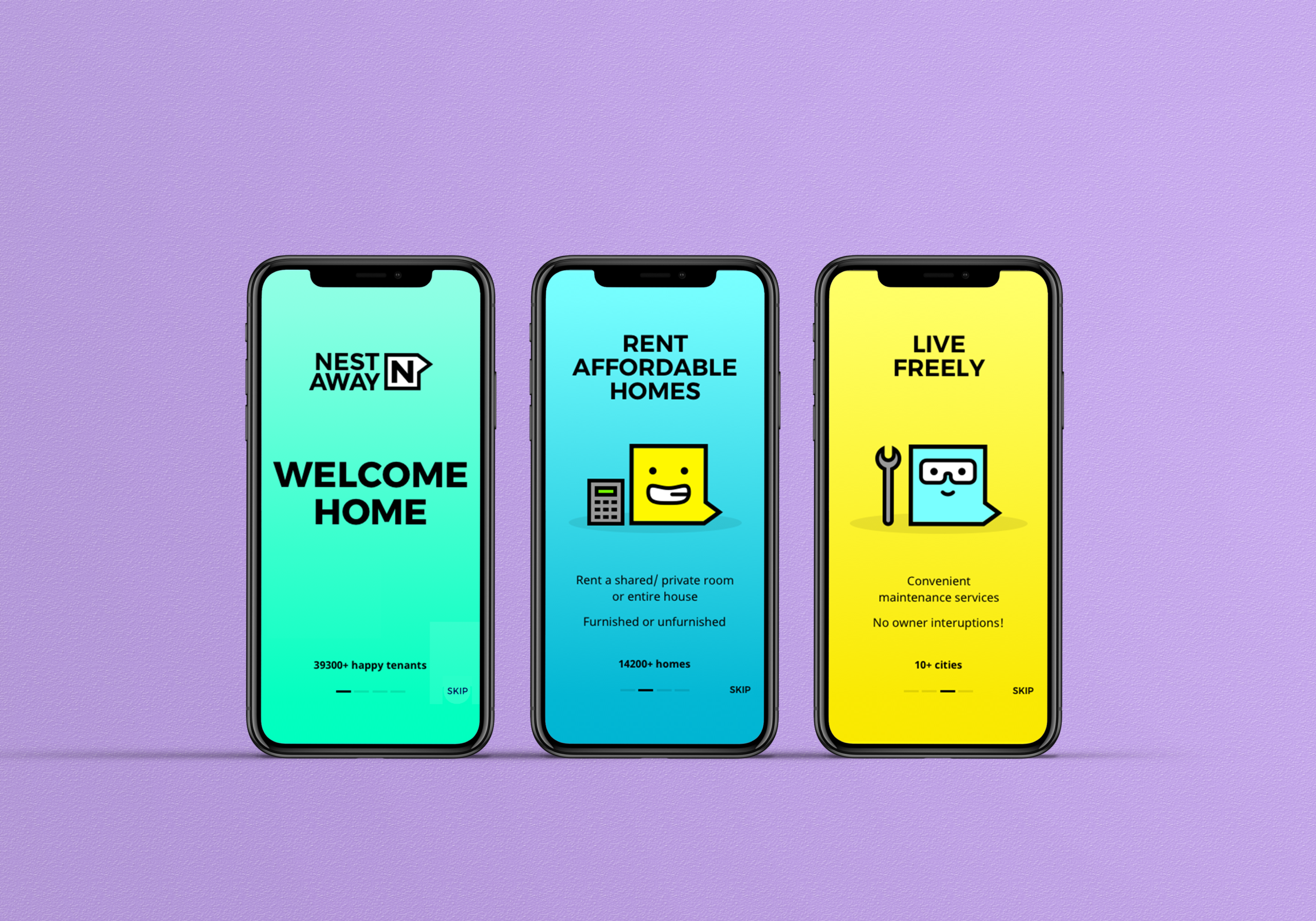
To ensure that the company policies are being showcased with the right amount of stress we introduced a character from the new branding system created for Nestaway.
Easy to build & change:
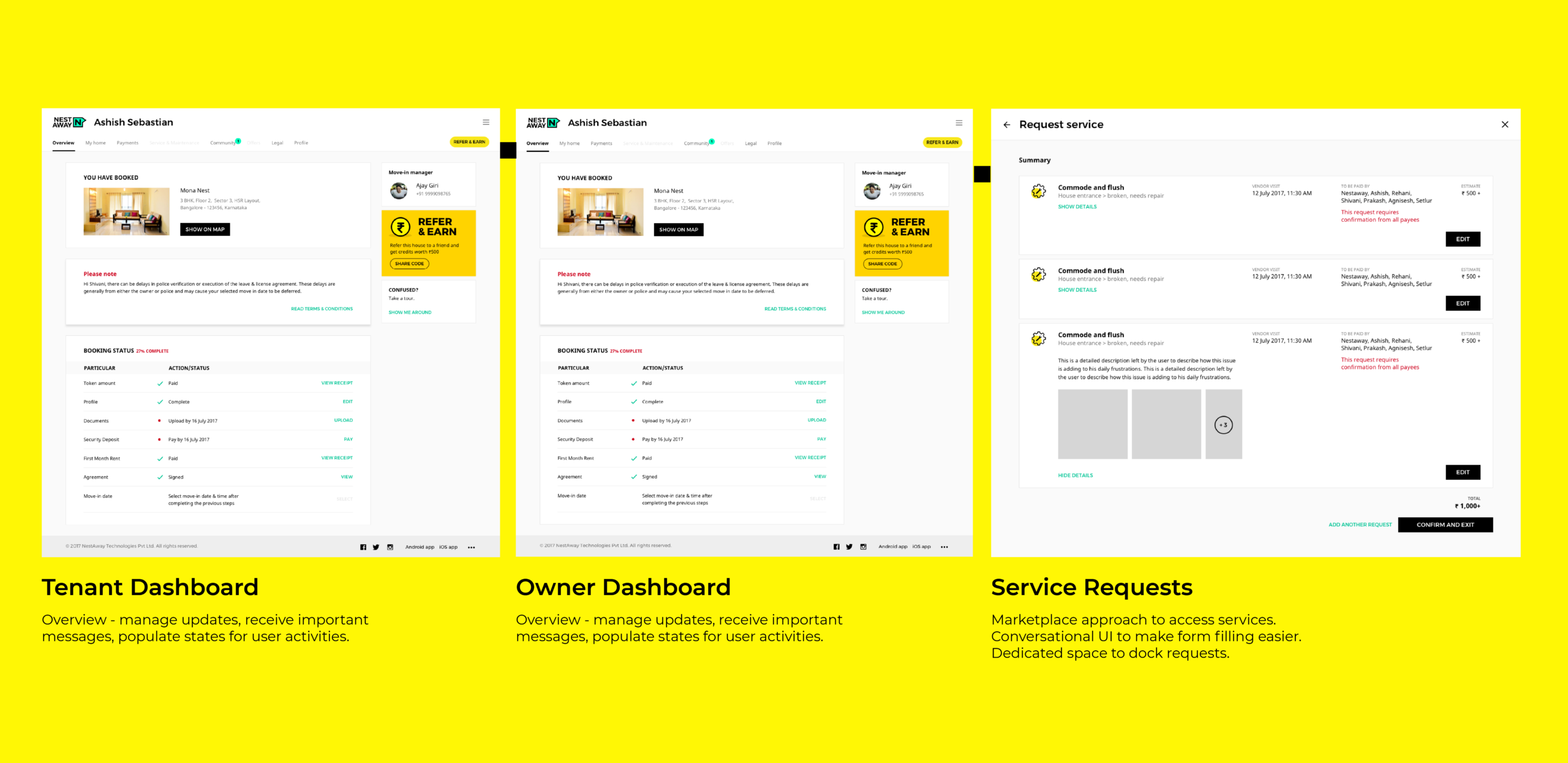
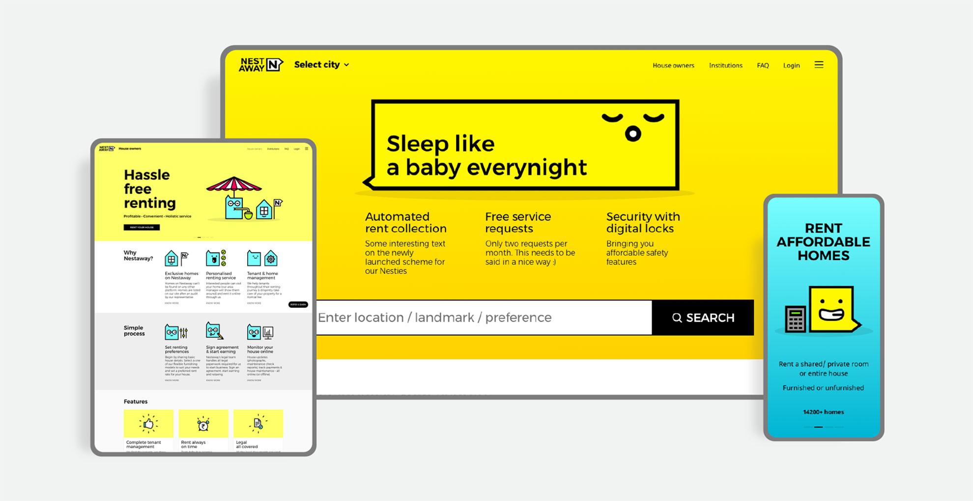
modular UI system
All user-interface elements were built to exist in
a modular system to enable the in-house team to build new pages with ease. The system was handed over in a Sketch file with nested symbols to enable quick changes across the all built elements. The interface was build for both tenants and home owners.
Communication & tailored information for repeat users
All static pages were re-designed based on intent and the revised branding guidelines. Information was tailored for repeat users to help them continue their experience
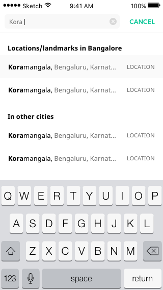
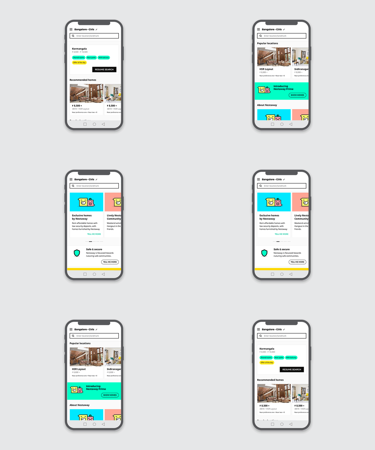
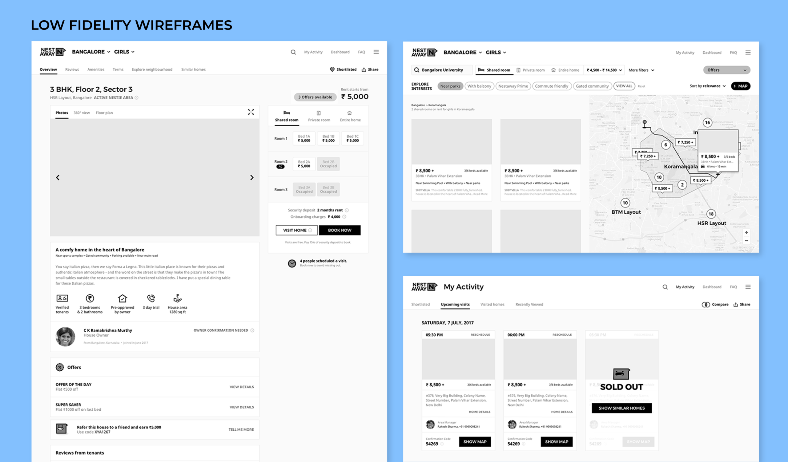
Direct Search: Single step access to homes. Intelligent suggestions based on input.
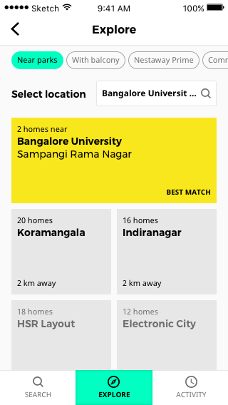
Discover localities based on interests. Play around with preferences to discover localities.
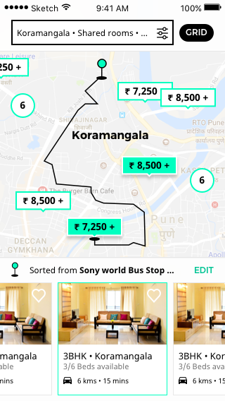
Search via map: Aid to better spatial understanding of a city
Users can see distance, route and time from a preferred location
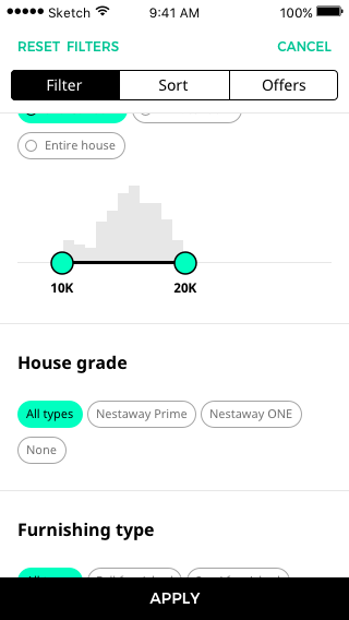
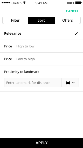
Upfront filters: Discover homes based on house type and budget together. Sort search results by proximity to an entered location. Condensed version of explore route enables user to continue his search for the perfect home.

Refined SRP: Simpler house card design with house specific USPs. Quick shortlisting feature
Suggestions based on users’ search activity
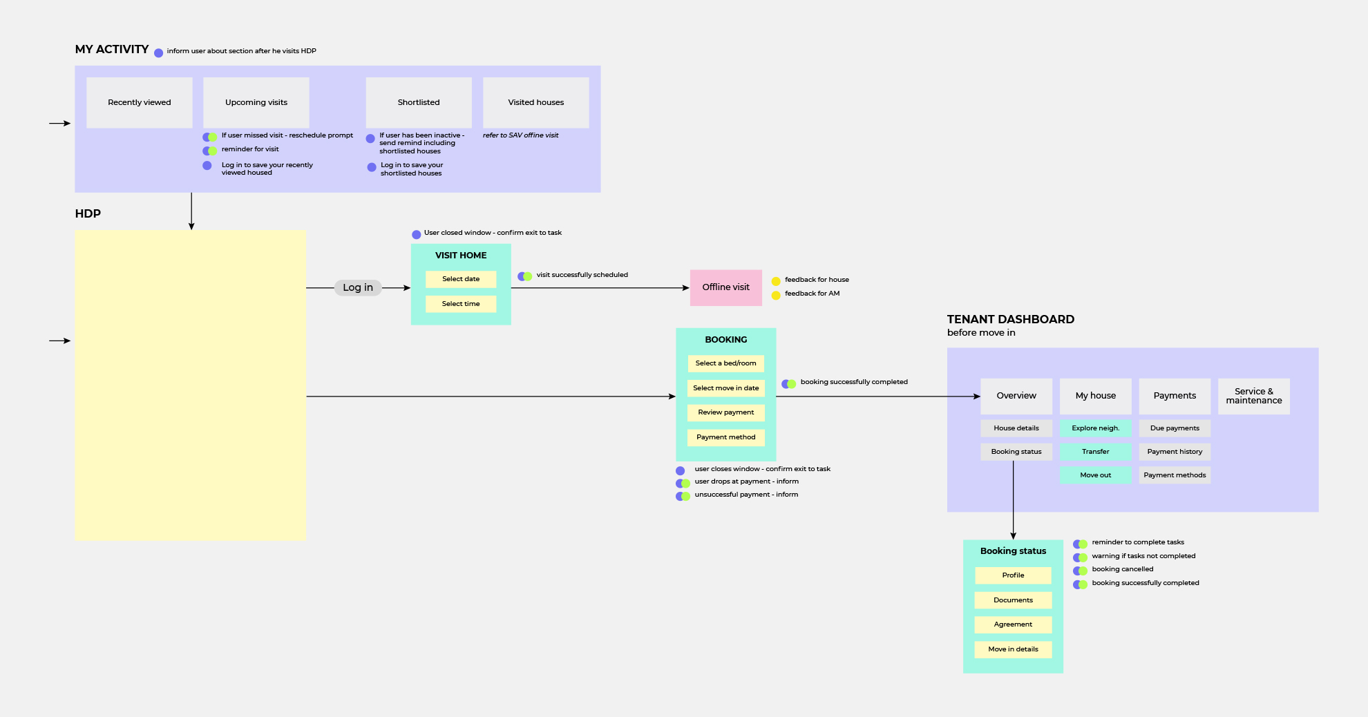
Activity Panel: Simple solution to manage house hunting on Nestaway. Track shortlisted homes, scheduled visits and visited homes. Share home lists and compare houses. Schedule visits or book homes directly
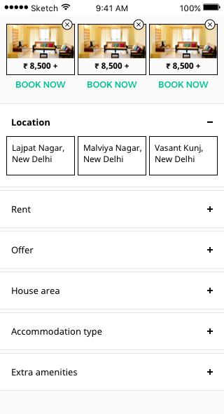
Refined HDP: Visible comparison between product and cost. Space to accommodate sales pitch for home, system to accommodate reviews. Exhaustive list of amenities and furnishings. Explore neighbourhood - feature to save locations to help user compare distance from workplace
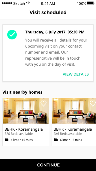
SAV Flow: Clear communication
for offline visit. Suggestion to visit nearby homes
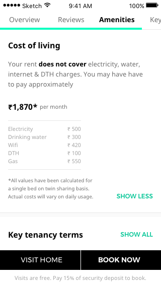
Activity Panel: Simple solution to manage house hunting on Nestaway. Track shortlisted homes, scheduled visits and visited homes. Share home lists and compare houses. Schedule visits or book homes directly
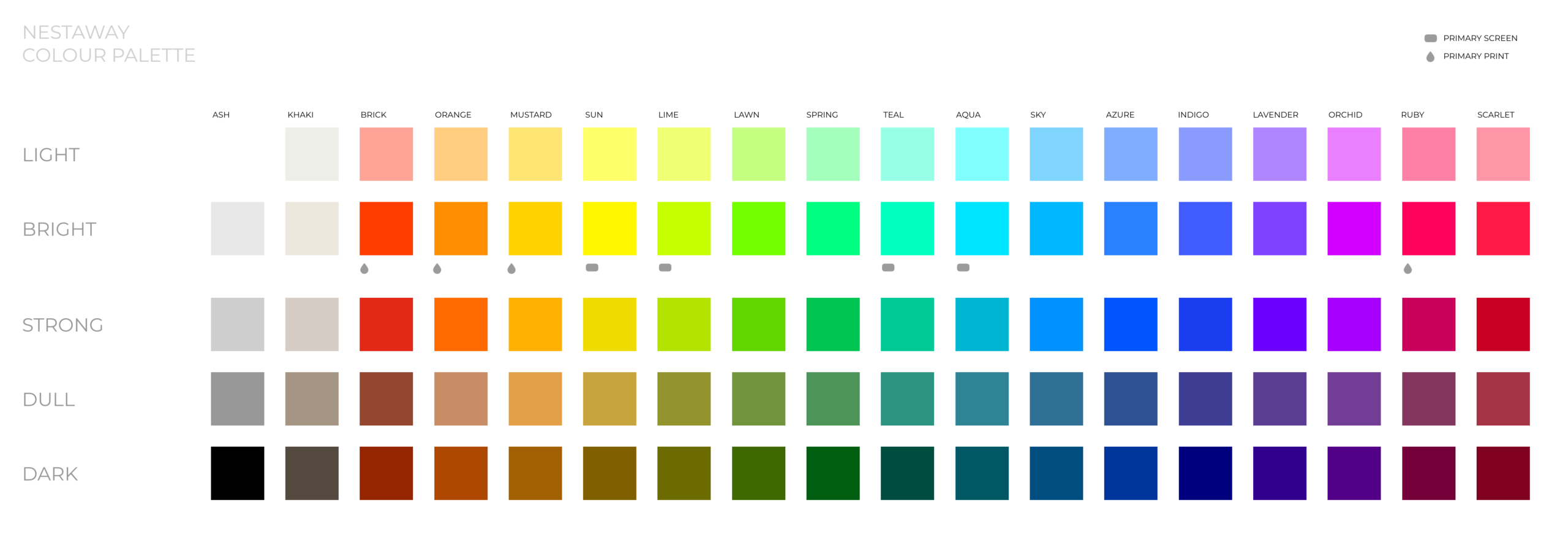
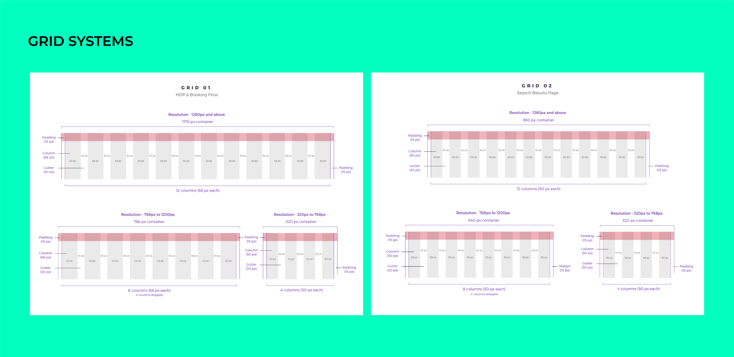
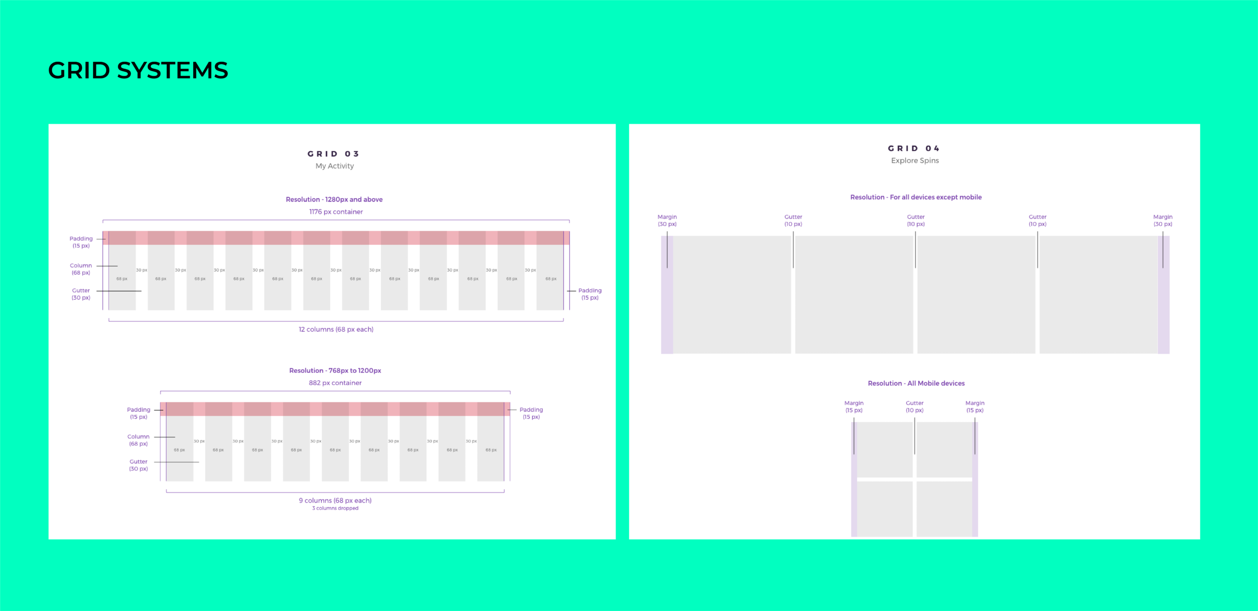
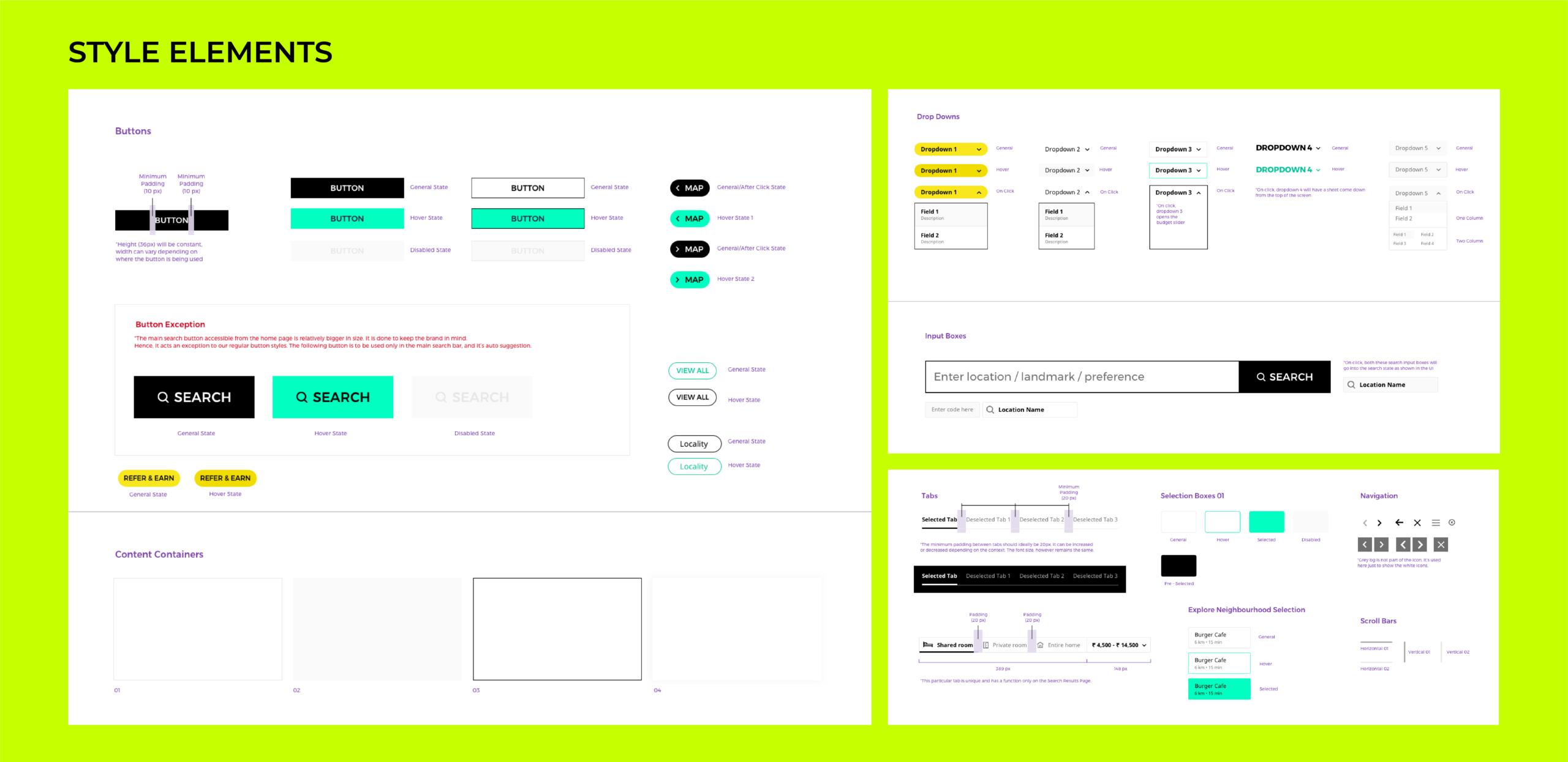
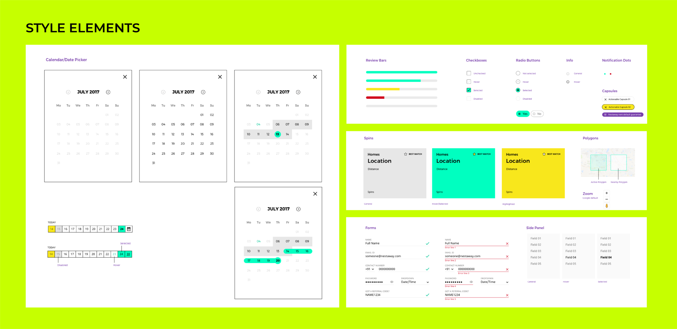
Style Elements
Static Pages
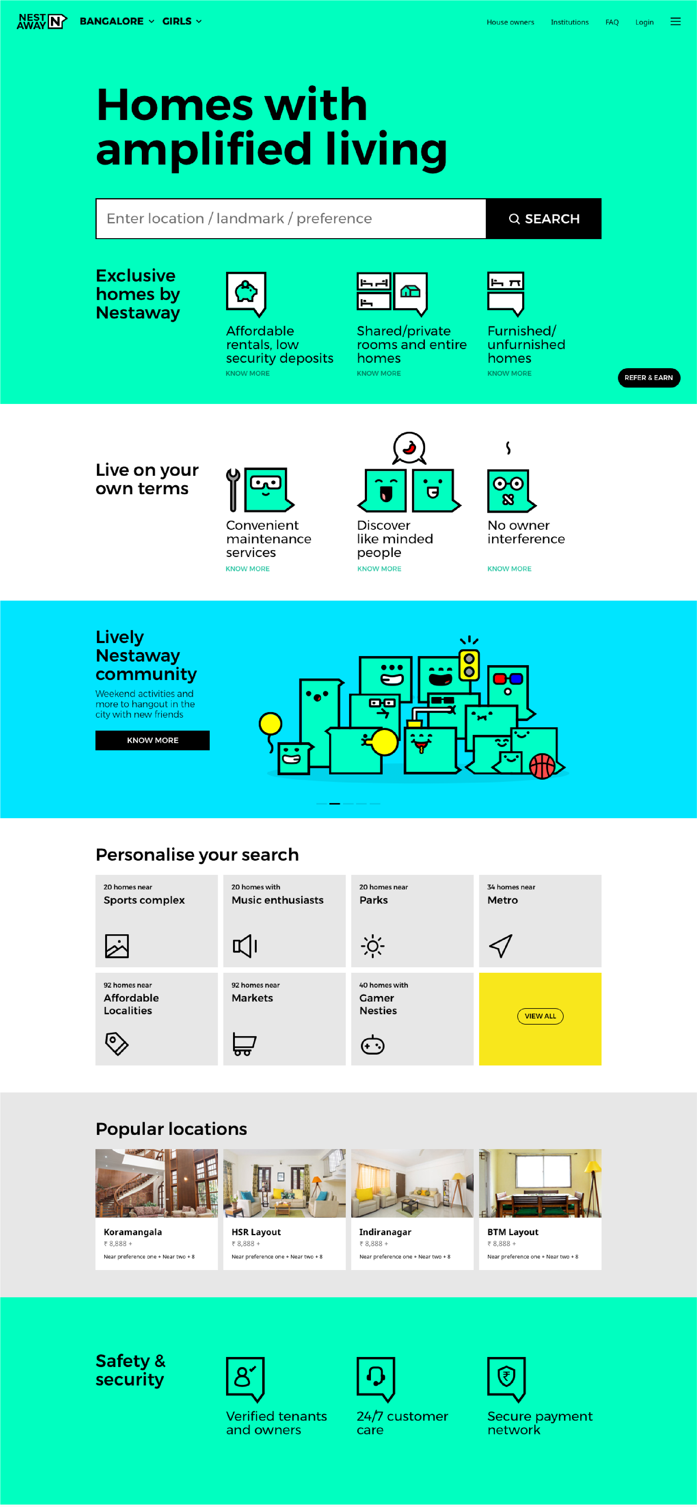
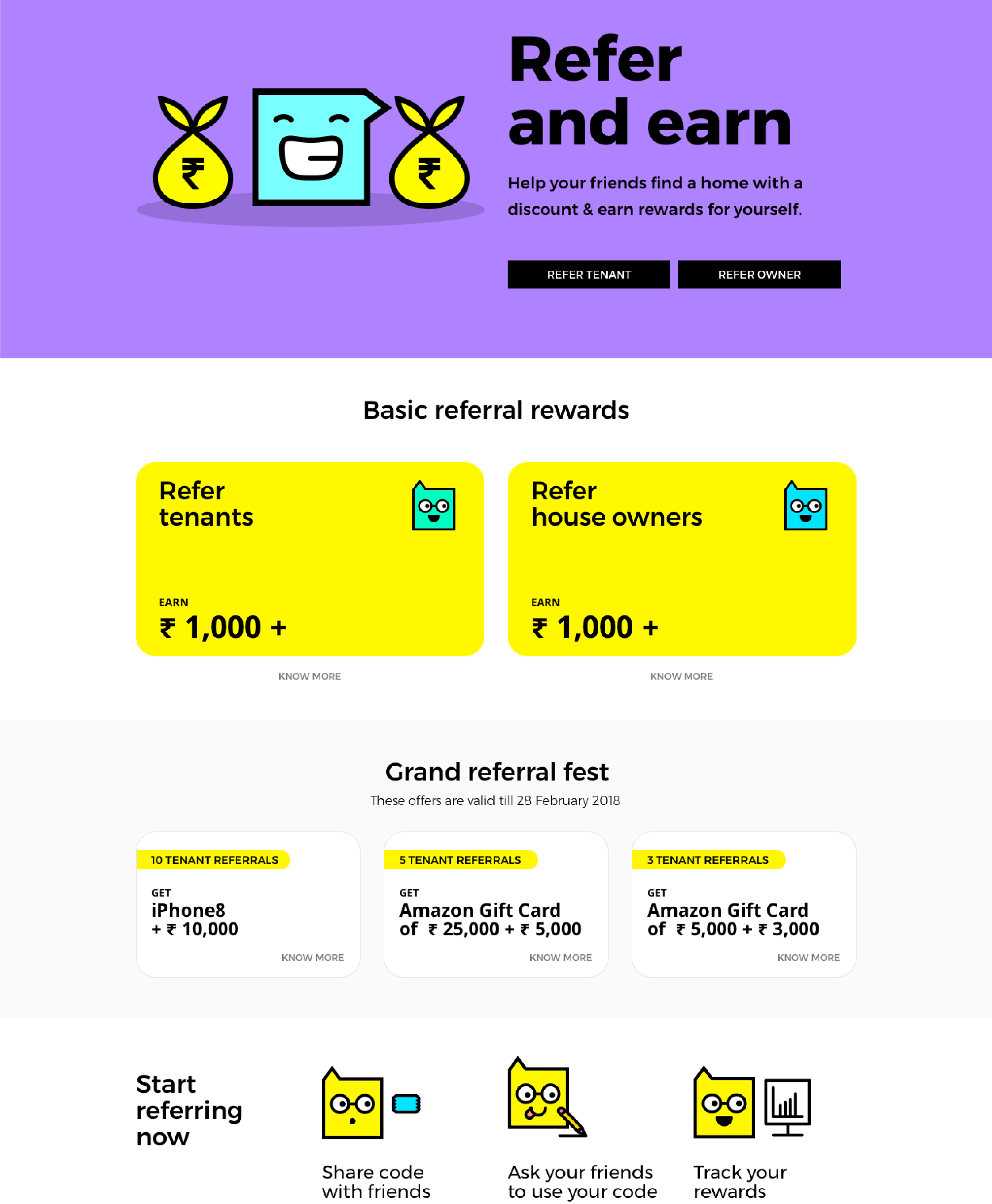
Home Page: Customised referral page for each user. Upfront referral counts for motivating users
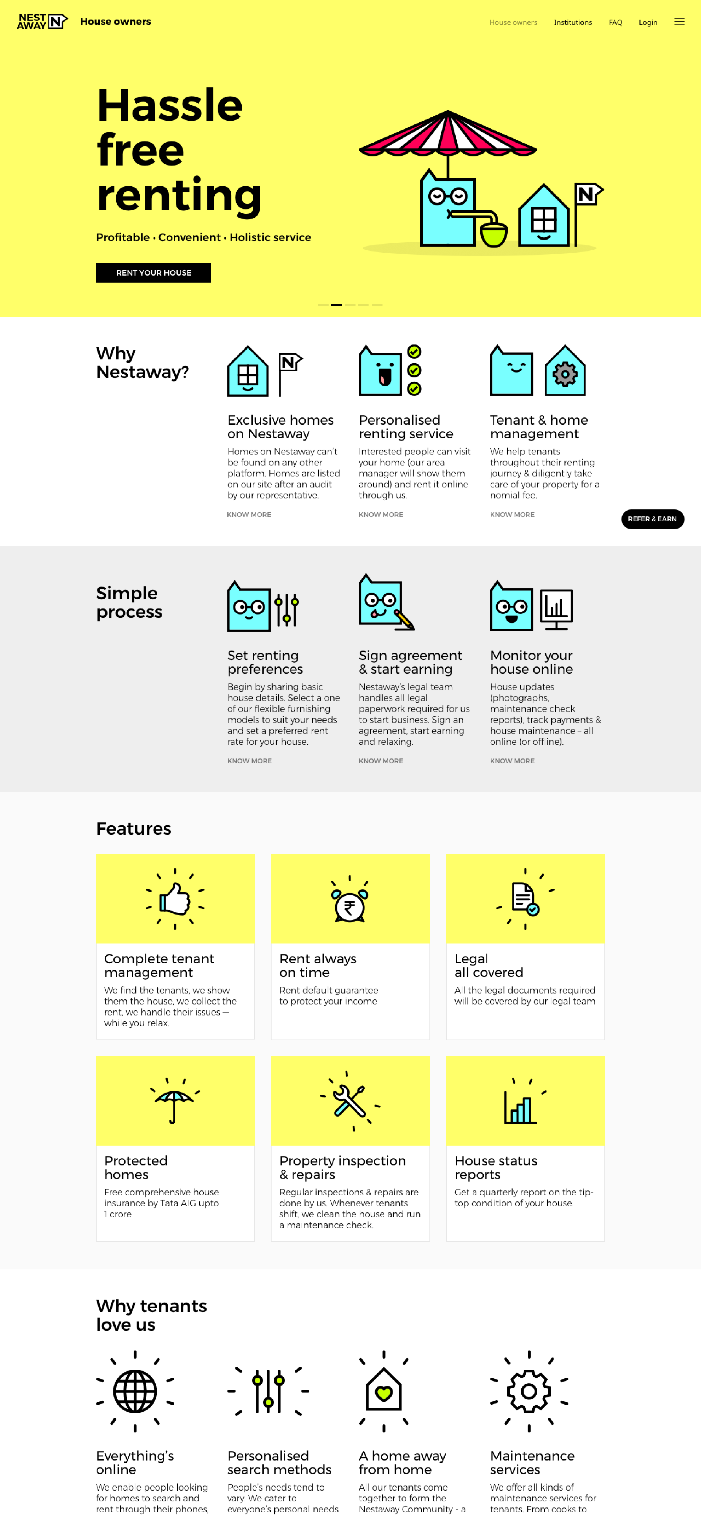
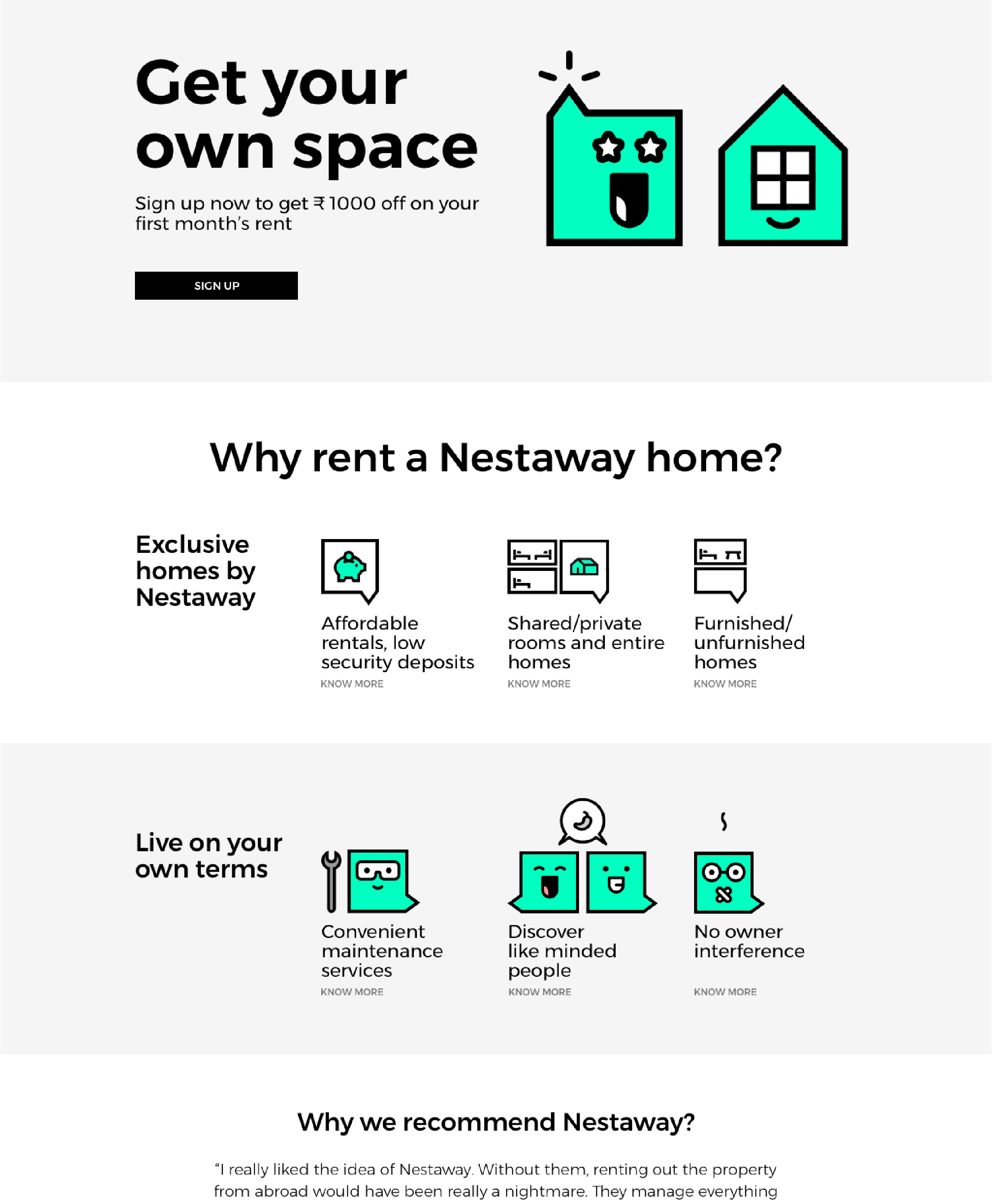
Owner Landing Page: Marketing pitch highlights Nestaway as a simple and efficient service. Easy to use self-listing feature
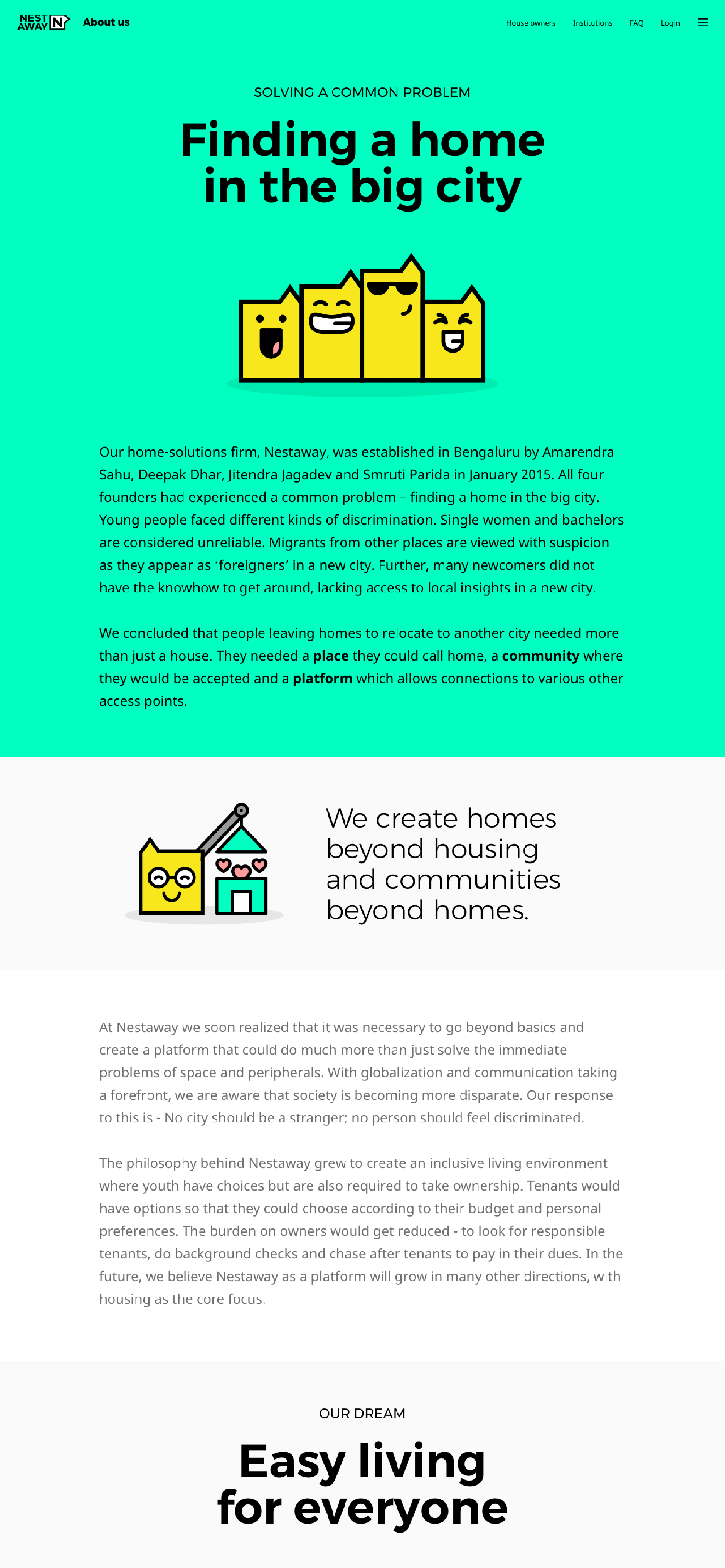
About Nestaway: Storytelling in an easy to read format. Key people of Nestaway highlighted
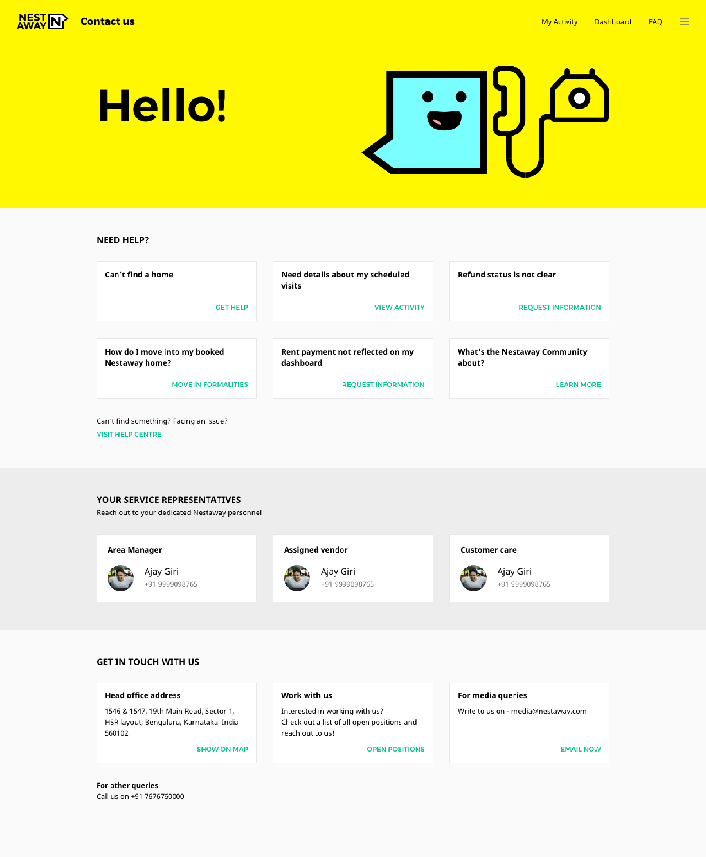
Contact Us: Custom help links and contacts of Nestaway representatives based on users’ journey and past activity.
Refer and Earn: Customised referral page for each user. Upfront referral counts for motivating users
For Corporates: Branded marketing pages for partner institutions and corporates

Amarendra Sahu
Co-founder and CEO, Nestaway Technologies
"Owing to my background in tech, I must admit that I was skeptical, to begin with, however, I was amazed by the sheer power of both the process and outcome of Lopez Design in coming up with Nestaway's brand identity.
More than anything else - it gave us a lingo to speak that we ourselves identify with. Being distinct and yet lovable was just some incidental benefits of it. I would strongly recommend them for businesses that want to talk to their consumers like people and fine tune their personality as well."

Rishi Dogra
CMO, NESTAWAY TECHNOLOGIES
"Lopez Design team is one of the best design units in the world in my opinion. I truly understood the real scope of Design as a discipline and the meaning of the word Design thinking thanks to the time we engaged in reimagining Nestaway as an experience.
Their clean thinking, ability to simplify yet lift the agenda, and depth of subject matter expertise is rare and very aspirational for any team or company. I strongly recommend their work and their work ethic both and remain a huge fan."
Activation
Project Management
Supervision
Fabrication & Installation
Insights
Follow Us
© 2025 Lopez Design Pvt. Ltd. All rights reserved
