A new voice for PMNCH

Following the Partners’ Forum of 2018, there was a lot of excitement about the ‘Pipli’ identity we had created for the conference. It was colorful, humanistic, variable and attended to six different sectors, bringing the missions of the constituencies alive. At the same time it brought out the power of partnership in a very tactile and memorable way. This identity was a huge turning point for how PMNCH could project itself. It also allowed the organization to make the often mundane-appearing tasks into vibrant communications that could enthuse stakeholders to act. For us and for our clients, when we were commissioned to do the new identity, the Partners’ Forum logo became a guiding force.
A new identity for a new focus
PMNCH also known as The Partnership wanted a new identity that would align with their 2021-25 strategy. Even though their calligraphic-styled identity had its own singular presence in the NGO marketplace, PMNCH felt many drawbacks to this early vision, which had grown since they were established in 2006. Over fifteen years, since their inception, their focus had shifted from maternal, newborn and child health to the health and well-being of women, children and adolescents. Further, their 2021-25 strategy placed great emphasis on their evidence-based advocacy, which is core to how PMNCH would now operate. The new identity had to bring out this voice of the partners as a committed group that actively advocates for change.
The distinguishing features of PMNCH / How PMNCH stands out
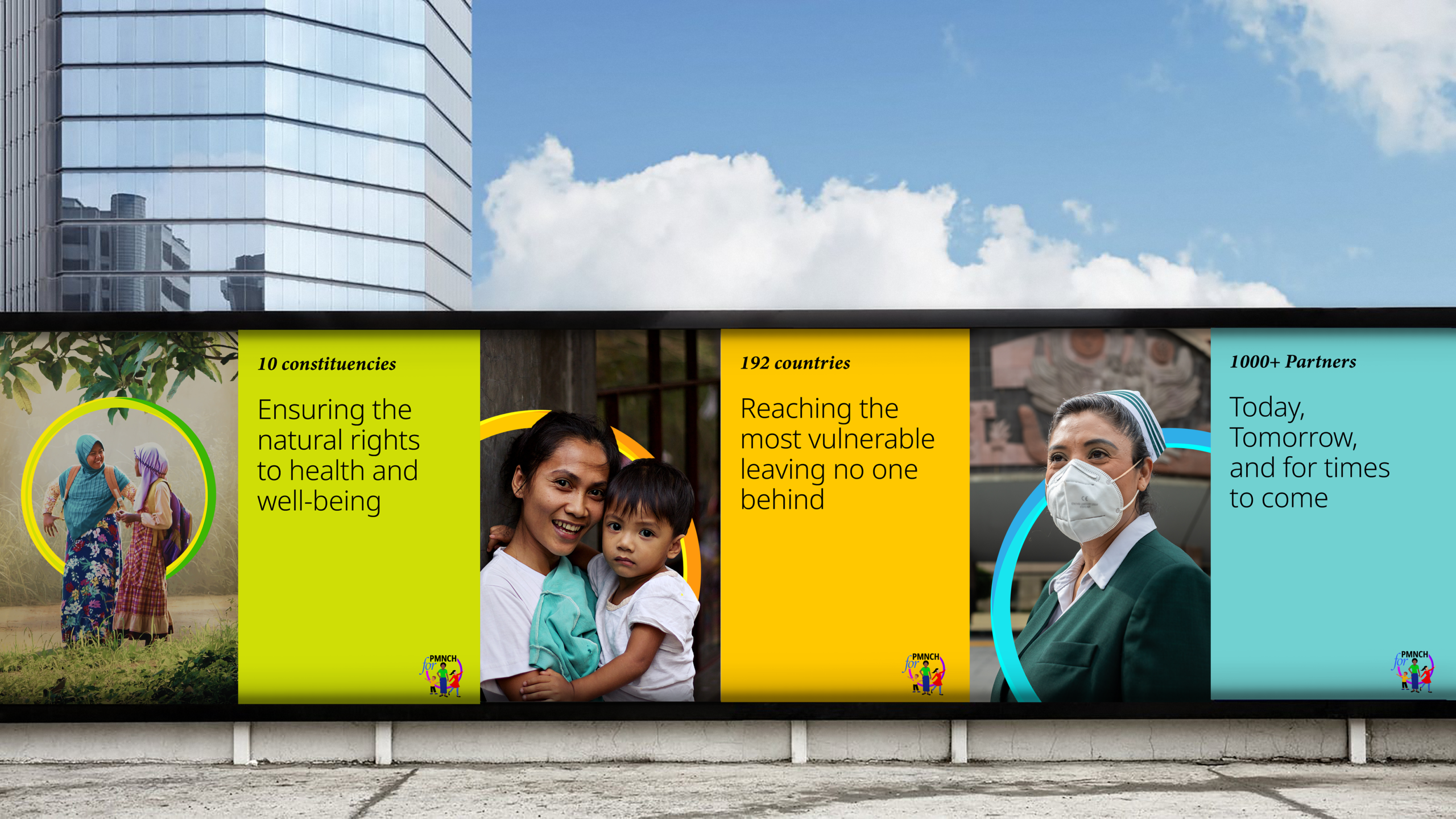
There were several unusual assets that make PMNCH stand out in the non-profit healthcare landscape. They are the largest partnership, with over 1000 partners from 192 countries. Over the years, they are well-recognized for their work and wide reach. They are powerful influencers, known for their ability to reach out to Heads of State and funding organizations. They saw themselves as having a stance of elegant advocacy — they were persuasive changemakers versus activists who shout out loud.
The challenges of a large partnership
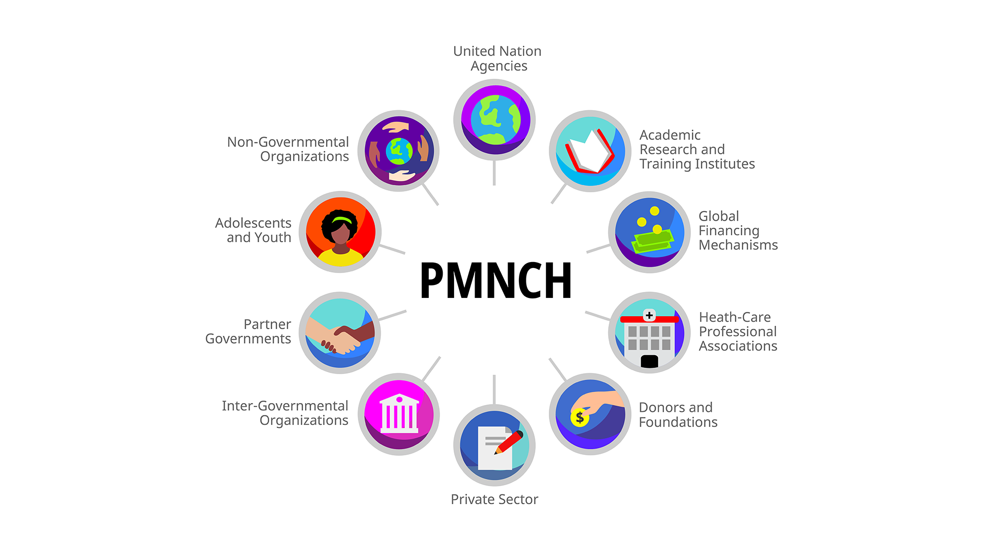
The PMNCH Secretariat comprises of a group of highly qualified professionals, diplomats and country heads who voluntarily give their time in the interests of the Partnership. This is an organization that brings together partners of varying strengths: some are large and powerful, while others are smaller and not as well placed. Each organization also has its own goals. PMNCH sees its partnership as a conduit for aiding all of its partners to reach their goals through its mission: to mobilize, align and amplify the voices of partners to advocate for women’s, children’s and adolescents’ health and well-being, particularly the most vulnerable.
PMNCH’s functional map was fairly complex. With 10 constituencies and multiple operations, the partnership was often perceived as a laborious machine. This perception had to be mitigated and made approachable.
The strategy and identity
PMNCH sees itself as a warm and colourful group in a space where many different cultures and conflicting viewpoints come together. They recognized the need for a cohesive identity, not necessarily a simplistic one, but one that has a strong system that can attend to all of their varying needs. After doing a deep investigation into their brand, the analyst team brought out the 2021-25 strategy, which determined how the new voice of PMNCH should be projected.
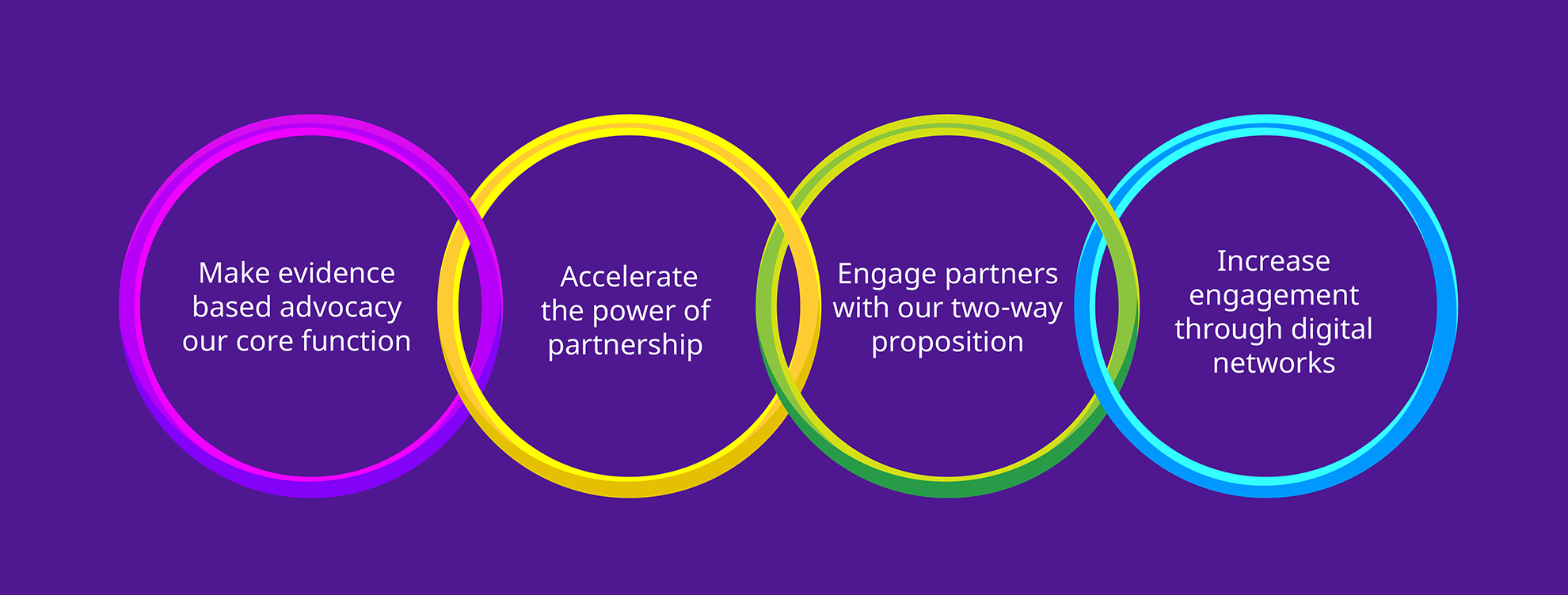
The 2021-25 strategy defined four core directives to propagate the vision of The Partnership — a world in which every woman, child and adolescent is able to realise their right to health and well-being, leaving no one behind.
What the identity had to achieve
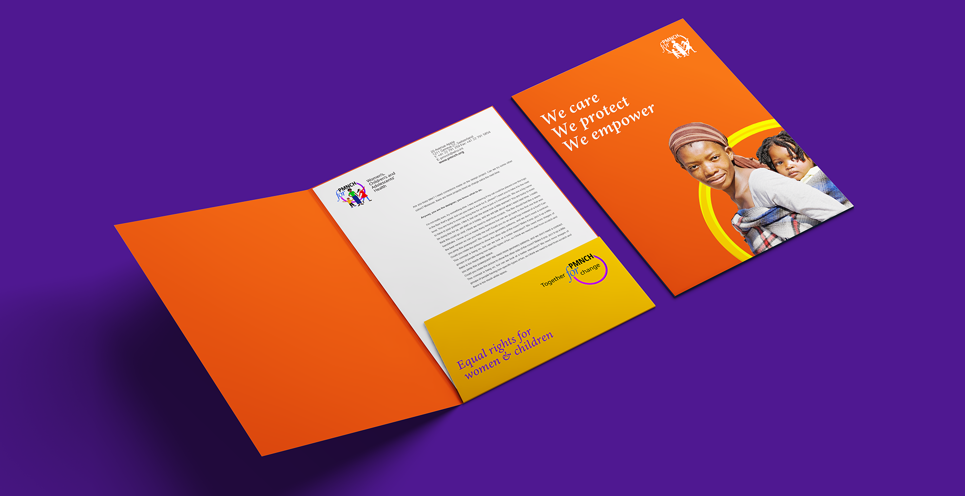
The identity had to be inclusive to all the partners, making them feel they are a part of this larger community, where each of their interests are served, and in which space acting together makes them stronger to achieve their common goals. It had to strongly bring out the new advocacy-based stance of PMNCH in an elegant way. It had to infuse the power of partnership and advocacy into all communications seamlessly and pave the way for a digital strategy. On another level, it was important to communicate PMNCH as a brand that based its decisions on evidence and knowledge. Overall, the identity had to mitigate differences and bring out the positive vigor of people coming together for change — the warmth, candor and enthusiasm of this special group.
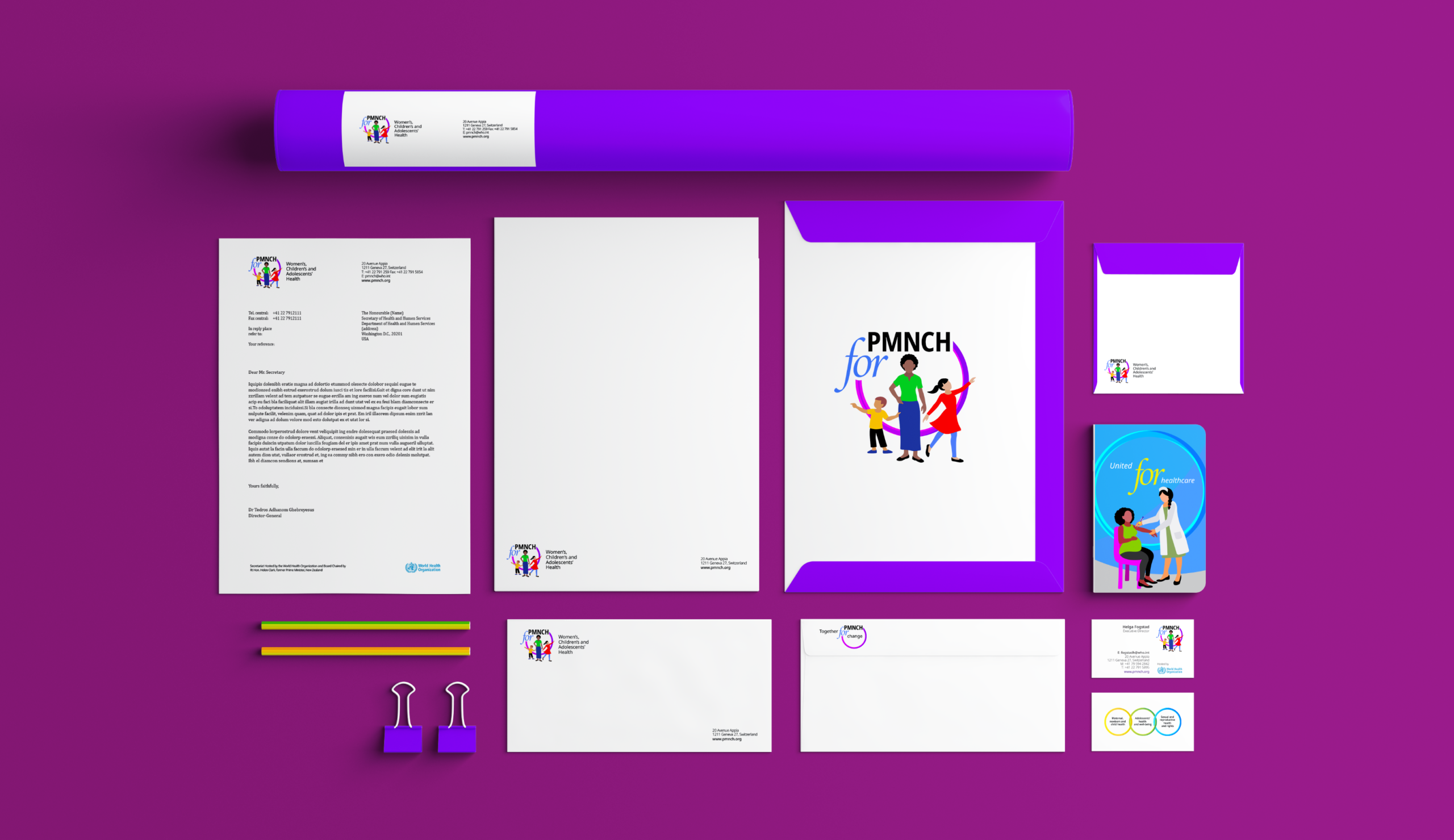
The new identity for PMNCH
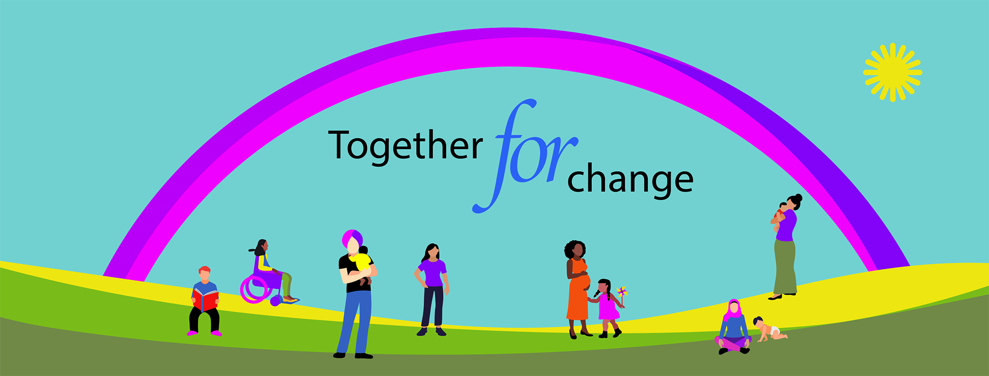
An important part of the identity was also the definition of the focus group within the space of the logo. In the earlier logo, PMNCH had a curlicue that depicted a mother and child. With the shift of focus to women, children and adolescents from the maternal, newborn and child, we analysed a shift from its ‘caregiver’ archetype.
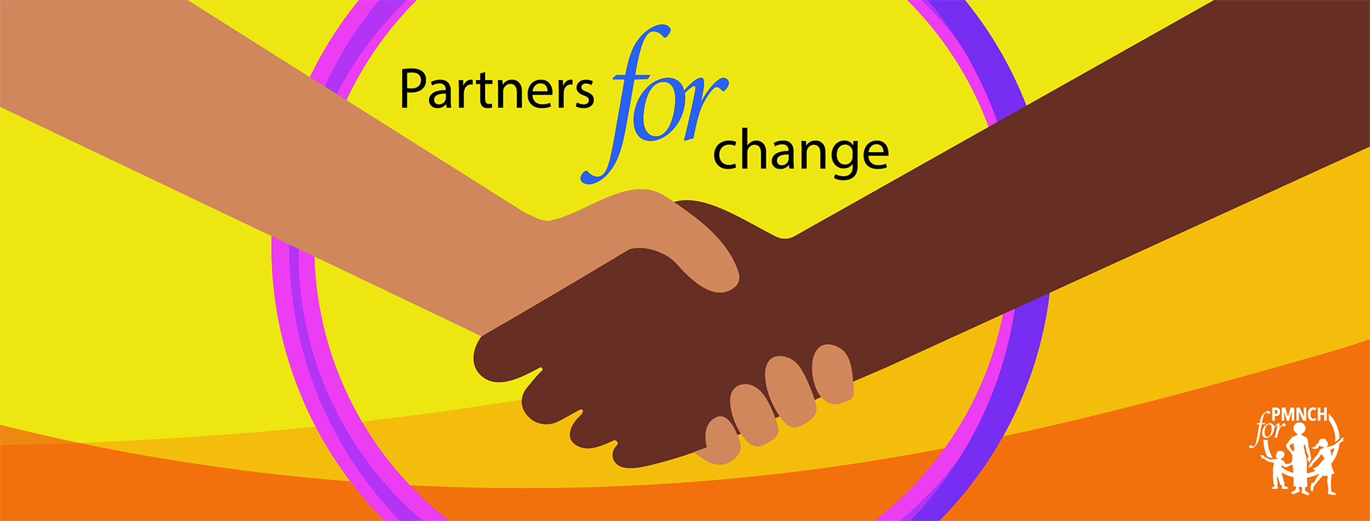
We set out to bring in the characters of a woman, child and adolescent as positive and independent, empowered by the Partnership. The final logo has a circular ring that embraces the characters, the PMNCH acronym and the word for; PMNCH for is contained within the circle. The preposition ‘for’ was introduced to always lend that active advocacy stance giving a sense of incomplete. Leaving it hanging involves the viewer and stakeholder to create and complete.
A multilayered solution for a complex brand
PMNCH is an organisation with complex functioning and we had to be attentive to the layers of communications required on different occasions. The system allowed parts of the logo to be used in different ways depending on the communications required. The circle, the characters, the PMNCH for - each would have many manifestations. Thus, the identity supported a strong visual branding system that perpetrated all the layers of this organization with its multiple objectives.
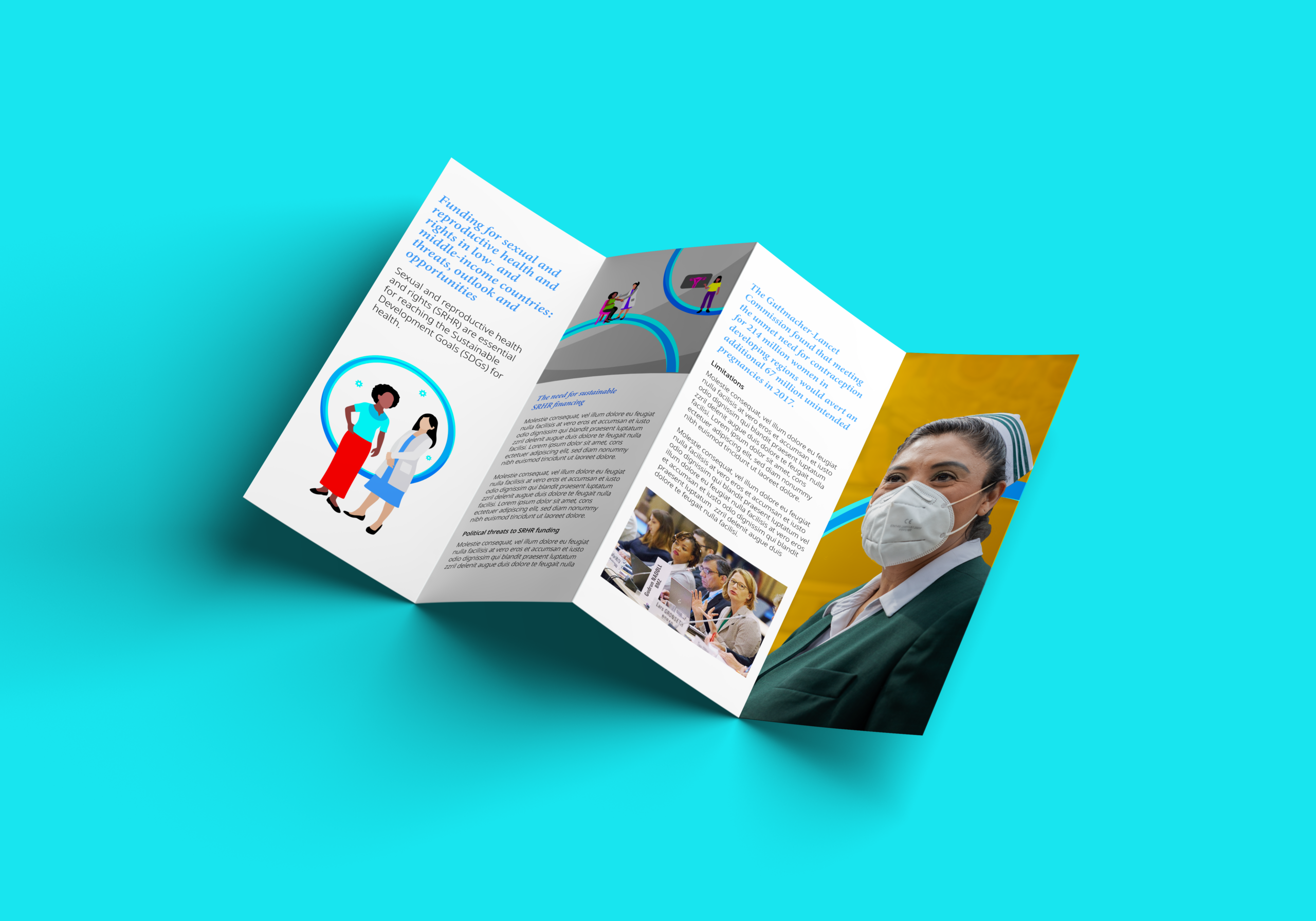
A strong visual language
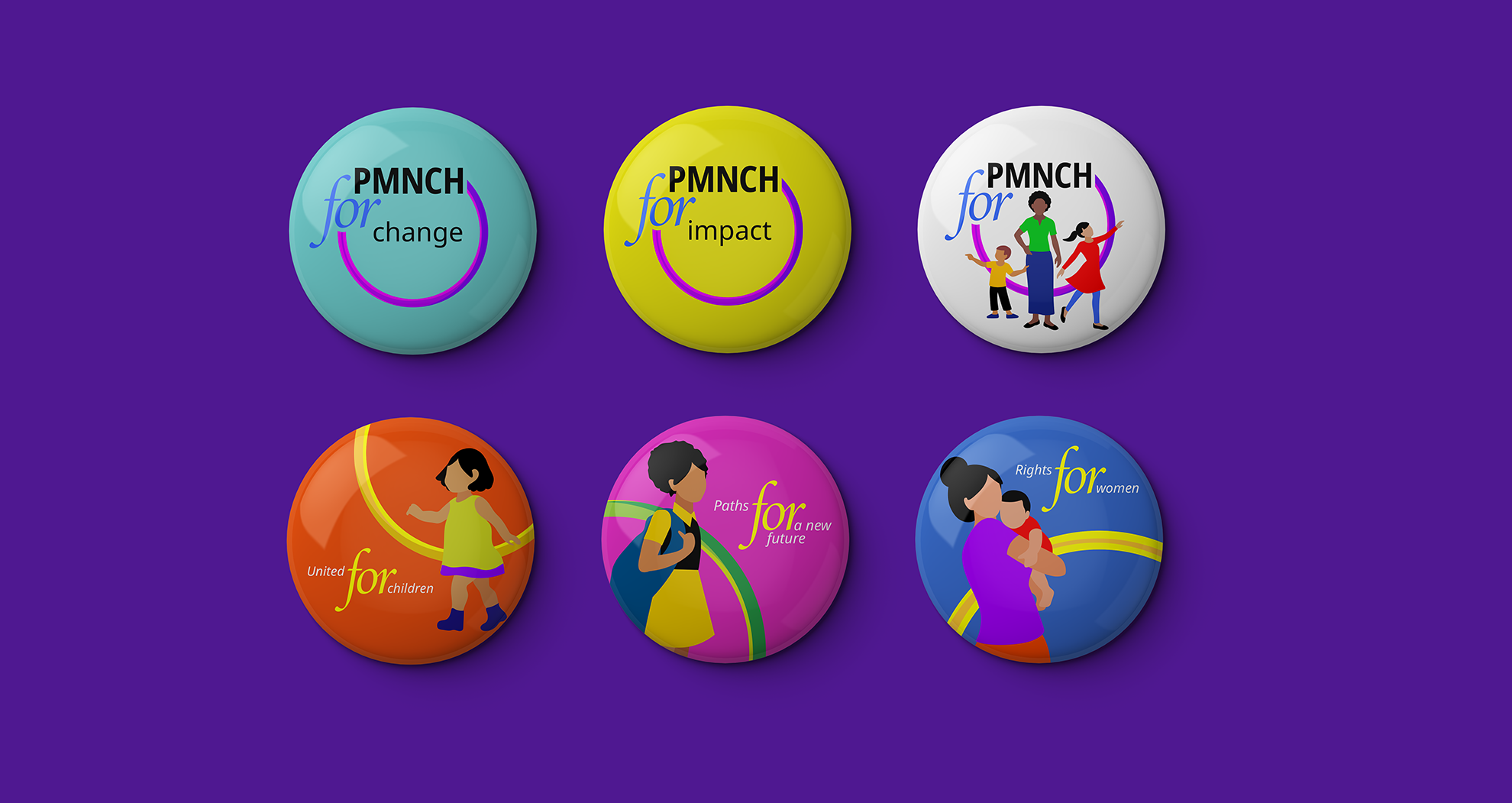
One of the complaints smaller partners of PMNCH had was how language often created a barrier. To overcome this, our identity systems placed emphasis on visual iconic characters. We also introduced variations on the PMNCH for text-only variation, accommodating for variations where we could have different endings to the for such as PMNCH for women, children and adolescents, PMNCH/ Partners for change, and so on. The placement of the circle, the PMNCH for and the text also allows a double reading so that you can see it as PMNCH for change as well as Partners for change.
A humanistic brand
We ended up creating a complete PMNCH pictionary where the characters came alive in many roles, in many colors and representing cultures and people across the world. This truly democractic branding system allowed people across the world to have pride of place. It thrust the vulnerable into places of power by giving them all representation on the same footing.
Color palettes
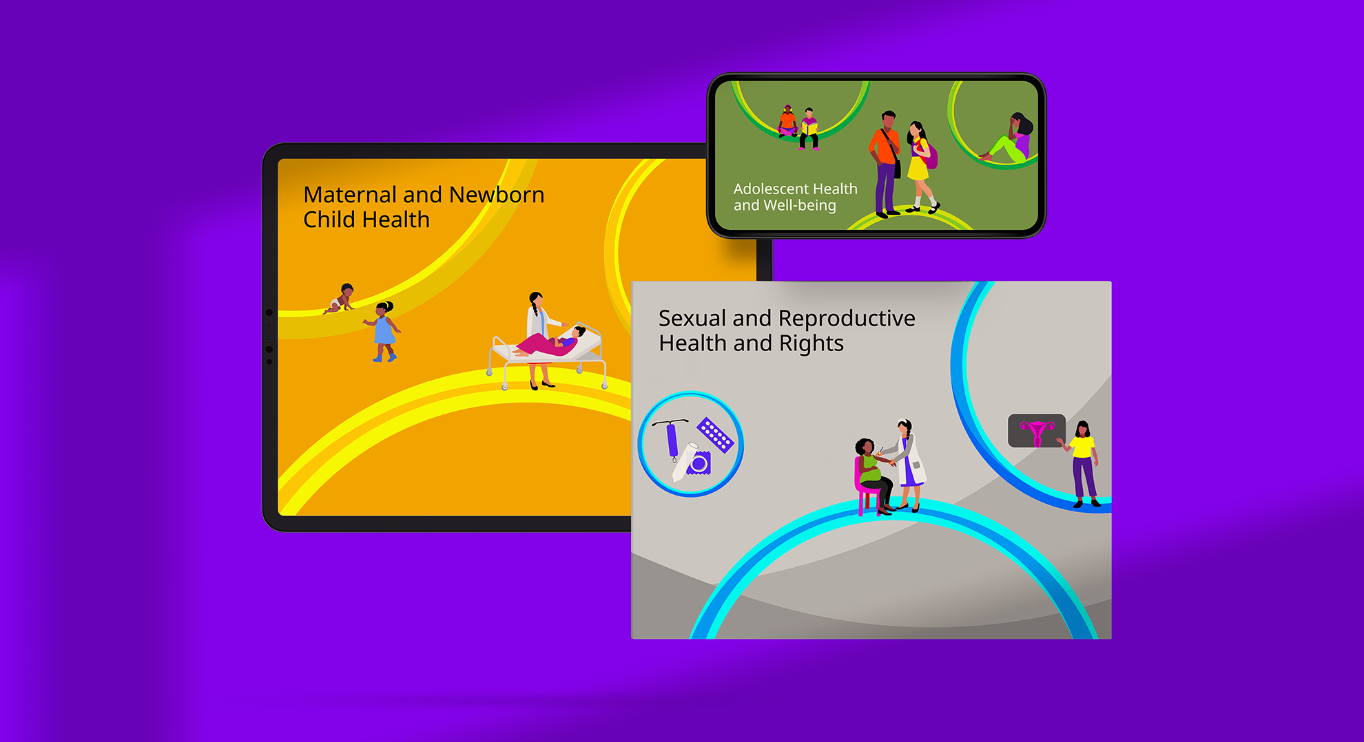
We provided PMNCH with a cohesive system of characters and four color palettes — three for their key focus areas SRHR, Adolescents and Women and children, and one main palette for general use. This smart color coding allows the brand to deftly use visual stimulus to create subliminal messaging to its audience.
Beyond providing the palette, we also had to think about making it easy for the users to pick colors; to this end, we gave names to each hue of the color palettes, so that decision making about the color choices were identified with emotions and feelings.
A flexible and dynamic identity
The identity and branding system, overall, maximises the applications for a digital brand that is, a brand that can truly use the digital space by opening up visual language, not restricting itself to a mere logo. We created an extensive set of icons with 226 characters and more than 65 environment elements, a new language for PMNCH, which they will have to study, learn, adapt to and speak.
Written by Sujatha Shankar Kumar
Layout by Ajay Sharma
Images by Saumya Mittal
Related Projects
PMNCH
BRAND STRATEGY + IDENTITY + CONTENT + PRINT + DIGITAL + WEB

The End of Violence Report
PRINT DESIGN + ACTIVATION

Join our mailing list
Receive our periodic newsletter on Branding, Experience, and Design thinking.
More Articles
A healthy future for all
Colors of Spring
Follow us on
Activation
Project Management
Supervision
Fabrication & Installation
Follow Us
© 2025 Lopez Design Pvt. Ltd. All rights reserved