A bridge to design schooling

The word design throws up various connotations, and the idea of a design school leaves us with very many different impressions. As a profession that straddles creativity and logic, practical considerations and imaginative thinking, ground realities and scientific approaches, design has often been misunderstood as an esoteric profession. All the more reason, when the newly emerging school Indian Institute of Art and Design (IIAD) approached us to create a brand strategy for their institution, as a brand consultant we felt the need to get to the core of what they do as a school and for the design profession, through careful consideration.
The IIAD Story
Set in the industrial hub of Okhla in New Delhi, IIAD has access to the vibrant culture of the Capital city. They have a unique partnership with the Kingston School of Art, London. We had the charge to find a clear brand positioning for IIAD whose project-oriented pedagogy, vibrant people-culture, focus on networks and individual professional growth differentiated them from others in the marketplace.
Bridging and building
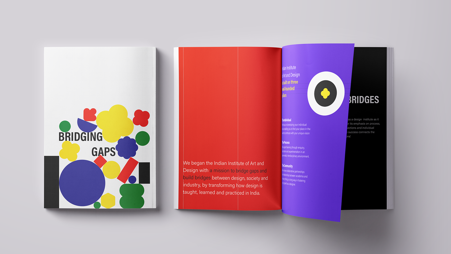
Delving deep into the understanding of the Institute’s philosophy, culture and pedagogical approach, our brand consultants found that IIAD had a unique perception towards how everything was connected: teachers to students, professional houses and education, design and the world, and so on. They adopted a custom-tailored approach towards resolving differences and making connections and evolving as professional designers. We interpreted this qualifier into the IIAD philosophy: Bridging gaps, building bridges, and this became the foundation for the evolution of the brand strategy.

Visual language and communications
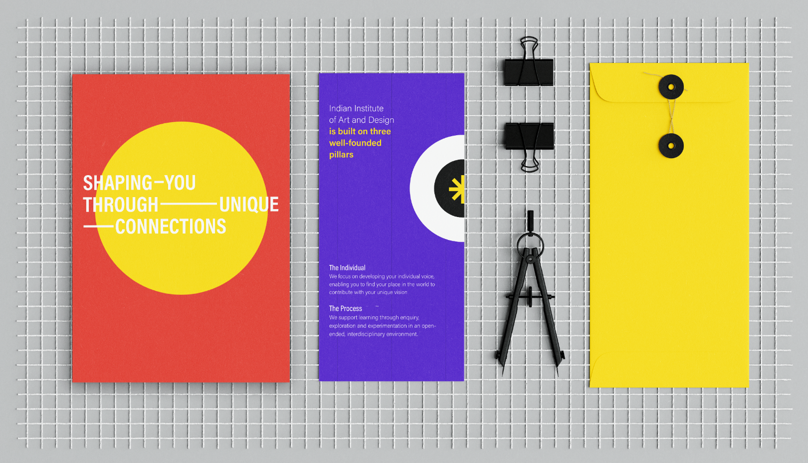
The visual language system grew from the brand strategy to let us create the idea of bridging and building through simple elements such as the dash and ampersand in typography, to steps and grids in illustration. Inspired by the philosophy, the language of the communication took off with leading lines such as ‘Bridge the gap between your passion and profession’. The entire website framework was set on a grid, showing the logical foundation of design processes in academia. A snappy color palette in yellow, purple, red and white also gave the website and collateral a refreshing and warm feel.
The Individual in the Group
Programs in design have from the start recognized how each individual develops their creative channel differently. IIAD gives special focus to individual development, emphasizing the structured system that supports this evolution. IIAD’s story was presented as star quality with five Ps: People, Place, Partnership, Pi-designers, and Pedagogy. The linkages between all of these and their importance in shaping the aspirant designer are crucial and this was brought out.
Special Platforms
From here on, the IIAD story was built into the website as a solid framework, capturing the alumni group as The Circle, and identifying every IIAD designer as a Pi-designer. The name Pi-designer is associated with the infinite quality of the fraction Pi, as well as its unique recurrence in nature. Such special nomenclatures showed IIAD as a special space where creativity flourishes in every nook and corner — the right school to hone your design skills.
Written by Sujatha Shankar Kumar
Images by James Thottan
Layout by Ajay Sharma
Related Projects
Titan : Design Impact
BRAND STRATEGY + BRAND IDENTITY + DIGITAL & SOCIAL MEDIA
PMNCH
BRAND STRATEGY + IDENTITY + CONTENT + PRINT + DIGITAL + WEB
Join our mailing list
Receive our periodic newsletter on Branding, Experience, and Design thinking.
More Articles
Education businesses need sharper branding
UNDO THAT
Follow us on
Offerings
Strategy
Brand Strategy
Brand Audit
Character & Voice
Communication Strategy
Brand Postioning
Naming & Brand Architecture
Employee Value Proposition
Insights
Follow Us
© 2023 Lopez Design Pvt. Ltd. All rights reserved
