A Brand For Every Moment

When we set out to rebrand the contemporary ethnic fashion-wear outfit Libas, we faced the usual unusual challenges. How could we make the Indian label stand out in a crowded apparel marketplace with many similar offerings? How could we redefine the meaning of contemporary ethnic wear with origins in Indian handcrafting? How could we differentiate the brand which had opened up its collections to a wide female demographic of all adult age groups?
History and Garments
Libas, which means garment in Hindi and Urdu, had its origins in New Delhi. Its history can be traced to independent India where a sense of pride and ownership proliferated all aspects of life. This ethos was especially reflected in what we wore, and the women of India took forward the traditions and customs more than men whose attire has predominantly been influenced by the West.
The New Libas
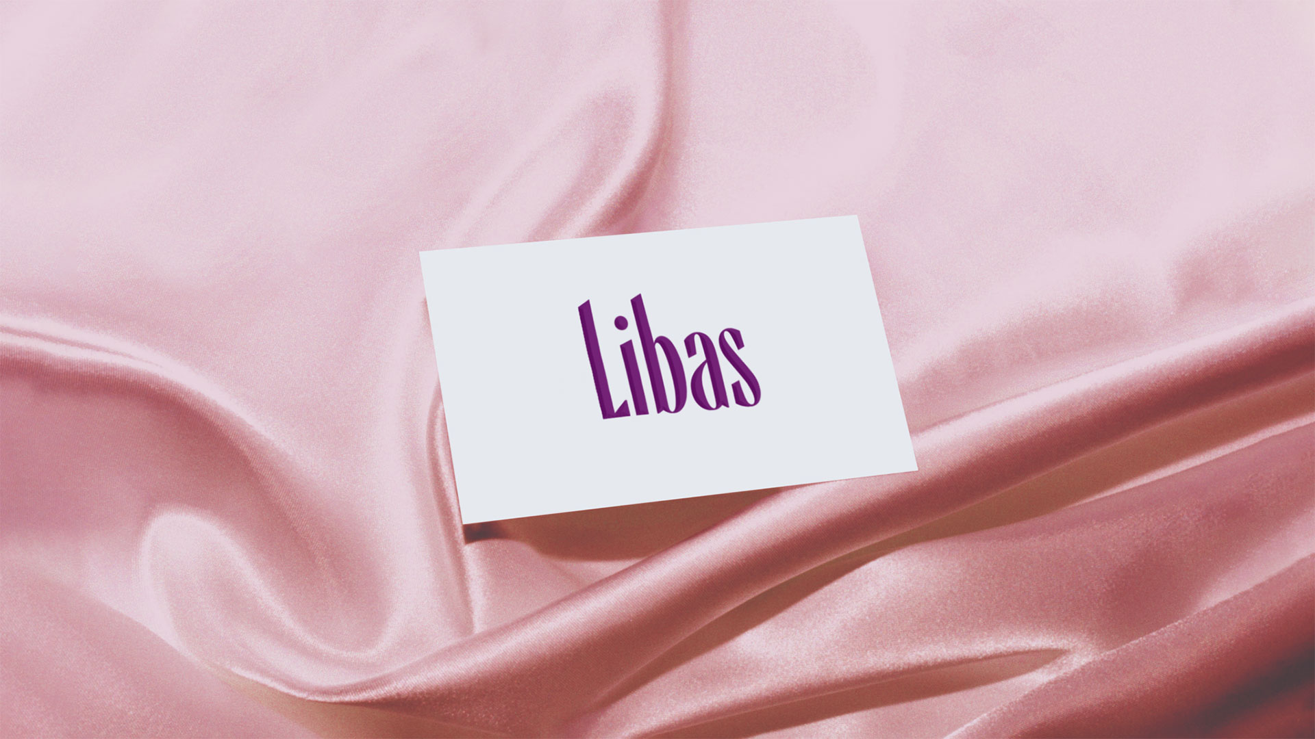
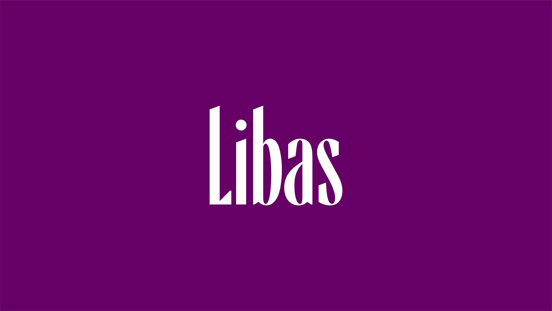
We brought out the free-spirited nature of the brand and its deep-rooted values in Indian ethnic wear and traditional attire, placing it in a contemporary perspective. We designed a condensed logotype, with smooth curves and sharp edges to visualize the bold, yet feminine nature of the brand. Unlike its competitors, the Libas logo tells its story through the design of the lettering itself, not depending on any conventional motifs or symbols.

We retained the Libas purple and tweaked the values to make it young and premium. The logotype is legible in a tight footprint, giving it an advantage in small print. Since the brand needed to appeal to women of all ages, the identity was designed to be mature, but with a touch of playfulness and elegance. The edgy curves of the letterforms encapsulated its ethnic stance and were at ease being Indian.
The brand graphics with motifs inspired by traditional crafts bring a celebratory sparkle. The density and formation of patterns can be varied depending on its applications, making the whole visual system extremely flexible. The color palette of pinks, oranges and violet hues is fresh and contemporary, yet Indian. It includes the vibrant shade of the flower Palash, also called flame of the forest, placing it firmly in the local milieu.
The favicon with the L is edgy and sharp, making a sophisticated geometric statement.
An Inclusive Positioning
The positioning as a ‘free-spirited contemporary brand with a fresh outlook to ethnic fashion with a versatile range of quality products for every occasion’ takes Libas forward ‘for every moment. The ubiquitous presence of the brand which caters to women of all ages and all types reiterates its inclusive stand that they are ‘for every woman’.
Woman at Center
The Libas story is the story of every Indian woman: she takes on all tasks, doing them with aplomb, multitasking much before the word came into vogue. She is a woman who is comfortable in her natural element. The Libas branding puts out a trendy and elegant image of this modern Indian woman instilling confidence in going global while staying local. It brings together the Indian story and the global platform in an elegant way, and more so in an effortless way — very much in tune with how the Indian woman is in charge. Leading with its byline ‘Libas for every moment’ the branding ultimately lets the Indian woman own her space in the way she desires.
Written by Sujatha Shankar Kumar
Images by Lopez Design Team
Layout by Ajay Sharma
Related Projects
Indian Institute of Art and Design
BRAND STRATEGY - CONTENT - DIGITAL - WEB
PMNCH
BRAND STRATEGY + IDENTITY + CONTENT + PRINT + DIGITAL + WEB
Join our mailing list
Receive our periodic newsletter on Branding, Experience, and Design thinking.
More Articles
The right type sets the tone
Marking the safe zone
Follow us on
Activation
Project Management
Supervision
Fabrication & Installation
Insights
Follow Us
© 2025 Lopez Design Pvt. Ltd. All rights reserved


