
India has historically been renowned as a country with a rich visual culture, a melting pot of numerous ethnicities, languages and diverse people. Cross-border economic, cultural and political exchanges have in the past modified our social fabric, and continue to do so. With increasing globalization, India’s cities could be said to have a postmodern identity, rooted in our history but fused with western influences and twentieth-century developments.
Despite our geographic and cultural diversity a ubiquitous contemporary aesthetic has taken over the Indian consumer and corporate landscape. All new brands, smartphone apps and graphic elements, visually look like they have come from a single origin, lending to a cultural homogeneity. Their names, inflections and behaviour too are often Westernised. These, in no way represent the idiomatic Indian landscape with its endless variations, complex symbology and heady narrative style.
In recent times, Indians have become increasingly conscious of preserving our past heritage and traditions, and have a deep desire to make our everyday interactions more meaningful and rooted in our land. Design offers constructive pathways to preserve and promote our rich history, visual culture and indigenous identities. At Lopez Design, we have made a singular effort to ingrain Indian ingredients into our projects, looking at creating authentic brand character. By embedding the ideals of authenticity, excellence and true purpose into our value system, we have always steered our branding exercises to draw from our indigenous roots to shape the language of brands we design.
This article looks at our India-inspired branding projects, with the challenge to deliver contemporary solutions for today.
Ayushman Bharat: Language of the people
Often, advertising and branding specialists are challenged by the changes in communication styles, nuances of speech and local narratives that vastly vary over geographical regions of our country. When confronted with the task of creating a brand for 1,50,000 health centres across India, we went with the famous Indian adage Unity in Diversity. Our solution had to find a common thread that would bind 650,244 villages and over 300 cities where officially 22 languages and 1652 dialects are spoken. We created a highly dynamic branding system consisting of a circle and square, which could wrap around the windows and doors of every building. The actual decorative patterns that fitted into these basic elements related to the geo-local region.
In hindsight, the beauty of this universal system corresponds to the Indian way of life: ancient houses and palaces were often decorated with paintings depicting human activity, plant and animal life, and folklore. For example, Warli is one of the oldest art forms which originated way back in 2500 BC. It vividly depicts social and routine life through unique, intricate geometric patterns. This concept is fundamental to many Indian traditions and has passed over several generations, defining the regional flavour of a place and giving people a sense of community and ownership. Today, in its new avatar, the branding for Ayushman Bharat unites people through their ability to express themselves.

Craft and sustainability through branding: Partners forum
India has always been famous for her crafts, and foreign visitors to our country travel far and wide to pick up an exquisitely embroidered toran, a bidri-ware pot or a Kashmiri wall hanging. Natural and sustainable ways of living were also part of the ancient Indian way. How could these expressions and ways of life become a part of a brand and represent our nation for a world-level conference?
The fourth Partner’s Forum of PMNCH (Partnership for Maternal, Newborn and Children’s Health) witnessed participation of 1000 members from 77 countries in New Delhi, in December 2018. On this occasion, it was perfectly appropriate to represent the six thematic areas of the conference as ‘the fabric of society’, translated through the age-old craft of Pipli applique. Its roots, which go back to the 12th century, are traced to a small village in Odisha. It is well known for its beautiful cutting and utilization of cloth scraps, which in turn epitomizes sustainability. Inspired by this principle, we reinforced the concept by designing all conference material to be repurposed as bags, cushion covers and table runners, opening a window to a greater purpose for the Forum, making the branding itself sustainable.
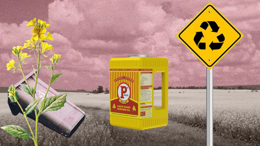
Legacy Prevails: Puri oil
We Indians are second to none in recycling, in the way every kitchen has big boxes of branded or non-branded products reutilized in some form. Expanding on this microscopic insight, our team designed an oversized opening and a detachable spout in the container for Puri Oil, so that it can be repurposed by households to store grain and pulses. The compactness and stackability of the packaging makes it easy and practical for users to re-utilize the package, thus providing additional utility to the end customer beyond the oil that the container carries.
This intervention helped P-Mark reposition its brand with an environment-friendly packaging that promotes reusability, reduces carbon footprint and enhances the appeal to environmentally-conscious customers. Not shying away, the bright traditional colours of red and yellow define the oil brand as Indian to its kernel.

A new language for chat: Nestaway
Whether neighbors over cups of tea, strangers on train journeys, acquaintances at work, or shopping for groceries, we Indians love to talk. Our romance with conversations continues with the Smartphone, messaging and chats. Therefore, it was no surprise that when Lopez Design was commissioned to create a new brand for Nestaway, a home-finding enterprise, we zeroed in on a ‘voice box’ to engage with their young audience and would-be clients. At the heart of the new brand, is a ‘desi’ core, with the tone of voice strategically defined to connect with the Indian consumer. The communication elements picked up on trending news, film culture, cricket and other Indian passions with punchy and surprising lines like ‘ja simran ja’ and ‘mogambo khush hua’. This authentic approach puts Nestaway in its desired space as a game changer with its open outlook and non-discriminatory policies and its ability to understand the Indian market.
Written by Sukanya Panda & Sujatha Shankar Kumar
Illustrations by Lopez Design Team
Edited by Sujatha Shankar Kumar
Further reads: