Designing for a signage system that is one with nature
Godrej’s new township project Riverhills in Mahalunge, Pune places a responsible thrust on ecology and sensitivity for the environment. The 69-acre township on the banks of the Mula River in Pune is conceived as a one-of-a-kind living space with all amenities and interconnected activities. The site which is bordered by hilly terrain above and the River Mula in the North, is planned with a Riverwalk, riverfront, park and Hill District. The conscious effort to marry living spaces with ecologically sensitive zones is apparent in the many meaningful developments around the river such as the Pune Riverwalk that connects the hill to the river and the bio-swale, a long linear green garden that relieves pressure on the drainage system. All of these features integrate together to establish a strong sense of identity for the project which is planned by Master planners DADA and landscape architects StudioPod. When Lopez Design was commissioned to do the Wayfinding and signage for the township, this thrust on ecology and nature framed our direction.
A walk in the park
The 7.6 acre park occupies a central space in the township binding all the communities. Situated south of the riverfront, Central Park brings the experience of the riverfront to all the precincts of the project. The report from DADA states, “The park is programmed to not only cater to the neighbourhood but also provides recreational space for the school as well as gathering spaces for the visitors. The built typology ensures that all edges along the park function as mixed-use edges and hence remain active and safe.”
Anthony Lopez says, “When we researched park designs across the world, we found that the signage in well-known forest preserves and trails used environmentally-friendly materials. We evolved the wayfinding system with this intention, to bring people closer to Nature, while giving them the freedom to explore the park.”
Find your way with ease
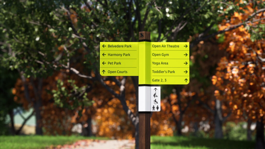
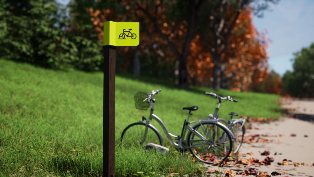
The wayfinding system situates and orients the user with ease and flexibility, giving them a sense of place and bonding with Nature. Primary directional signs are placed along the main spine, treating it as the central artery. From here, users move to other zones and destinations, and the park’s ‘health loops’. As you get closer to your desired destination, user-friendly signs give localised directions and identify various amenities like health pods, cycle stands and restrooms.

Upcycling for Nature
We zeroed in on upcycled reclaimed teak wood for the posts, following the ‘One with Nature’ ethos of the park design. The Entrance Wall features live moss, combined with the identity of Central Park, which reinforces the organic nature of this park.
Clean and green
The main sign panels are green in colour, consistent throughout the sign family blending with the verdant surroundings. The aluminium panels have clean and refreshing graphics with a palette of distinct colours for different kinds of trails. This makes them easy to read and interpret at a quick glance.

Follow your own trail
The signage design allows the user to pick from health loops, forest trails, reflexology trails and the rope walkway, all of which form smaller trips within the park. The three health loops (600, 300 & 270 meters), start at active recreational zones like the open courts, open gym or health pods. Information at the start of these loops and trails give the distance, maps and calories burnt, letting the user decide which route is desirable for them.

Coded pathways
Beautiful flecks of pastel shades colour code the trails and aid users with trail identification markers, distance markers & track maps, all of which enhances their run. Clear routes are designed without overlapping trails to avoid confusion.

Interpreting Biodiversity
The park’s rich biodiversity is expressed through flora and fauna elements ingrained in the signage. The burnt bird motifs on the sign posts correspond to the local species impressing on ecology. Interpretive signs across the township give information about the ecological diversity of the space such as the Riverfront and the banks of the Mula river and the heritage aspects of the township like the Golden Bridge.

Experiencing a space through signs
The cutting-edge Wayfinding and Signage heightens the whole experience of the Park through a contemporary and edgy design, giving Central Park a vibrant outlook. The users access Nature and place through informational signs and aptly placed directional signs. The colour palette is intuitive and balanced, lending a sense of harmony to the entire design and letting you follow your path, the way you wish to. Lopez says, “The signage system has very strong character that blends with the ethos with the township and what Central Park is all about. A person feels elevated in the space.”
Written by Sujatha Shankar Kumar, Prabhjot Kaur, Namita Jain & Anshul Kapoor
Images by Mainak Das
Layout by Ajay Sharma
Project managed by Tarka Patil
Further reads: