Club of Mozambique
A new voice for PMNCH
A new voice for PMNCH
A new voice for PMNCH
A new voice for PMNCH
STRATEGY + SYSTEM DESIGN + INTERACTIVE
COMMUNICATION STRATEGY + IDENTITY SYSTEM
COMMUNICATION STRATEGY + IDENTITY SYSTEM
COMMUNICATIN STRATEGY + IDENTITY SYSTEM
COMMUNICATION STRATEGY + IDENTITY SYSTEM
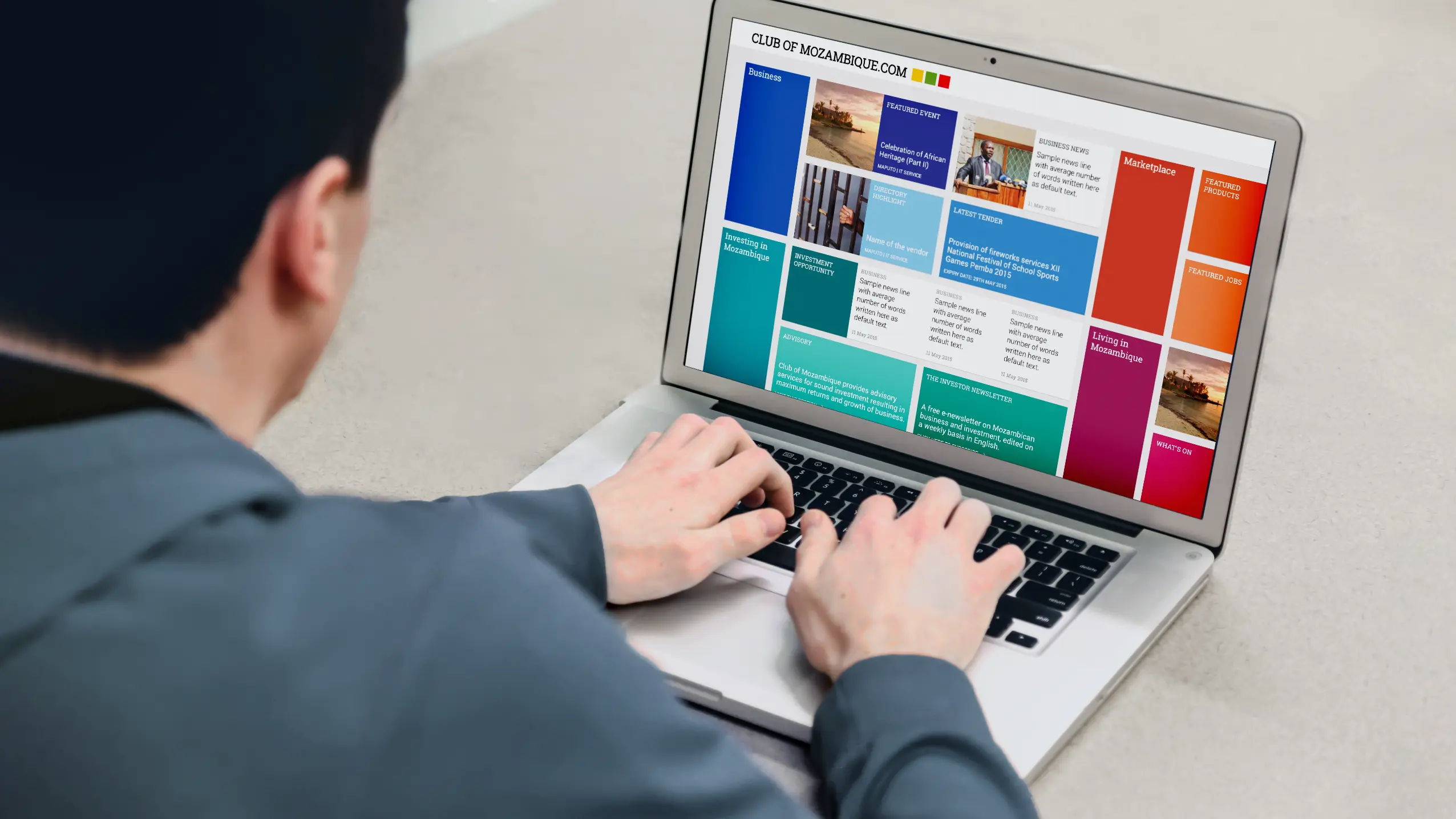
The site shows Mozambique in a positive light, projecting how it is conducive to business and holistic growth despite it being a small nation. It also encourages the client’s website team to develop great new content with an outlook on big business.
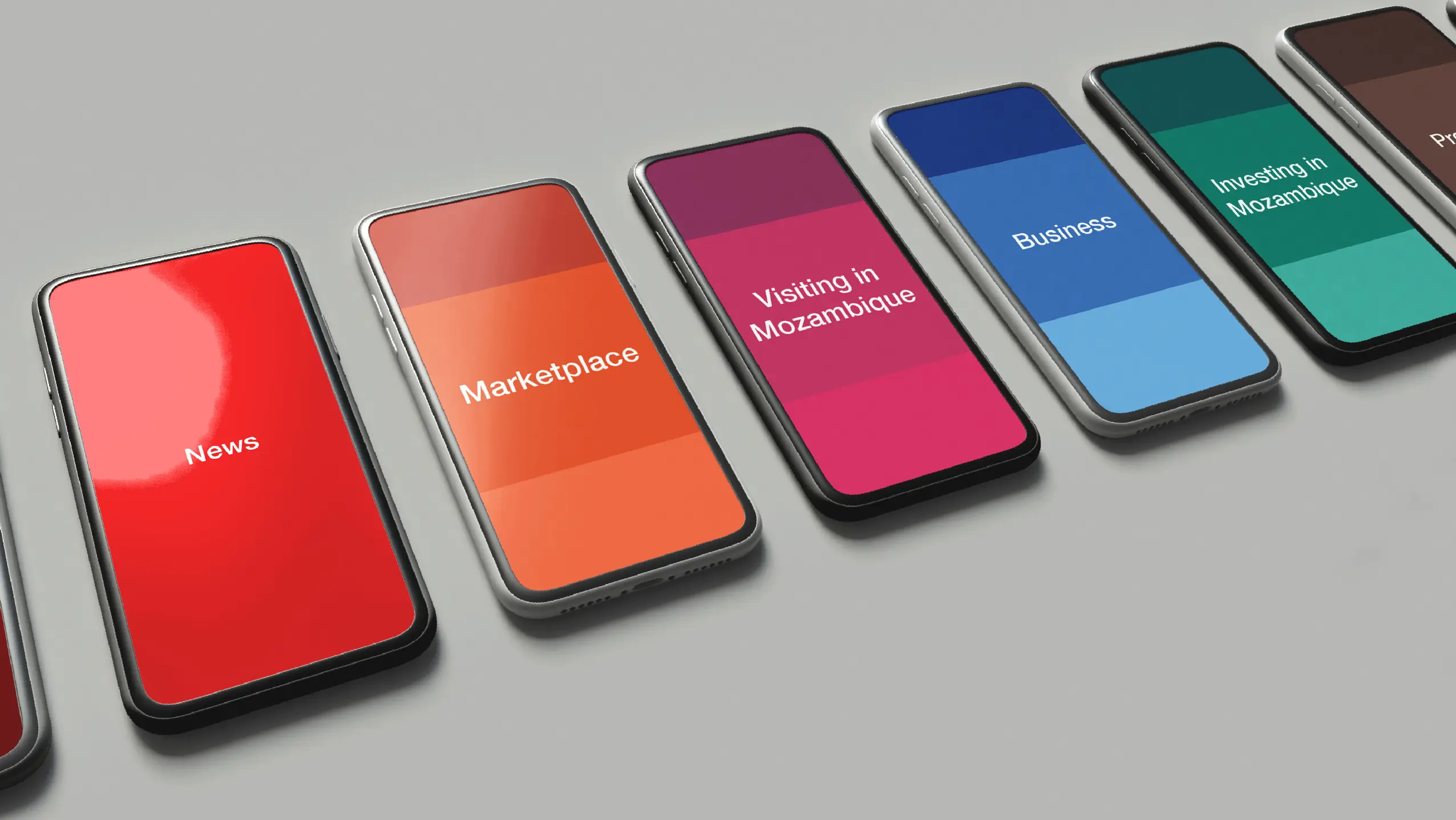
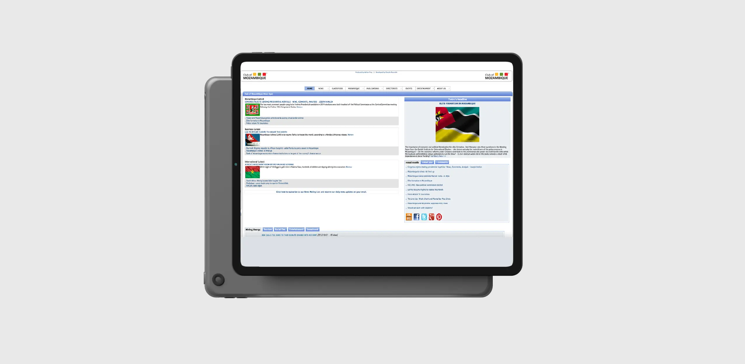
Aspects of the website were also made more user-friendly as per the client's requirement to simplify the site as well as modify it for the team at Mozambique to adapt more easily.
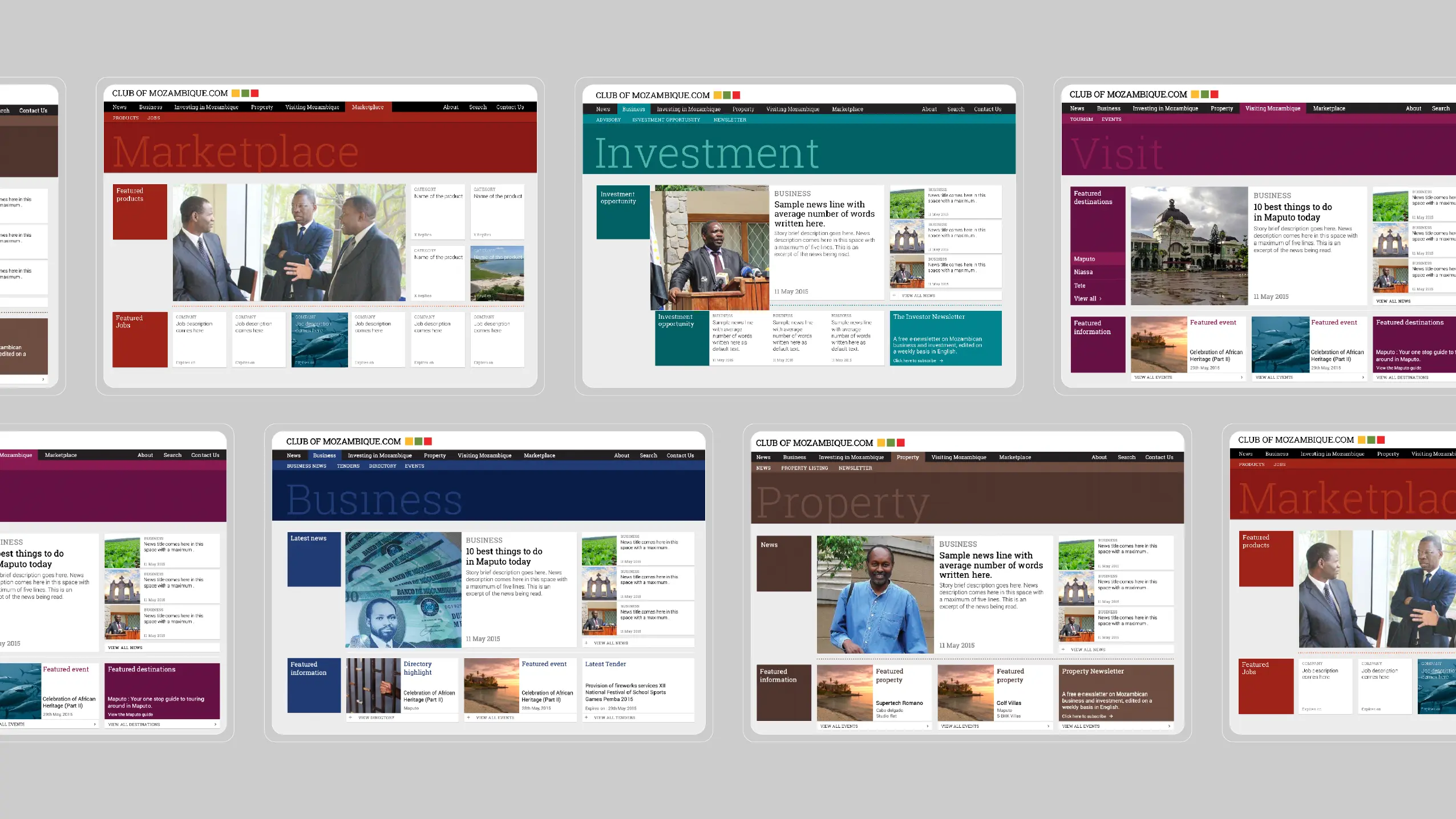
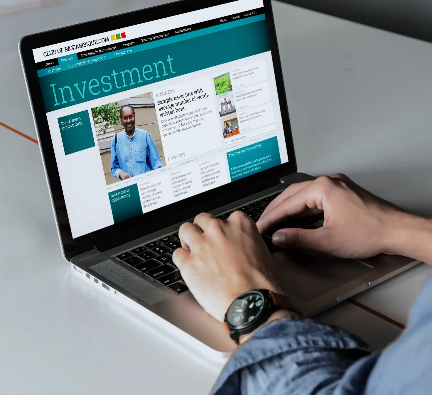
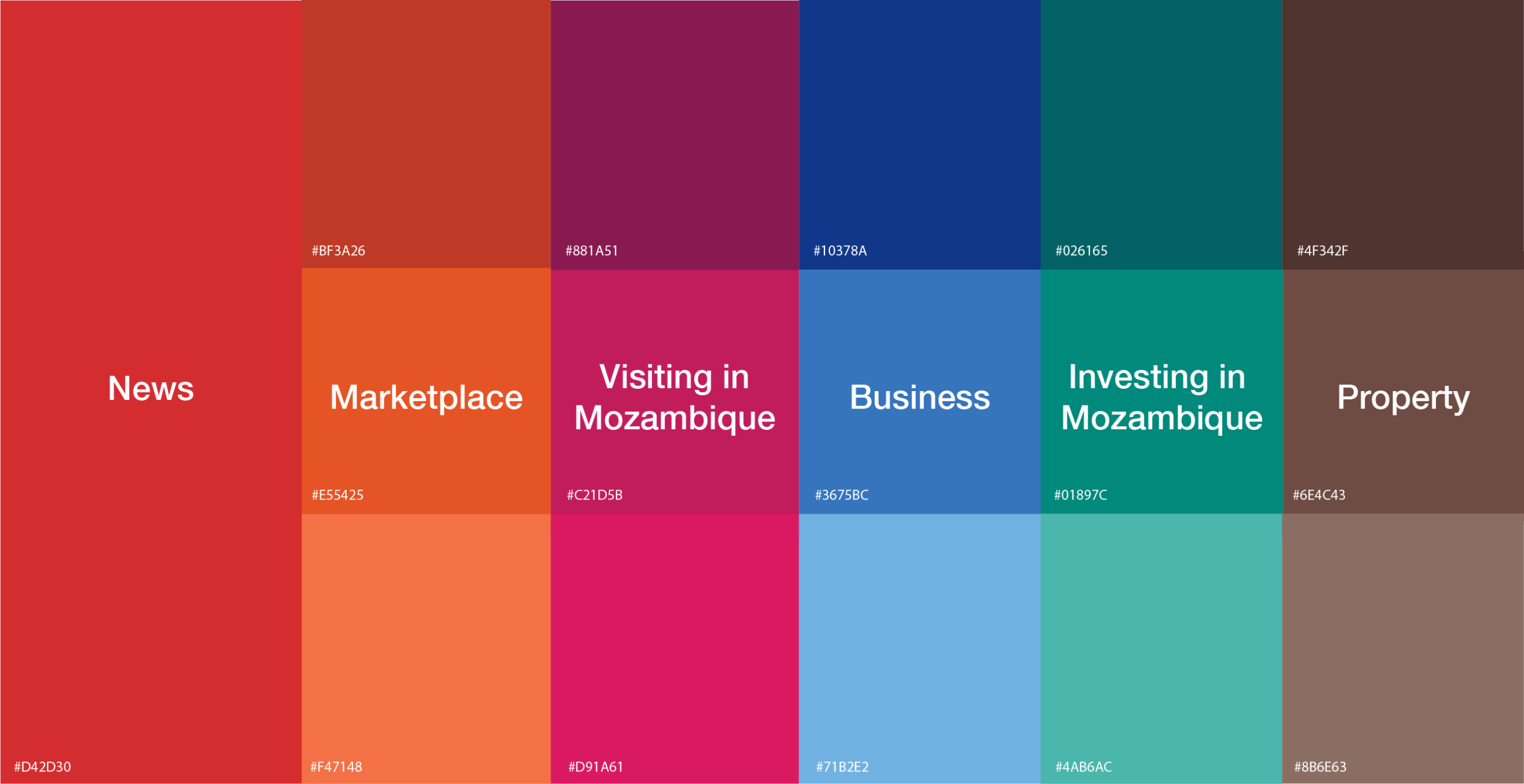
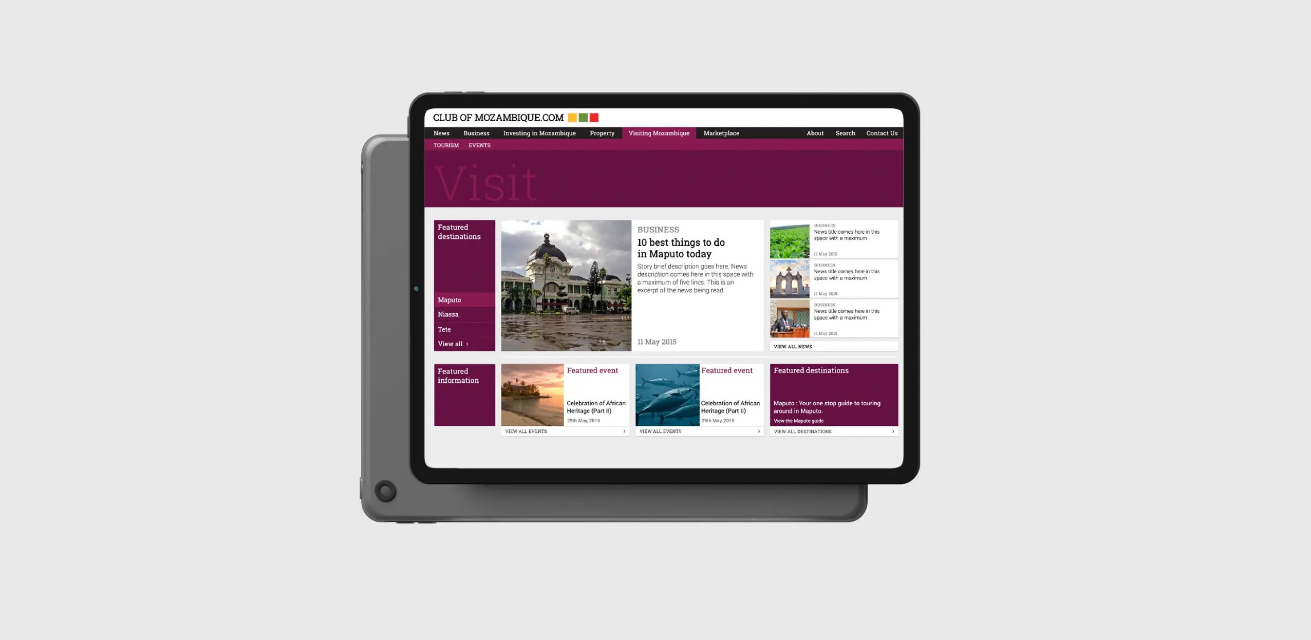
The visual design took its cue from the squares and fused them together with the aesthetics of material design. The main bucketed categories on the site were allocated a color each to develop affinity and recall with the section of their interest, for a repeat visitor. NEWS was identified with red as this was the primary and breaking element, BUSINESS information is in blue giving a corporate feel, PROPERTY in brown associates with land, and INVESTMENTS in green relates to money and returns. The last category is VISITING MOZAMBIQUE, which was made purple as it is a homogeneous balancing color.
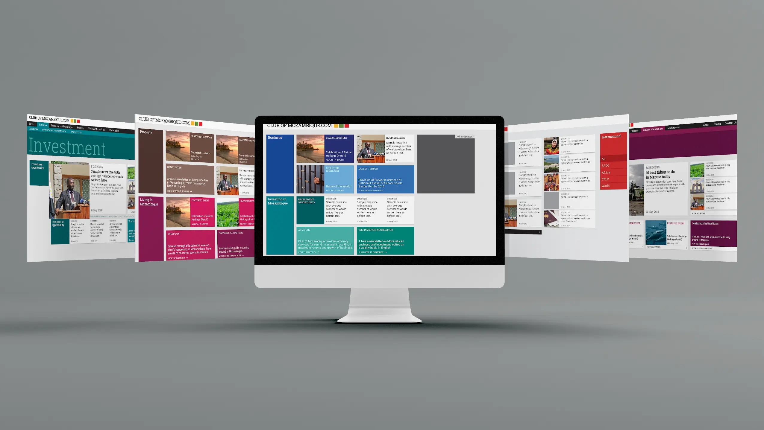
Marketing and Revenue Opportunities were brought to the forefront, by the identification of various spots and ways to plot Promoted content, featured listings, and the advertisement banners from sponsors and partners. This gave the client, revenue generation opportunities and promised the sustainability of the venture.
The website is based on a 7-column grid with pockets of 2 and 4 columns for various listings. The odd column (first column) on the left side was dedicated to the titling and navigation within a section, acting like an Intro. The next 4 columns (2nd-5th column) made up the body of the website, holding the primary information. The last two columns lead to relevant sections and accommodate advertisements and secondary information, much like an Outro.
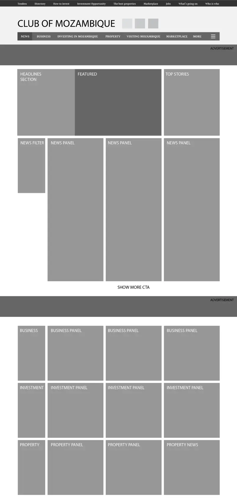
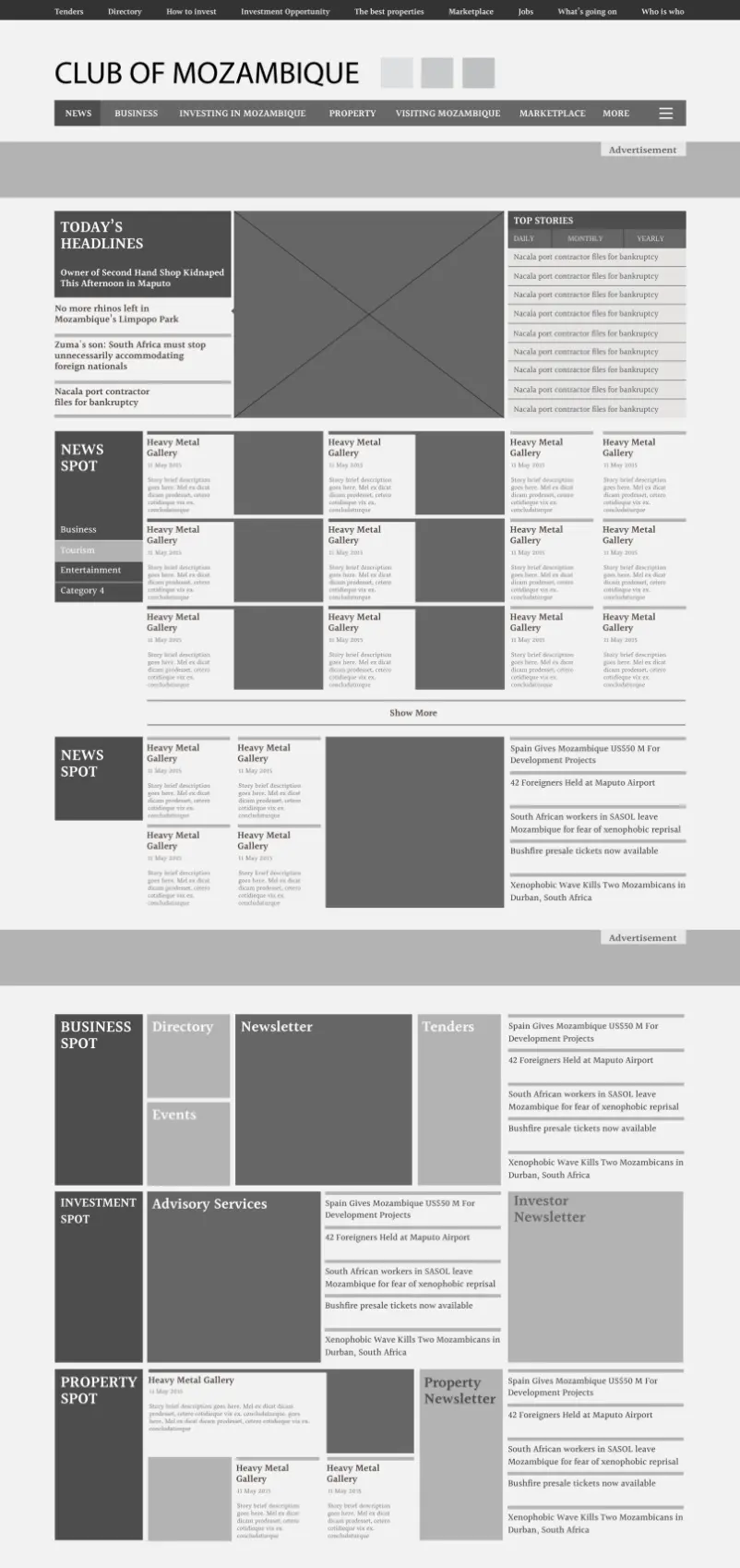
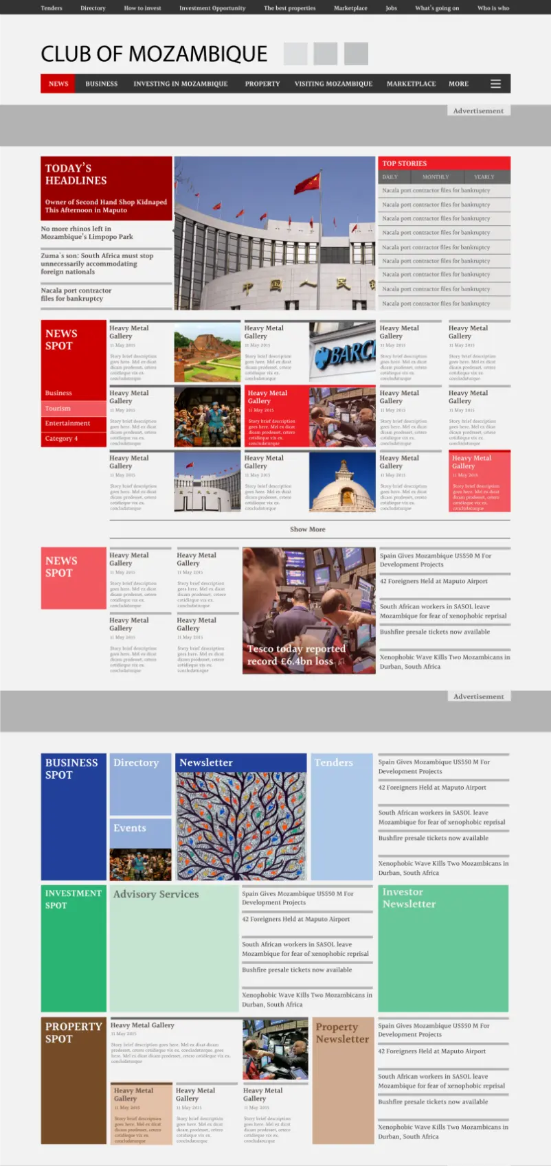
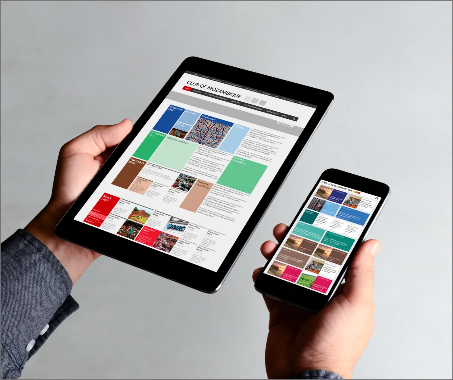
The 7 column grid allowed for a seamless adaptation to response versions with Tablet landscape retaining 5 column, 4 column for Tablet landscape and 2 column grid for the mobile.
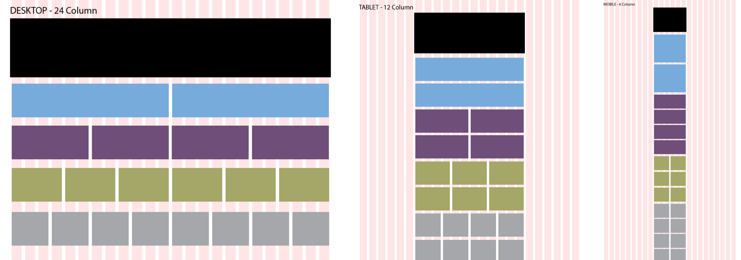
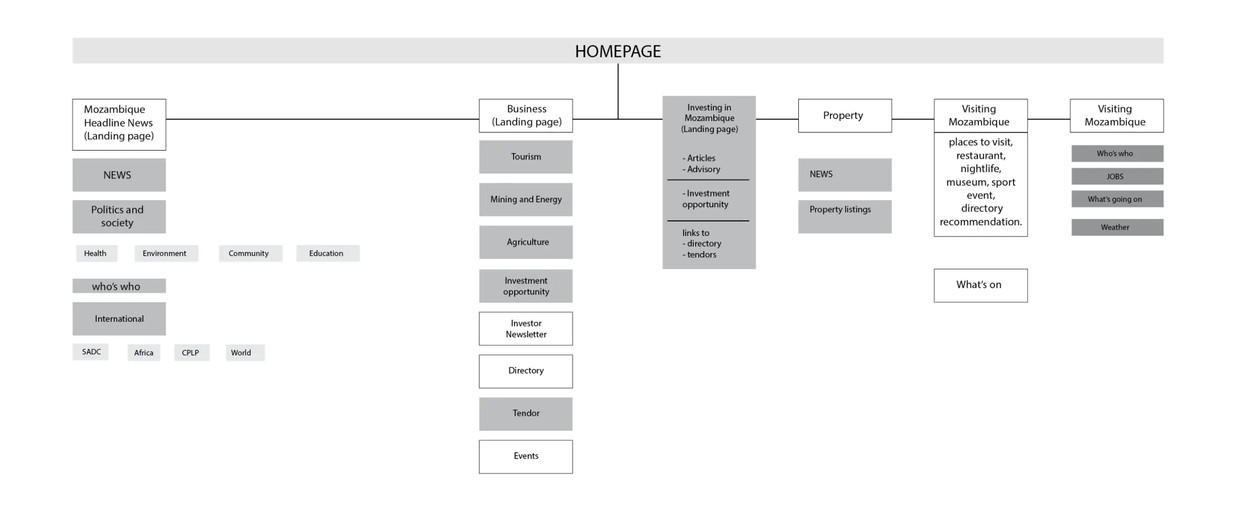
Various sitemap approaches allowed us to figure out relevant connections which could induce an infinite loop of surfing experience for the user. It tracks back to the very reason why the internet is called the web!” This was achieved by introducing widgets on the right side column, which are smaller boxes, also colored, which help connect relevant sections with each other. Someone from BUSINESS can connect to INVESTMENTS and to the DIRECTORY.
Activation
Project Management
Supervision
Fabrication & Installation
Insights
Follow Us
© 2025 Lopez Design Pvt. Ltd. All rights reserved
