Typography makes a difference in how your brand is perceived.
We live in a world where we are continually bombarded with visual media. Words are our staple diet at every consumer touchpoint, from social media posts to outdoor banners and ads.
This constant bombardment of visuals has led to the human attention span now becoming less than that of a goldfish’s 4 seconds. A brand, therefore, has merely a few seconds to make an impression. Typography goes beyond visual messaging, becoming strategic for implementation.
Bihar Museum - Where type becomes the bridge

Our visualization of Bihar Museum as “The bridge to the past and portal to the future” was literally translated into the brand identity, where Devanagari and English are sandwiched together through the shirorekha, a physical and typographic bridge.
The dual use of scripts within the logotype allows the brands to be seen through multiple lenses, of the past and the future, national and international. It also reflects the different layers and multicultural history of Bihar.
Typography became the visual language to tell the story of Bihar museum, enhancing the meaning of the words. The use of English and Devanagari in all communications connected history to translation, a powerful metaphor of how historians and scholars discover the past. The visual qualities of Halant and Ek Mukta reflected the ethos of Bihar Museum as wise, magnanimous, open, friendly, lively and progressive.
The tone of voice for Bihar Museum stems from the brand values of the organization - magnanimous, wise, open, friendly, lively, and progressive. This branded tone communicates the organization’s ethos, heritage, and glorious presence. The system captures this wisdom, always communicating in not one, but two scripts.
Nestaway - An identity that speaks

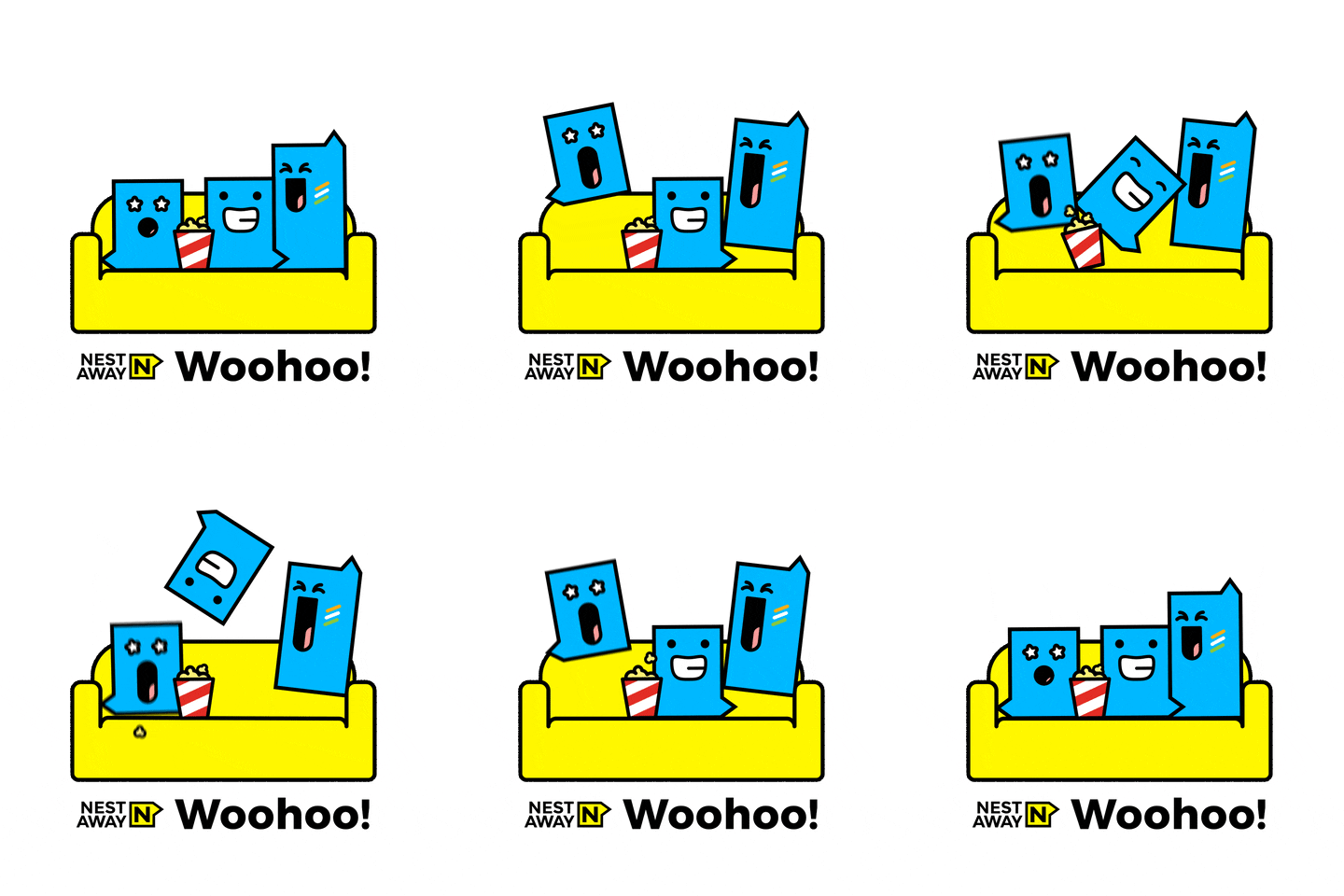
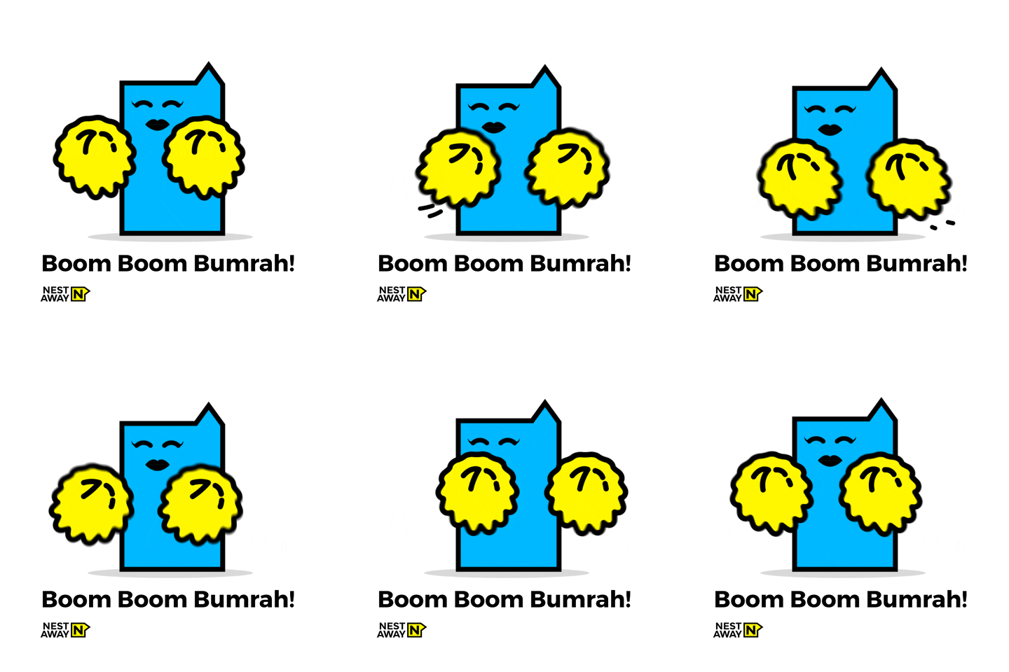
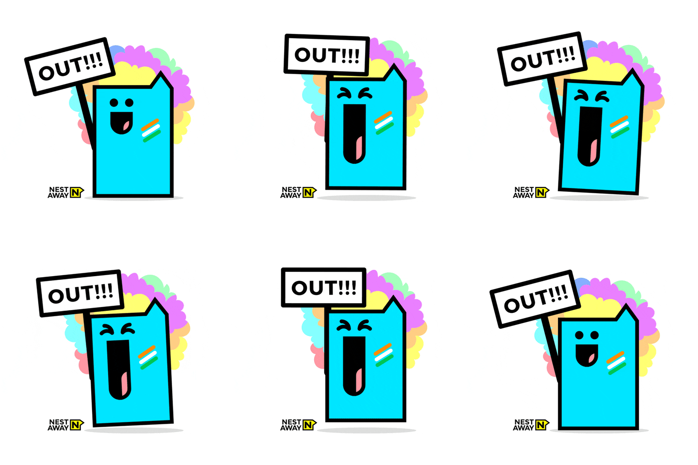
The down-to-earth logo for Nestaway is a ‘voice-box’ that establishes an easy connection with the brand’s youthful audience. The customized communications combined messaging with composition of words inside the box making typography an emphatic messenger. The system uses Montserrat, a modern rounded font to complement the geometric nature of the logo.
As the logo was designed as a container, the possibilities to experiment with typography inside the box are unlimited: the box can be stretched, stacked and duplicated. The attractive and relatable nature of the visual system earned the brand around 15.8 million views on giphy. The voice-box identity holds messages in any form, making the brand easily and instantly recognizable in all communication mediums.
A23 - From logo form to logotype

A23, pioneers of online rummy in India — formerly known as Ace2Three —are game-changers in the online gaming revolution in India. Their former identity did not reflect the premium brand value of the platform’s new undertaking.
We dropped the logo form and recreated the logo using only typography. The customized ‘A23’ monogram crafted by our expert team is the hallmark of the brand that adds premium value for its aspirational users. The shift from a hand drawn serif typeface to a custom sans serif logotype highlighted the brand’s modern aesthetic, use of cutting-edge technology, and professional rummy experience.
Canto, the typeface purchased by the client is modern and gives the brand a clean and premium aesthetic. Recognising the potential of the premium look, the client invested in purchasing the whole family of the font and uses it across all touchpoints giving the brand a very consistent look.
Written by Saumya Mittal
Edited by Sujatha Shankar Kumar
Cover Image By Nishtha Sharma
Images by Lopez Design team
Layout by Ajay Sharma
Further reads:
A Brand For Every Moment


