PMNCH
BRAND STRATEGY + IDENTITY + CONTENT + PRINT + DIGITAL + WEB

PMNCH’s new branding and identity system focus on their 2021-2025 strategy – ‘Every Woman, Child, and Adolescent can realize their right to health and well-being’.
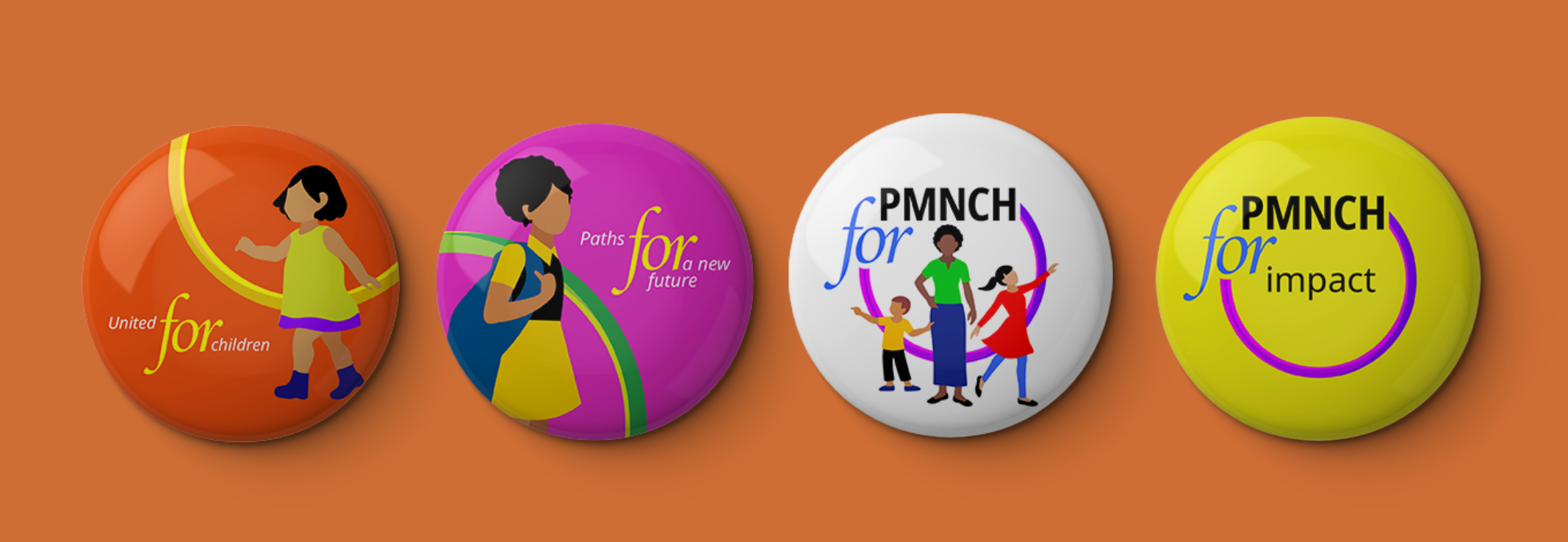
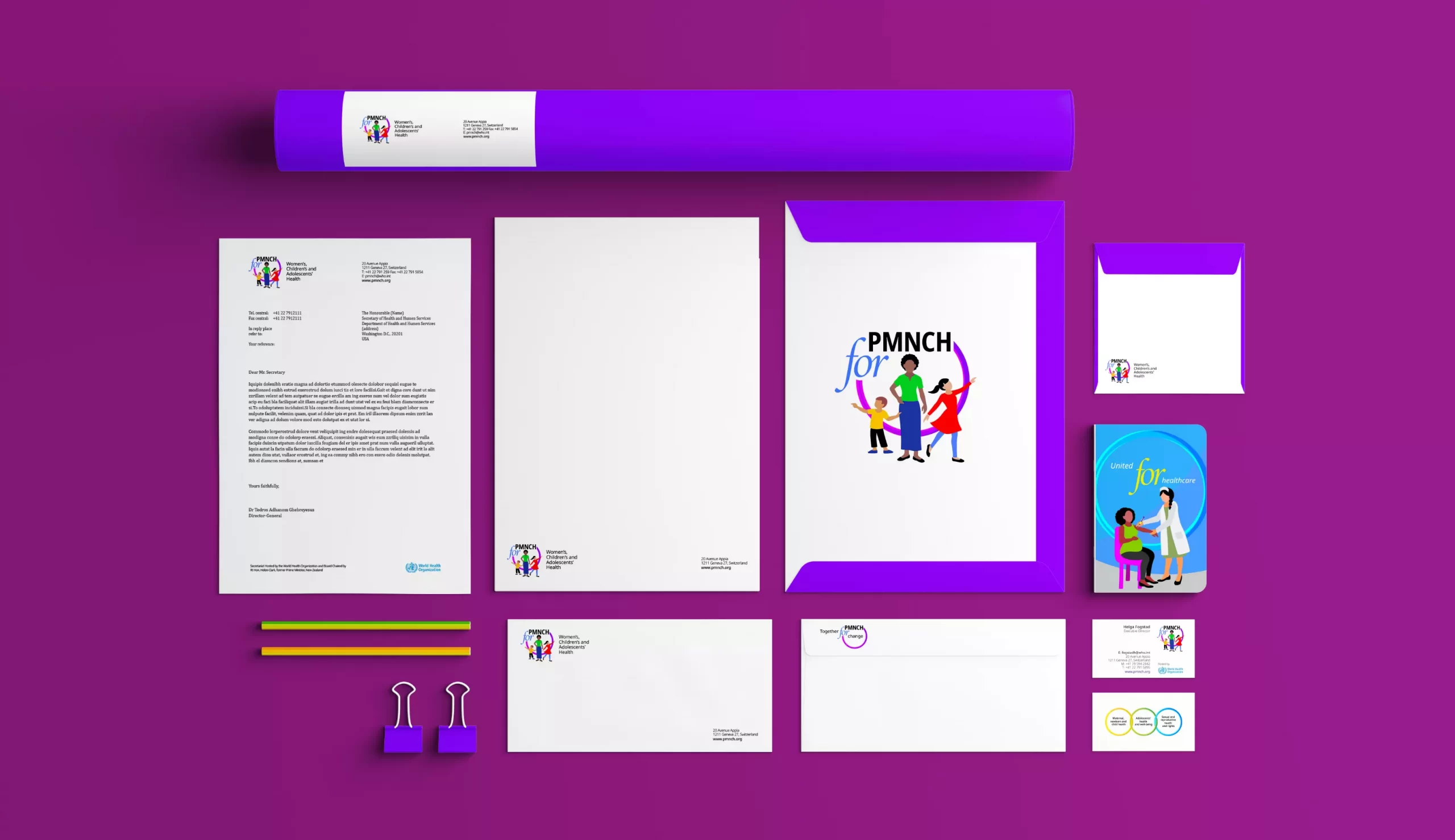
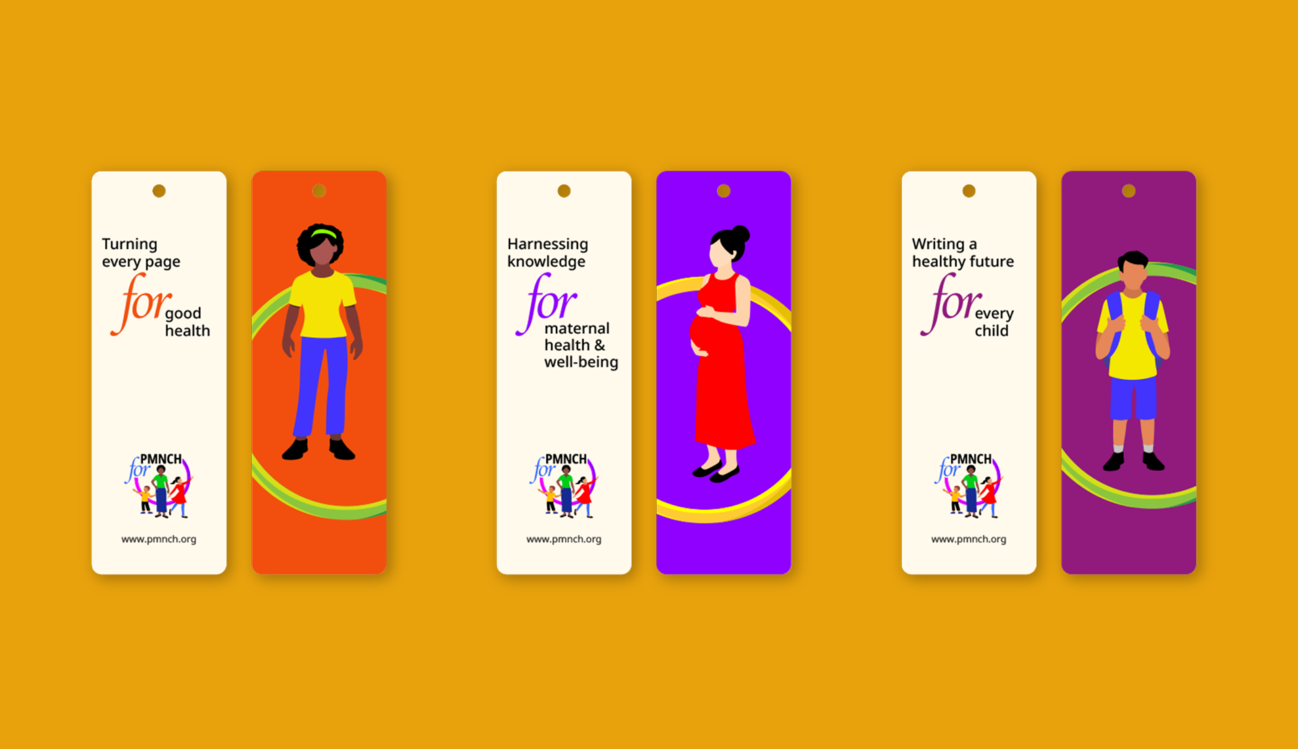



We set out to bring in the characters of a woman, child, and adolescent as positive and independent, empowered by the Partnership. The final logo has a circular ring that embraces the characters, the PMNCH acronym, and the word 'for'.



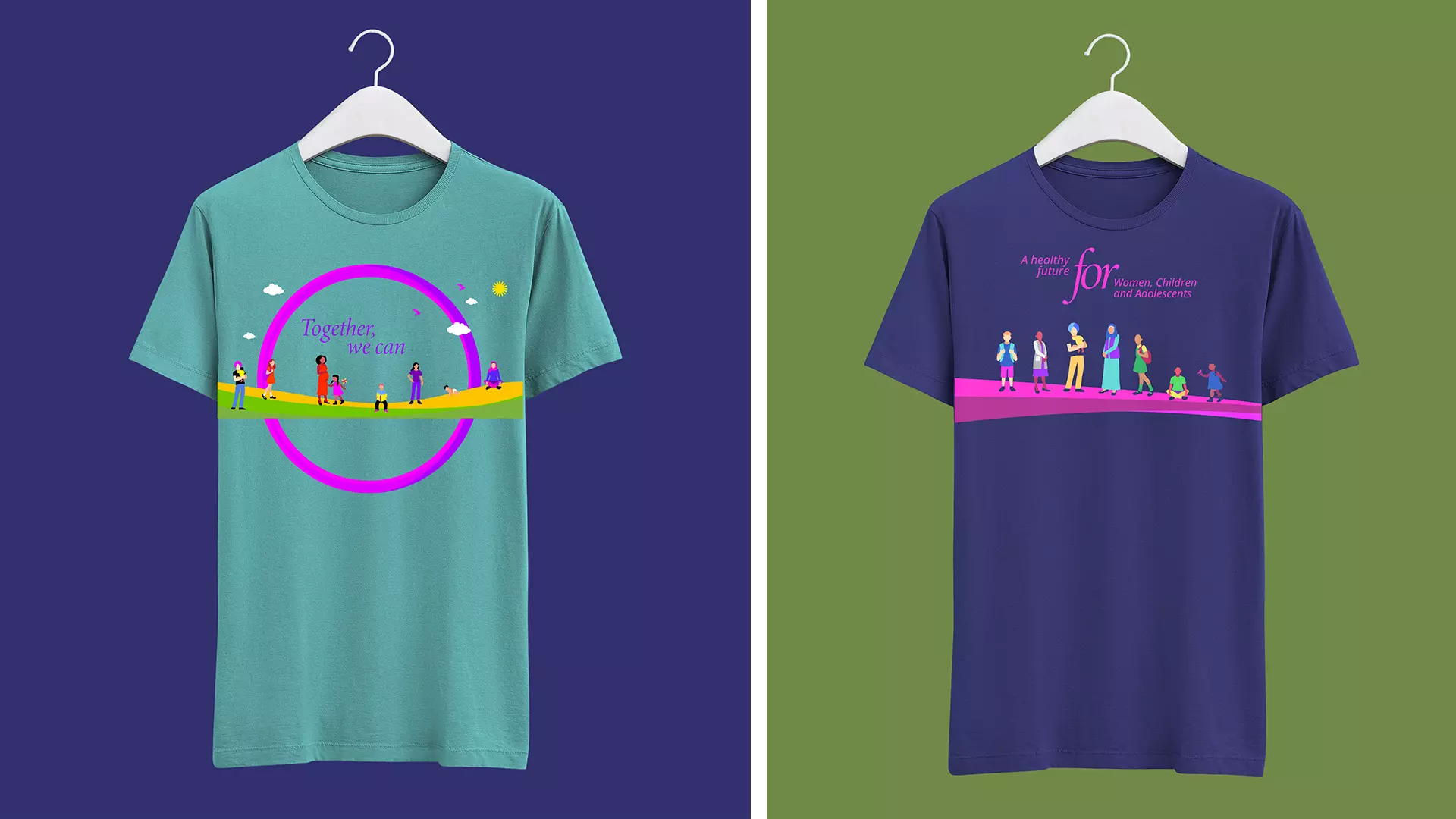
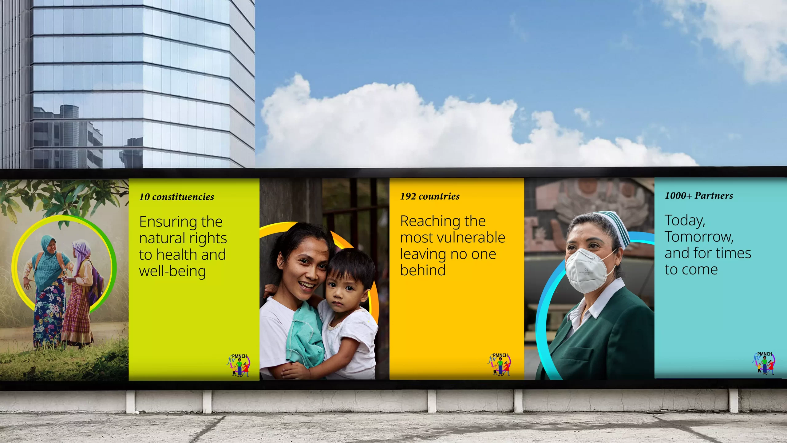

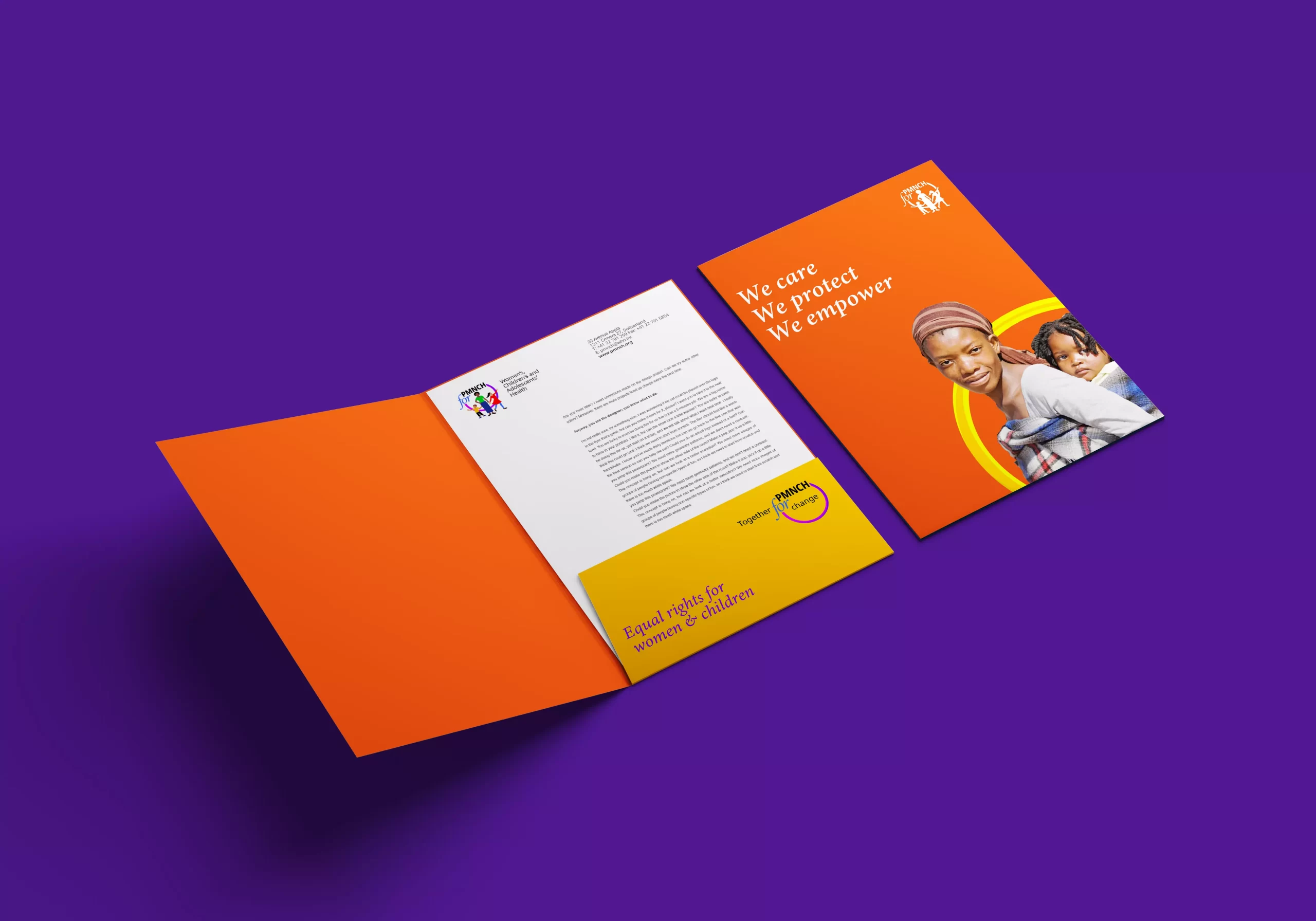
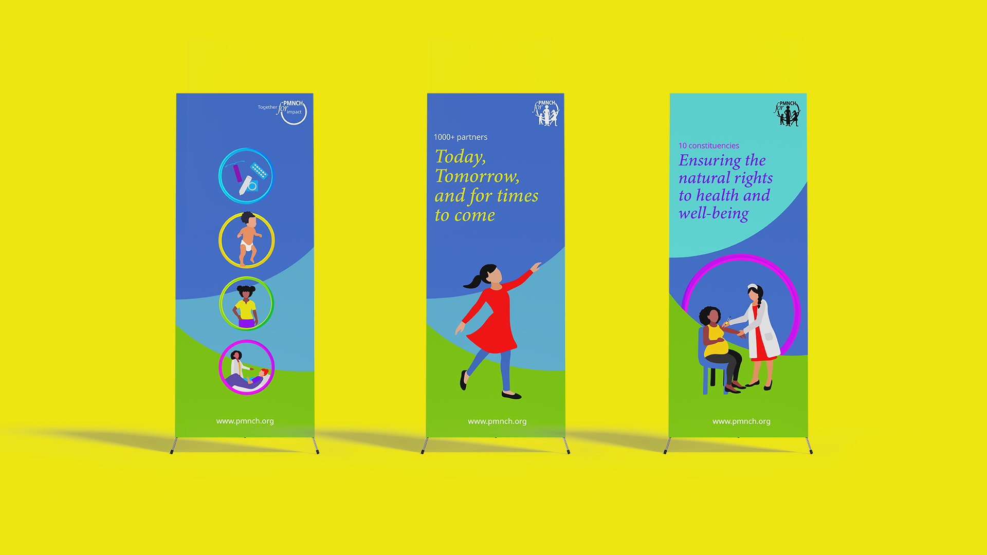
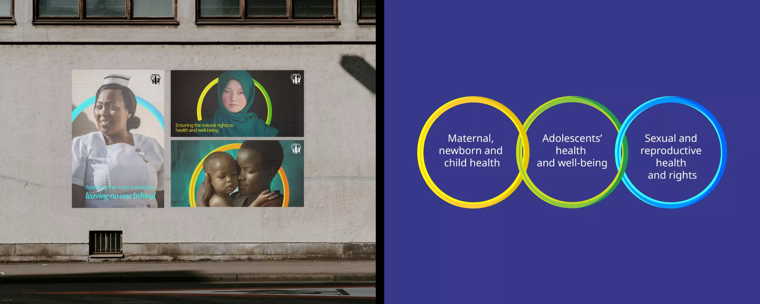
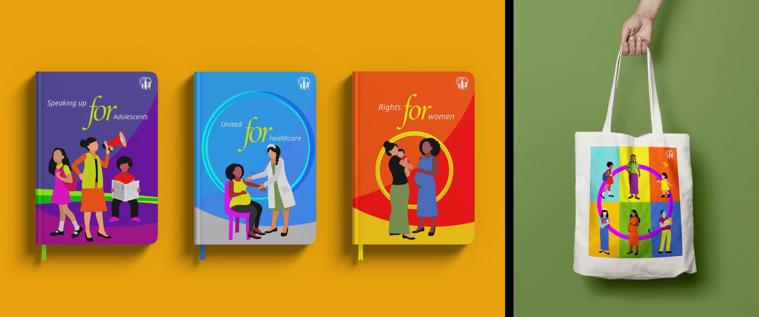
'PMNCH + for': The word ‘for’ is a preposition representing active advocacy and draws focus to the organization’s purpose. This system allows the different parts of the logo and its elements to have multiple manifestations based on the organization’s numerous objectives - for change, for women, for children, for adolescents, and more.

Lori McDougall
Deputy Executive Director, PMNCH
“With the launch of our 2021- 2025 digital strategy, we needed new branding to bring to focus our renewed purpose. PMNCH is the largest partnership in its field, having evolved over 15 years, and the identity needed to help us take along all our partners with our power to influence and bring about change. This exercise was a tough challenge to get many different aspects together.
Our long-standing branding and design partner, Lopez Design, developed a well crafted, forward-thinking and clever solution that ensured us a unique space for our new advocacy stance with a logo that reads ‘PMNCH for’. The warm, people-centric and colorful branding projects our true essence bringing out our humanitarian, knowledgeable, and evidence-based advocacy approach. Its open-ended nature gives us enormous flexibility. All of us at PMNCH were especially impressed by the relentless work put into the branding and the thoroughness with which the team approached everything right from their painstaking research to the final brand story. We are happy to say that we have a brand identity that we can truly love and cherish that will see us into this aspiring digital age.”
Activation
Project Management
Supervision
Fabrication & Installation
Insights
Follow Us
© 2025 Lopez Design Pvt. Ltd. All rights reserved
