Forum No.20
7th Oct 2017
Forum No.20
7th Oct 2017
Forum No.20
7th Oct 2017
Forum No.20
7th Oct 2017
Forum No.20
7th Oct 2017
COLLABORATION | YIELDS GROOVY RESULTS
COLLABORATION | YIELDS GROOVY RESULTS
COLLABORATION | YIELDS GROOVY RESULTS
COLLABORATION | YIELDS GROOVY RESULTS
COLLABORATION | YIELDS GROOVY RESULTS
GRAPHIC DESIGNER AND ANTHROPOLOGIST
Samprati Pani
PHOTOGRAPHER • DIRECTOR
Dinesh Khanna
ARTIST
Kate Bowen
GRAPHIC DESIGNER AND ANTHROPOLOGIST
Samprati Pani
PHOTOGRAPHER • DIRECTOR
Dinesh Khanna
ARTIST
Kate Bowen
GRAPHIC DESIGNER AND ANTHROPOLOGIST
Samprati Pani
PHOTOGRAPHER • DIRECTOR
Dinesh Khanna
ARTIST
Kate Bowen
GRAPHIC DESIGNER
AND ANTHROPOLOGIST
Samprati Pani
PHOTOGRAPHER • DIRECTOR
Dinesh Khanna
ARTIST
Kate Bowen
GRAPHIC DESIGNER AND ANTHROPOLOGIST
Samprati Pani
PHOTOGRAPHER • DIRECTOR
Dinesh Khanna
ARTIST
Kate Bowen
ARTIST
Chetna Verma
ART CURATOR
Kanika Anand
ARTIST
Chetna Verma
ART CURATOR
Kanika Anand
ARTIST
Chetna Verma
ART CURATOR
Kanika Anand
ARTIST
Chetna Verma
ART CURATOR
Kanika Anand
ARTIST
Chetna Verma
ART CURATOR
Kanika Anand
GRAPHIC DESIGNER AND ANTHROPOLOGIST
Samprati Pani
GRAPHIC DESIGNER AND ANTHROPOLOGIST
Samprati Pani
GRAPHIC DESIGNER AND ANTHROPOLOGIST
Samprati Pani
GRAPHIC DESIGNER AND ANTHROPOLOGIST
Samprati Pani
GRAPHIC DESIGNER
AND ANTHROPOLOGIST
Samprati Pani
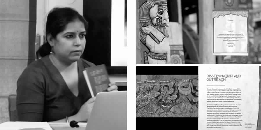
Co-founder of a studio that specialises in book design, Samprati Pani trained as a graphic designer and worked in academic publishing for more than a decade. At the Forum, she presented her work in academic publications such as Oxford Press, her own studio designs and her ongoing research work in the area of bazaar culture.
In her explorations of designs for books, Samprati showed us a book with heavy text and observed how the book cover is usually designed after the whole book is completed. This is why, she says, there is no continuity between the inside content and the cover. In most cases, a designer may arrive at the graphic without examining the content of the book in detail. Unless the editor makes an effort to talk to the designer in detail, the continuity from content to cover is not maintained. Time is an essential factor in the design of books. As the editor is required to produce a number of books, and also the designer, there is often no time to maintain a cohesive identity for book design. Creating a genuine identity for every single book is not possible. Samprati showed us examples where she had taken the initiative to design holistically, connecting elements on the cover of the book with elements inside. For example, the section divider page has features that are worked into the page dividers. The same font family is used. While at times, the design could be a combination of disjointed elements, Samprati cherishes the freedom she got when designing for a new series launched by Oxford.
Much of Samprati’s graphic work is concerned with exploring the ethnographic space in book design – studying people and culture situated in place. A recipe for making a dish with arbi leaves derives its graphic from the plant contours while a page exploring street culture of eating golgappas picks out how typography is used on the vendor’s cart. Implements used in grinding by the Gardia Lohar community establish context through a photograph, while the meaning of the word ‘jugaad’ is elaborated by picking up interesting examples of innovation on the street.
Samprati, who pursued her PhD at the department of sociology at Shiv Nadar University, melds her interests in ethnography and design by studying the weekly bazaars of Delhi, which offer a rich amalgam of experiences. Samprati’s musings on her observations of everyday affairs of the city appear in her blog Chiragdilli. Her research focuses on the evolution of bazaars, many of which are impermanent and itinerant in nature, studying how they carve their space in the city alongside with other activities, the influence of people and changing city culture. Samprati connects the nature of change with the sameness of experiences over time through the thread of memory.
Written by Sujatha Shankar Kumar
PHOTOGRAPHER • DIRECTOR
Dinesh Khanna
PHOTOGRAPHER • DIRECTOR
Dinesh Khanna
PHOTOGRAPHER • DIRECTOR
Dinesh Khanna
PHOTOGRAPHER • DIRECTOR
Dinesh Khanna
PHOTOGRAPHER • DIRECTOR
Dinesh Khanna
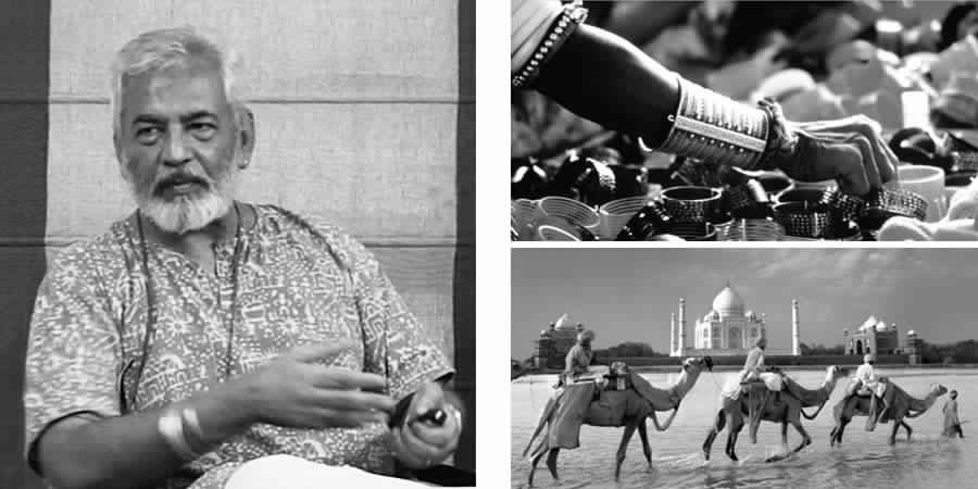
Co-founder of Nazar Foundation, and one of the Creative Directors as well as co-founder of the Delhi Photo Festival, Dinesh Khanna has been practicing photography for over 30 years. The seed was sown early in him - encouraged by his photographer father to use a camera as a child, Dinesh learned hands-on and got a good grounding. In the era of film photography, where materials and processing were expensive, the young boy had access to cameras, lenses, a darkroom and film. At 18, when it came to making a career choice, Dinesh rebelled against being a chip off the old block, feeling that he would be succumbing to the Indian caste system, where a cobbler’s son becomes a cobbler and a businessman’s progeny continues his business. Wanting to do something completely different, Dinesh drifted into advertising, where, soon his good performance got him the branch manager position in his agency at the age of 27.
Somewhere within, Dinesh knew that photography was his first and true love. After eleven years in advertising, he quit his job and got into commercial and advertising photography, which was closest to his expertise. Still raw in his chosen field, he bought a twin lens reflex camera - not considered the right choice for professionals he found out – and determinedly forged ahead to carve his chosen path. Starting with small assignments he could get from known advertising clients, he built up his knowledge on the job.
While he recognised these opportunities to translate every client’s vision into a relevant output in commercial photographic assignments, Dinesh had the itch to travel and shoot. Recalling his younger days travelling weekends to Rishikesh and Haridwar, Dinesh renewed his interest in street photography, traveling across the country, shooting between assignments. His philosophy of photography grew to the understanding that it was all about storytelling, what you related to and what you wanted to share through the medium. He emphasises how you do it is no one else’s concern – with a 4 x 5 camera, a Nikon or the use of any special lens. The idea is to come up with something that brings awe, and to become part of the greater collective perception, as he says. “I am putting my feelings about the subject, my expression and my view into it…like any art form to tell stories in a form you are passionate about.”
You get work depending on what you are passionate about, says Dinesh, who has shot a wide variety of subjects. From farmers in UP to the President’s bodyguard, the avid photographer treasures his anti-specialist experience, where he has done architectural, street, portrait, product, food and more. At his presentation, he shared a variety of photographs that showed his interest in colours and people of India. At the tribal festival in Gujarat his composition shows how women wearing exotic silver jewelry are fascinated by cheap plastic ornaments. He explores indigenous patterns in a monochromatic picture of clogs in Ayodhya. Travelling across the country except Kashmir and the North-East for over ten years, his subject matters grew quite organically without any premeditation towards religious faiths and bazaars. The reason, Dinesh believes he was drawn to these subjects is because he was following a natural pattern - India lives very openly and Indians transact on the street. The new generation malls on the contrary do not let us be interactive – they are more about let me see what you want and I’ll provide that. Dinesh produced a huge body of work in the form of exhibitions such as Living Faith and Bazaars, both of which got him book offers.
His courage to adventure ahead without a fixed plan, following his intuition shows how the pursuit of passion reaps great rewards in good time.
Written by Sujatha Shankar Kumar
ARTIST
Kate Bowen
ARTIST
Kate Bowen
ARTIST
Kate Bowen
ARTIST
Kate Bowen
ARTIST
Kate Bowen
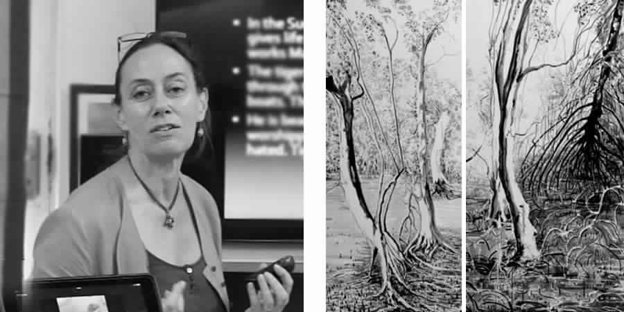
A British painter, now settled in India, Kate moved to Myanmar in 2013 to work with organisations and communities to help rebuild natural habitats and environments that were destroyed during the 2008 cyclones. Her focus was on the mangroves of the area, which were affected during the cyclones.
A program was created involving several specialists like marine biologists and foresters conducting research and finding solutions to replant the mangroves. Workshops were conducted with other participants and locals to create alternate fuel and other means of income to avoid any further deforestation. Art workshops were held with local students to brainstorm and document the current state of the mangroves and the outcome was presented to the local authorities and the academic bodies in the area to give the initiative impetus to sustain beyond the above mentioned workshops. The workshop and her research culminated in a collaborative exhibition of Kate’s paintings of the mangroves. She created audio artworks alongside installations jointly with a local artist and a Norwegian photographer who were also working along the same lines. The exhibit was experiential in nature. Kate described a space which was transformed into a meditative area with her large scale, black and white paintings flanking the walls, which were paired with sound recordings of the insects and birds of the local mangroves. Kate also spoke about the interesting process of creating these large scale works. To create large scale impact, she had to paint with brushes attached to the end of a long bamboo sticks. Kate is currently working in india with environmentalists researching the vulnerable natural habitats and mangroves of the Indian coastal areas and the Sundarbans.
Written by Surajit Ranjan Das
ARTIST
Chetna Verma
ARTIST
Chetna Verma
ARTIST
Chetna Verma
ARTIST
Chetna Verma
ARTIST
Chetna Verma
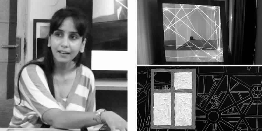
Chetna, a contemporary artist, draws her influence from cityscapes and translates these into minimalistic, geometric art. She’s been a part of many exhibitions in Delhi, Chandigarh, Chennai and Brussels, and was recently presented with the ‘Emerging Artist of the Year’ Award by Glenfiddich. Giving us a glimpse of her obsession with ‘lines’, she began by narrating the following.
‘Lines are everywhere…..
Lines can make you wait….
Lines can hold you back….
Lines can set you free….
Lines can keep you together….
Lines can set you apart…. But eventually what matters Are the lines that you leave behind…’
Chetna spoke about challenges of retaining geometry while experimenting with different media, and how she overcame them to produce art that appealed to various kinds of audiences. Her experimental installation with laser lights at a recent show titled – ‘The Infinite Cube’ was of a worthy note, and drew much praise. Having previously worked with the color white majorly, ’Noir’, her latest show was an attempt to work with the color ’black’. The talk ended with images of her art from this particular show. Chetna’s work can be found in the collection of the College of Art Museum, as well as with numerous private collectors in India.
Written by Joash Youtham
ART CURATOR
Kanika Anand
ART CURATOR
Kanika Anand
ART CURATOR
Kanika Anand
ART CURATOR
Kanika Anand
ART CURATOR
Kanika Anand
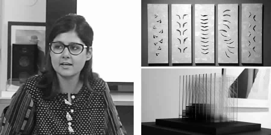
Kanika Anand is a art writer and curator with a Master’s degree in Art History. In her professional domain, Kanika curates art that hinges on collaborative processes. She has worked extensively with galleries and alternative spaces such as Rajeev Sethi Scenographers and Gallery Espace in India. She contributes articles to international publications like Art India, Daily Serving, Art Radar Asia and the Sunday Guardian. At the Lopez Design forum, Kanika spoke about NOIR, an exhibition of more recent works of artist Chetnaa, which she had curated.
NOIR explores ‘blackness’ as both material and method in making of art. The artworks bring to our eyes, the darkness of living spaces that we tend to ignore. NOIR derives its name and sensibility from the genre ‘film noir’ most widely associated with stylish Hollywood crime dramas from the 1940s to 1950s. A collection of architecturally inspired art presented in a dark viewing space, the exhibition is fittingly inspired by an urban environment marked by oblique and vertical lines, neon signs and shadowy dark alleys. Amidst the shadows, Chetnaa’s art attempts to bring out the changing nature of spatial and temporal structures in today’s world.
Written by Agnisesh Setlur
Activation
Project Management
Supervision
Fabrication & Installation
Follow Us
© 2025 Lopez Design Pvt. Ltd. All rights reserved