
Harvest Gold
IDENTITY DESIGN + PACKAGING DESIGN
Problem
Established in 1983, Harvest Gold is a legacy baker's brand that needed to reinforce its perceived value across a highly competitive Indian marketplace. With the rise of quick commerce and growing competition, the brand needed to appeal to a newer audience making faster purchasing decisions.
To sustain its market relevance and leadership, Harvest Gold required a comprehensive brand identity and packaging system that felt fresh and contemporary, staying entirely true to its decades-long heritage and reputation.
We reimagined Harvest Gold’s brand identity and packaging system to stand out in the crowded Indian marketplace while staying true to its legacy bakery heritage.
Solution
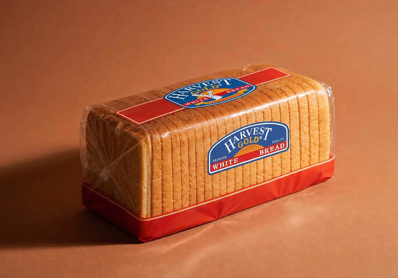
To set apart Harvest Gold on the crowded retail shelf, we designed a breakthrough premium packaging. Our standout solution displayed the real product in a first-of-its-kind transparent packaging, a win for all — the product took pride of place, seamlessly capturing the attention of buyers and humanising the brand. The logo we developed was like the seal of the premium baker legacy, completing the classic “baker’s bread” appearance, instantly elevating consumer trust and confidence.
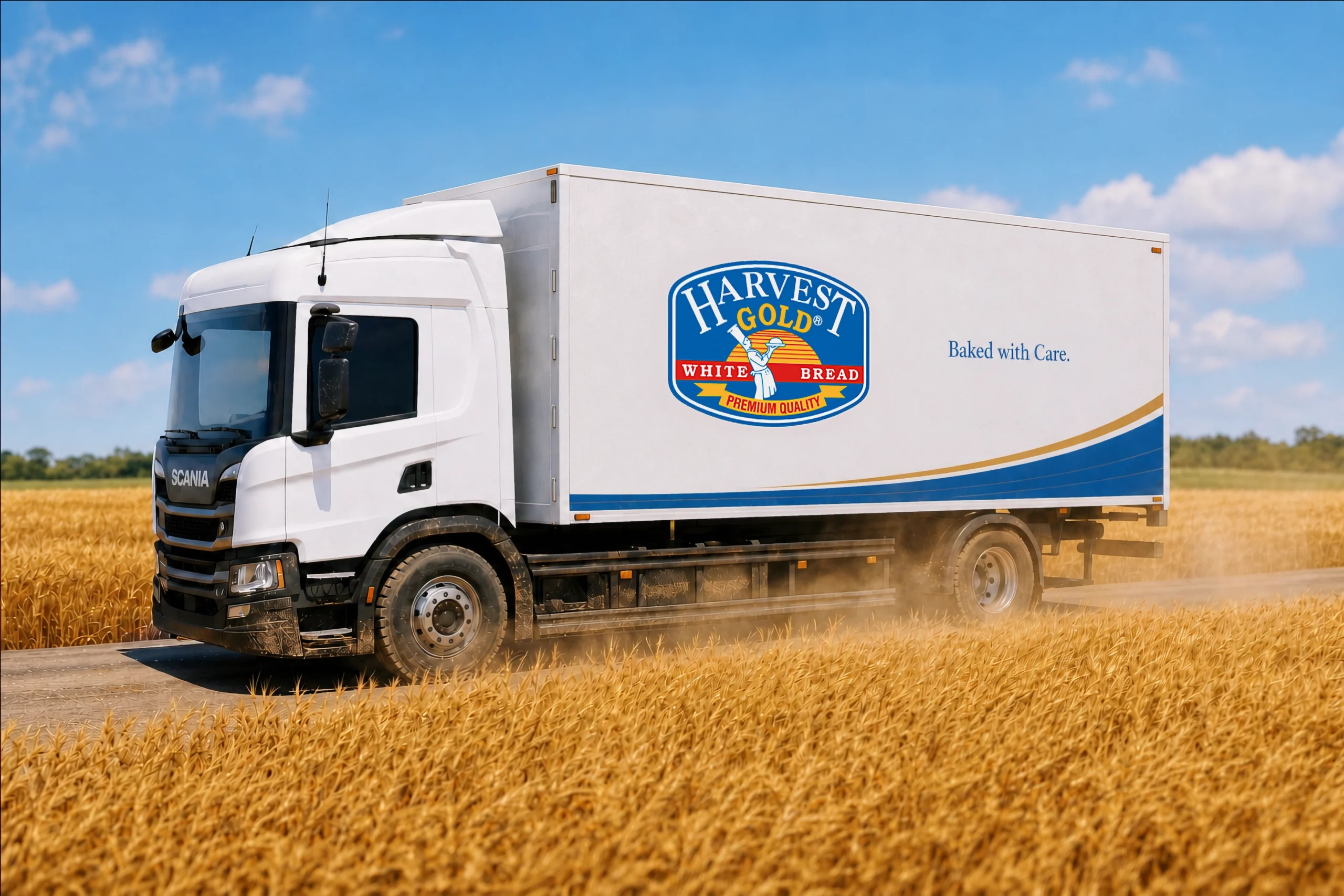
We successfully extended this unified, distinctive identity across all aspects of the brand’s presence — from bread and bun packaging to every consumer touchpoint — helping Harvest Gold capture audience attention, trust and market share.
A Systemic Solution
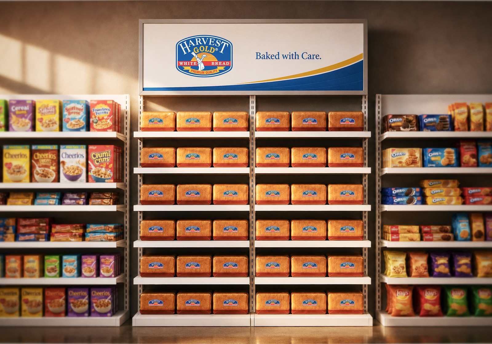
The natural look that we achieved with the transparent packaging showcased the freshness of the bread — but it also revealed crumbs. This compromised the premium look. We resolved this by introducing an opaque base tray. This strategically placed solid base concealed crumb buildup and it also established a clear visual anchor for product placement. This intuitive design cue organically nudged retailers to stack the loaves upright, ensuring a neat, commanding shelf presence that reinforced Harvest Gold's market positioning.
The opaque base band concealed crumb clutter while intuitively guiding upright stacking for a cleaner, distinctive shelf presence.
Team
Mohan Godwal
Senior Graphic Designer
Raj Kishore Gupta
Graphic Designer
Anthony Lopez
Founder and Chief Creative Director
Activation
Project Management
Supervision
Fabrication & Installation
© 2025 Lopez Design Pvt. Ltd. All rights reserved