We engaged with a key corporate player in our TDC takeover chat to find out: What is the value of design?
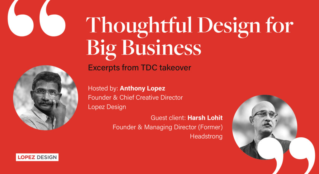
"I remember that the design budget was close to a crore. How did you possibly convince your leadership team?" Anthony Lopez did not mince words in his query to Harsh Lohit, his one-time client of a global firm with offices in North America, Europe, Philippines and other parts of Asia Pacific and India.
The exchange happened on The Design Collective’s (TDC) Instagram platform, when they hosted an episode on 'Creating Branded Environments' on July 23rd, 2020. Founder of Lopez Design, Anthony got Lohit, his longtime client on board to have an honest discussion about whether a business could profit by branding a work environment. Lopez Design had executed the environmental branding for Headstrong, a global IT company that Lohit started with seven others.
Lohit and Lopez go back 15 years. One could see them as two starkly different personalities: the former has spent 25 years in the software industry, expanding his business from Delhi to New York, and many international hubs in between. While the latter is a bona fide creative, multi-faceted designer, and has built the reputation for his eponymous organization Lopez Design, by establishing it as a boutique studio. Nonetheless, their professional tryst has strengthened over time to mutual respect, because both align on the idea: Design has business value. And even today, Lohit affirms he got more bang for his buck with LD’s intervention. Headstrong was acquired by BPO major Genpact in April 2011. Many other insights followed in the scintillating and candid conversation between the designer and the IT head turned organic farmer.
1. Branding is a business-critical infrastructure, not just a ‘good-to-have’ proposition
As a member of the board, the first person Harsh had to convince was himself.
"This was the biggest bet we were laying on our capacity to grow. We were then worth 75 million USD. By 2011 when we were acquired by a larger firm, we were around 250 million USD!" Headstrong wanted to unify its people through a common sense of purpose and evolve in alignment with its market success.

"It was super-critical that all the 3,500 employees felt that they were part of a different organization. And truly we were different; in our business focus and our values. The physical space had to mirror that difference!"
Lopez went beyond the norms of corporate branding. What binds people of different traditions, places, and backgrounds? Is there a language of signs that everyone relates to, no matter where they come from? Seeking the fundamental roots of humanity was central to our exploration. The communications developed thereon: motion graphics, signage systems, poster schemes, room graphics, and super graphics.
The result, as Harsh would say ahead in the interview, "...I will not be exaggerating if I say that people from almost the top 30 investment banks in the world visiting the office said that their facility in the US or Europe looked 20 years older than ours, though it was done recently. So there was a vibrancy about the organization that the entire infrastructure enhanced."
"Every aspect of each area was so well-thought! From the signage to graphics, it was creative and original. The soul of the building came through. The customers, the employees, even the board was blown away upon seeing the office. That's the difference it made. Moreover, you were able to create it across centres: Delhi, Bangalore, Washington, Chicago, and New York."
2. What people don’t like, is paying for ideas
Harsh sums up his own experience. "Even in our industry people don't mind paying for tangibles or equipment. They'll buy the hardware but would get the software pirated, even if that means more harm. Sadly, that's the way it is".

People don't like paying for ideas.
Consider the Headstrong space — with the human mind as the fount of wisdom an iconic system of signs was developed. Lopez Design zeroed in on Superman– the symbol of superhuman, The Sumo Wrestler– the physical challenger, and The Yogi– the spiritual quotient.

The room signage played on aspects of human nature. “Meet Talk Elevate” with three human figures that symbolized the aim of dialogue for meeting rooms. “Super PM” was the sign for the Project Manager.
The poster scheme motivated people by making them pause and introspect to connect with intangible values. Graphics in black were superimposed on a mirror surface, so people could see their reflection while simultaneously reading lines like “Stop Look Think” and “The Essential is the Invisible.”
But all these were mere thoughts, nascent sketches, and as radical as they were- ideas! Very few like Lohit can gauge their potential and have the belief that they will deliver over time. What we need is this conviction to find its way to the core businesses.
3. While the design is important, the execution is as important
It's easy to guess that Harsh comes from a practical school of thought like most clients who are sceptical about the promise of design against its capacity to deliver.

"In the end, it was your commitment that matched mine to do it right," Harsh says to Anthony, which made their partnership a success.
He added, "I think your team's ability to empathize and adapt was another thing which I liked. I am a very practical guy and I think as much as design is important, the execution is as important. Your guys did a fantastic job of executing very complex stuff. It was truly multimedia. Not in the sense of what we see today, but physical multimedia. Like many artists and engineers brought together executing across dimensions".
Written by Harshala Gupte
Edited by Sujatha Shankar Kumar